Step-saving shortcuts
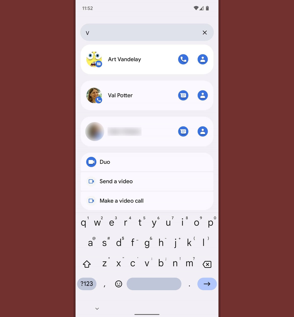
10. Here's another Pixel-specific Android 12 treat: Provided you're using the Pixel phone's default home screen environment in Android 12 (and not a custom Android launcher), swipe up from the bottom of your screen to open your app drawer and then tap the search box at the top of that area.
You'd never know it, but the Pixel's app drawer search function got a major upgrade in Android 12 — and you can now search for contacts, conversations, settings, apps, and shortcuts within apps from that one streamlined spot to find anything you need in a snap.
 JR Raphael/IDG
The Android 12 app drawer search box has some spectacular hidden search powers on Pixel phones.
11. Make that new universal search system even more efficient by tapping the three-dot menu icon within the Pixel app drawer's search box and then tapping "Always show keyboard." That'll cause your on-screen keyboard to automatically pop up and be ready for input as soon as you open the app drawer, saving you the step of having to tap on the box to get it to appear.
12. Need to get someone else on your Wi-Fi network, whether in the office or at home? Android 12 has a handy new system for sharing your current network's configuration wirelessly over Bluetooth. Tap the Internet tile in your device's Quick Settings area, then tap the gear-shaped settings icon next to your current network's name. Tap the "Share" command on the screen that comes up next, then tap "Nearby" and hold the other person's phone back to back against yours.
You should see a prompt on the second phone to turn on Nearby Share and accept the information, after which the network should automatically connect — no manual password typing or clunky QR code scanning required.
13. If you find yourself missing the excellent connected-device control panel that was built into the power-button menu in Android 11, set a mental reminder: That same info is still available in Android 12 — only now, it's in your Quick Settings panel instead of the power-button menu (sigh).
Don't despair, though! Here's a teensy trick to make that connected-device shortcut section easier to access within this new arrangement: Edit your device's Quick Settings area, using the same steps we went over earlier, and look for the new Device Controls tile. Drag it up into one of the top four positions, and it'll never be more than a single swipe away.
14. You'd be forgiven for failing to notice, but you can also get to Android 12's Device Controls section directly from your lock screen — at least, in Google's version of Android.
Provided your phone supports the function, look for a house-shaped icon in the lower-left corner of the lock screen to hop directly to that area — and if you don't see that icon there, head into the Display section of your system settings, tap "Lock screen," and then look for the "Show device controls" option to activate it.
15. On a related note, take note: The tiles in your Android 12 Device Controls area may look like basic buttons, but they're actually much more. In addition to tapping, you can long-press most of those commands to jump directly to the full set of controls in the associated app — and in certain cases, like when a control is for a dimmable light, you can swipe left or right on the button to adjust its level without having to open anything else.
16. Don't let the name Device Controls fool you. With the right tool and a few minutes of crafty configuration, you can add fast-access commands for almost any shortcut imaginable into Android 12's Device Controls area. Follow the instructions in this guide if you want to dive deep into some next-level custom time-savers.
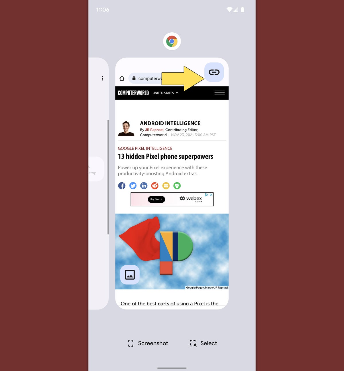
17. On a Pixel, Android 12 adds in the ability to snag and share a link to a web page from right inside the system Overview area. Just swipe your finger up about an inch from the bottom of the screen and stop, if you're using the current Android gestures system — or press the square-shaped button along the bottom of your phone's screen, if you're still clinging onto the legacy three-button nav setup — and then find Chrome in your list of recently used apps.
 JR Raphael/IDG
Open up Chrome in Android 12's Overview area, and a special new button will greet you.
See that funky new button in the browser's thumbnail? Tap that, and you'll be able to copy the current page's link or share it directly to any other app on your phone in seconds flat.
18. Another simple but supremely effective new second-saver in Android 12 (and, yes, another one that's specific to Google's own version of Android — sorry, Samsung pals!): When you capture a screenshot and see the confirmation graphic show up in the lower-left corner of your screen, you can now swipe that confirmation away to dismiss it. It's a small thing, admittedly, but it's much more natural and intuitive than the awkward old tiny-"x"-tapping action that was required in the past.
System smarts
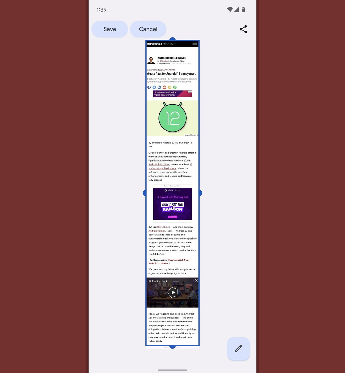
19. While we're on the subject of screenshots, Android 12 allows you to capture scrolling screenshots that show more than a single screen's worth of information. It's a great way to share an especially long email, web page, or other piece of content without having to capture multiple images.
The function is limited only to apps that support it, but it's already available in Chrome and Gmail as well as in most parts of the Android system interface. Just press your phone's power and volume-down button together to take the screenshot, then look for the "Capture more" button (or the icon showing a box with two arrows inside it, on a Samsung phone) within the screenshot confirmation to give it a go.
 JR Raphael/IDG
Android 12's new scrolling screenshot feature lets you capture an extended area of a website — at last!
20. Google snuck a couple of subtle but welcome improvements into Android's picture-in-picture system in the Android 12 release. First up is a faster and easier way to resize any picture-in-picture box on your screen with a convenient new gesture.
The next time you've got one of those floating windows of content — like when you start a navigation in Google Maps or play a video in YouTube (in certain conditions) and then go back to your home screen — try touching two fingers to the box and then stretching your fingers outward to enlarge it or pinching them together to shrink it down into a smaller state.
And speaking of minimization...
21. Android 12 allows you to push a picture-in-picture window almost entirely off the side of your screen, in case you want to keep a video or navigation playing but need it out of your active viewing area for a while. Just touch your finger to the box and slide it all the way to either side. That'll leave you with just a sliver of the box's edge visible, and you can then press and hold that edge to drag the box back into a more prominent area whenever you're ready.
22. After years of neglect, Google is giving Android widgets some long overdue love as of Android 12 (imagine that!). And if you're using a Pixel phone, you can find some hidden extra widget elements by adding certain system-level widgets onto your home screen and then making 'em larger than their default size.
If you've got a Pixel, try this:
- Press and hold your finger onto any open area of your home screen and select "Widgets" from the menu that comes up.
- Tap the line labeled "Google," then touch and hold your finger to the 4x2 weather widget in the list of options.
- Drop that widget onto any open area of your home screen.
- See the lines around the widget? (If you don't, press and hold your finger to it for a second to get them to appear.) Drag the line along the widget's bottom edge downward to expand it, and you'll see a forecast for the next couple of days show up beneath the current day's weather info.
Who knew?!
23. Last but not least, a pair of Pixel-specific surface-level Android 12 additions that are well worth uncovering:
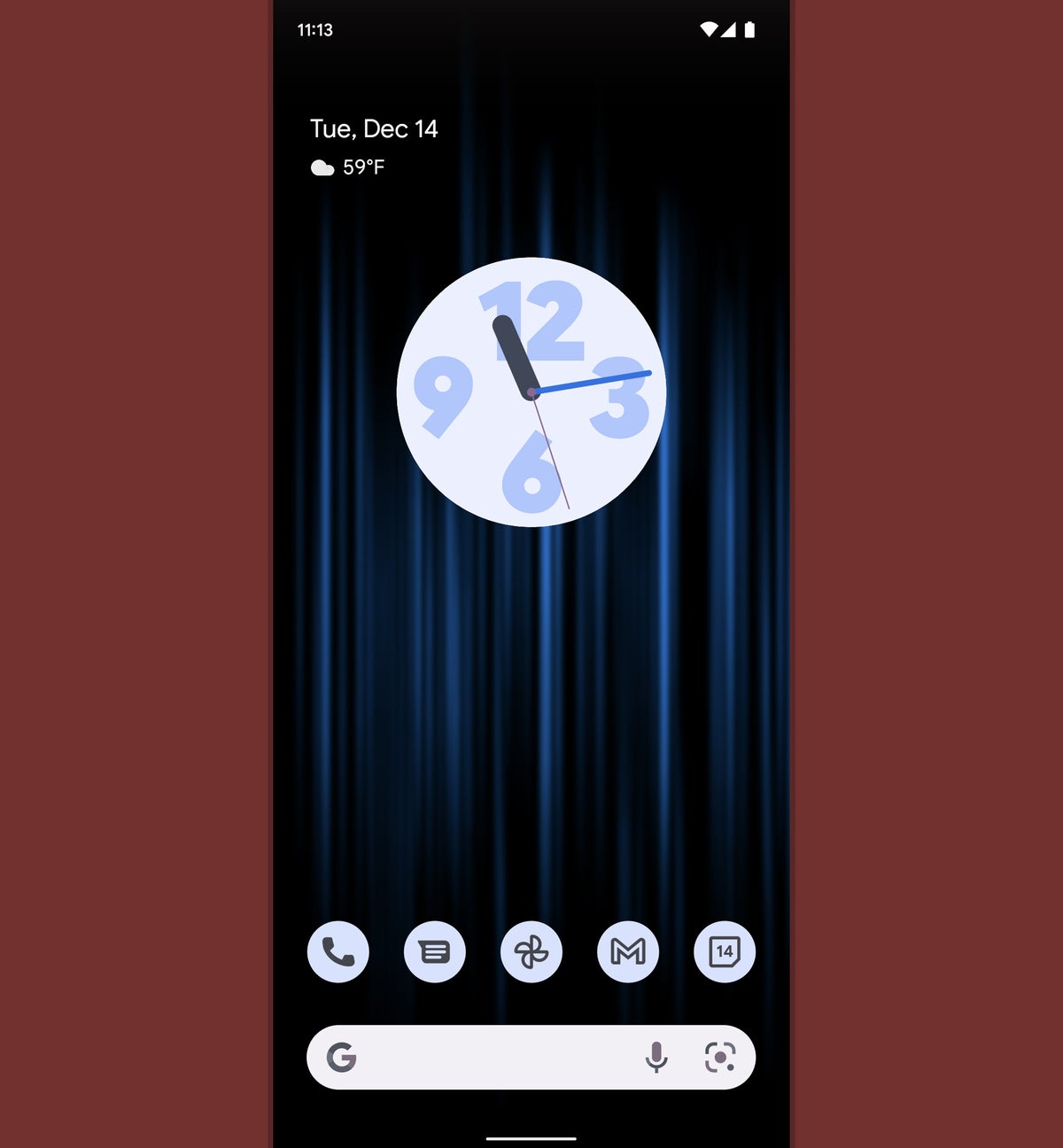
First, press and hold your finger onto an empty area of your phone's home screen and select "Wallpaper & style." Scroll down a bit and find the option called "Themed icons." If the switch next to that isn't already in the on position, flip it on — then watch the icons from supported apps on your home screen automatically color themselves to match your wallpaper and continue to do so whenever your wallpaper changes. (It's mostly Google-made apps that support the system at the moment. But with any luck, that'll expand over time.)
 JR Raphael/IDG
On a Pixel, Android 12 can give your entire device a sleek and cohesive themed appearance — all the way down to the icons on your home screen.
And finally...
24. Once more, only on a Pixel for now: Touch your finger to any open text field to pull up the Gboard keyboard. Touch the three-dot icon along the keyboard's top row, then tap "Settings" followed by "Theme."
Find and tap the "Dynamic Color" option, then back your way out of that menu. And just like magic, your phone's keyboard will now follow that same Android 12 auto-theming system and change its color to match the rest of your system interface based on your current wallpaper.
It may not have any real practical value, but hey: A pleasant working environment can go a surprisingly long way.
Hungry for even more Android 12 sweetness? Keep the Google-flavored tech feast going with my guide to fixing some of Android 12's most vexing annoyances.


