Riddle me this: What exactly is a "note-taking app"?
It seems almost painfully obvious, I know — but it's a question I've found myself struggling to answer as I've been exploring a new breed of information-storing services.
The services allow you to collect and organize thoughts, lists, and all sorts of other materials. They also, however, provide a powerful framework for mapping out complex projects, processing large amounts of data, and even writing documents. And they're all designed to support some pretty sophisticated forms of collaboration.
So are they note-taking apps? Are they word processors — or maybe spreadsheet editors? Or are they task management tools, project management tools, or perhaps even just broad "collaboration utilities"?
Ultimately, I suspect what we call 'em depends on how we're using 'em at any given moment — because what truly sets these apps apart from the more typical note-taking programs is the fact that they're shape-shifting genies. Their versatility allows them to play a staggering number of roles and turn into practically anything you need them to be.
Today, we're going to focus on how they can supplement whatever more traditional note-taking software you're using and help you create a highly customized and exceptionally flexible system for information organization. So without further ado, here's a detailed comparison of three standout tools that could seriously shake up the way you think about notes — and so much more.
1. Workflowy: The deceptively simple bullet-based organizer
Ideal for: Multilayered, text-centric note organization and collaboration
If you're looking for a simple yet power-packed place to store and organize information, Workflowy might be just the revelation you've been waiting for. The service is built around expandable bullet points, each of which also doubles as its own standalone document.
Sounds unusual, right? It is — but once you wrap your mind around the concept, it's actually an incredibly clever and logical framework for note collection. And the service does an extraordinary job of making sure you understand what it's all about from the second you sign in.
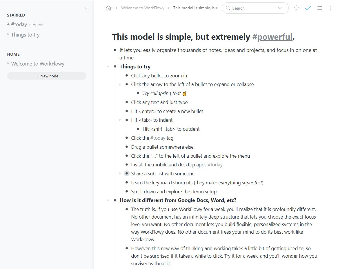
A sample list — a node, in Workflowy lingo — greets you upon your first sign-in and introduces you to the Workflowy way. Workflowy is "an infinite document," it explains. It's like a series of interlinked bullet points, only in addition to expanding and collapsing the layers of information within each point, you can open any point and then work within it, as if it were a document, simply by clicking the dot at its start.
 JR Raphael/IDG
Workflowy's "infinite document" arrangement opens up lots of interesting possibilities, as this sample node illustrates. (Click image to enlarge it.)
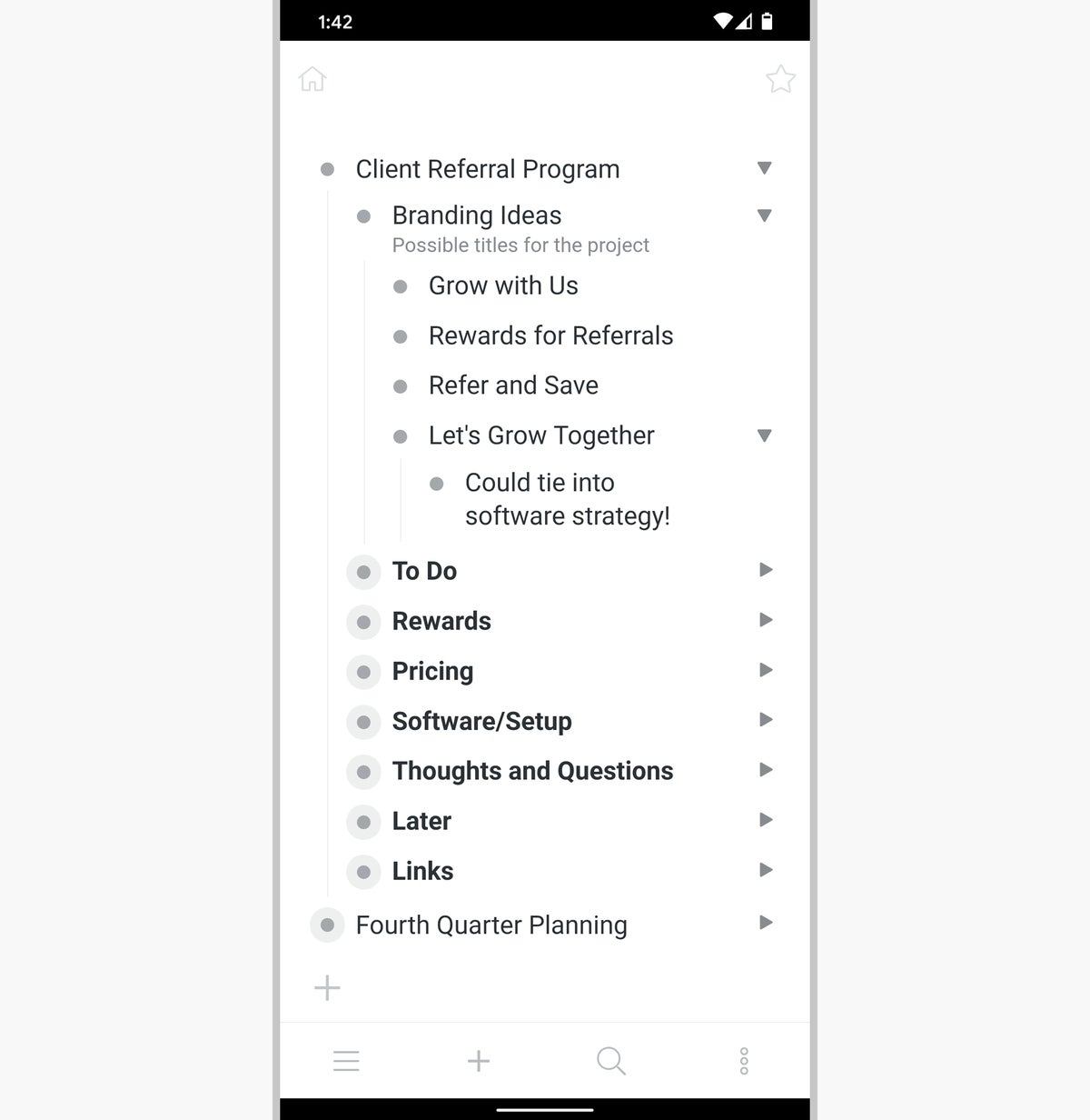
The ways you could use that "infinite document" setup are, rather appropriately, virtually infinite. You could create quick 'n' simple notes as their own nodes or maintain multilayered lists for tasks, goals, or even meeting outlines. Or you could think through complex company projects and use Workflowy's bulleted layers to structure every last detail of your various steps and phases.
 JR Raphael/IDG
The bullet point structure within Workflowy is perfectly suited for complex project organization — which is essentially just a thoughtfully presented collection of notes.
Basic structure aside, Workflowy has plenty of practical features — everything from a built-in tagging system for extra organization to a series of smart shortcuts for zipping around the apps quickly. It even has tools for mirroring items and allowing them to appear in multiple nodes at once and remain synced across all of those places.
And then there's the area of sharing and collaboration: With one click on a menu alongside any bullet point, Workflowy lets you export the entire point — with any associated sublayers — for easy copying, pasting, or attaching (as an HTML file). You can also create public web links for either a complete node or even just a specific bullet point within a node and then share those with anyone for collaborative viewing or editing.
Workflowy is available on the web as well as in native apps for Windows, Mac, Linux, Android, and iOS. The service is free with a limit of 250 new lists and items per month. A Pro plan — which removes that restriction and also adds in more customization options, a Dropbox backup possibility, and premium-level support — runs $49 a year or $48 per user per year in a team arrangement, with administration abilities included.
Workflowy's simple structure and text-centric nature are distinctive advantages that make the service both effective to use and easy to manage — but if you're looking for something more robust, well, keep reading.
2. Coda: The all-in-one document command center
Ideal for: Document-driven note-taking that brings lots of elements and data sources into a single spot
While Workflowy revolves around bullet points, with expandable documents available at every level, Coda goes in a different direction and brings the documents front and center.
You could actually just use Coda as a Google Docs-like word processor, in fact, but that's only scratching the surface of what the service has to offer. As part of any document within Coda, you can create everything from interactive spreadsheet-style tables to fully functional buttons for performing advanced actions within your workspace. It's almost as if a service like Airtable had been dropped into a larger document and had even more possibilities added in around it.
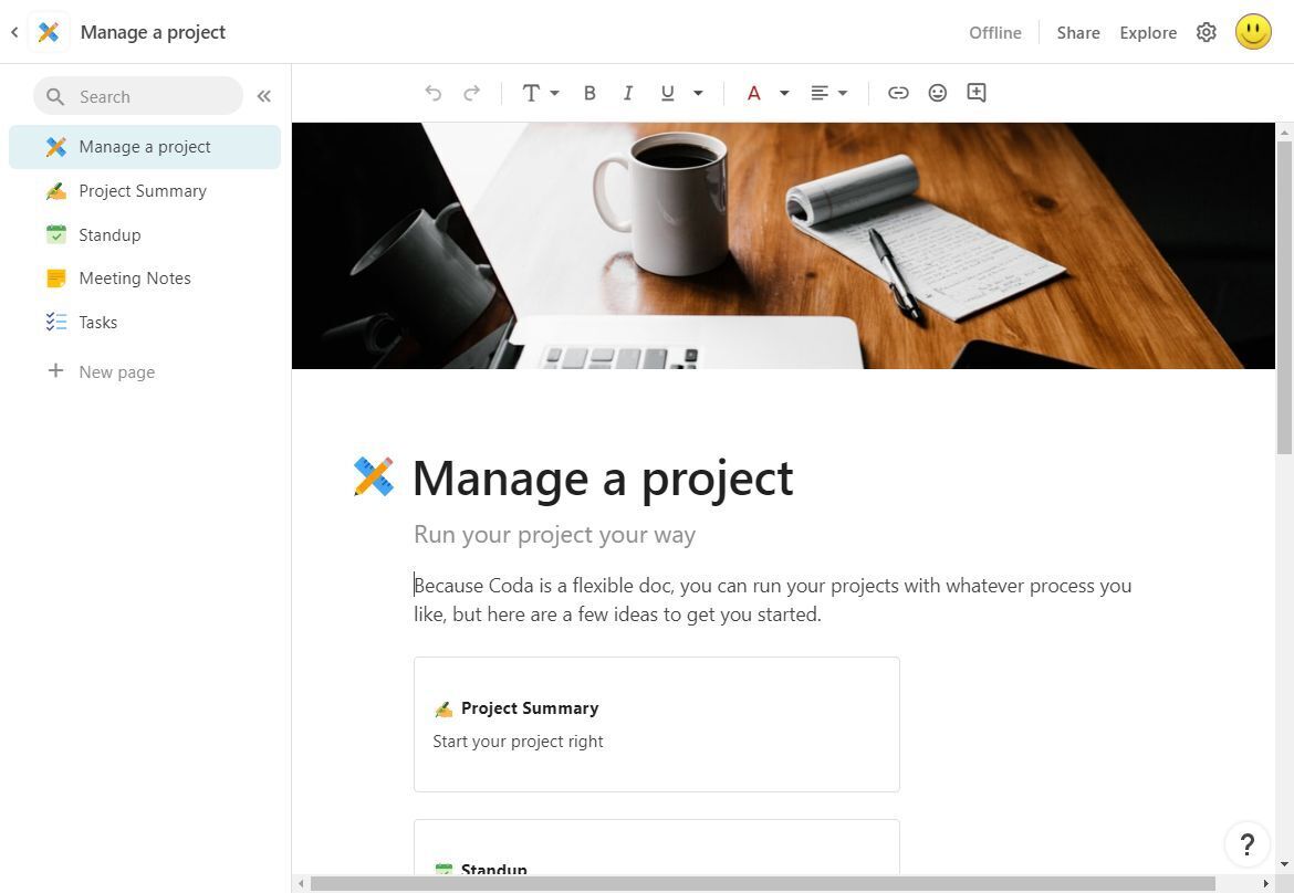
This, for example, is the opening page of a document template Coda gives you for managing a project:
 JR Raphael/IDG
Coda's project-managing template shows one way a series of notes could be organized and presented. (Click image to enlarge it.)
The items on the left represent different pages within the document, while the larger area of the screen is the currently active page. And the sky's the limit for what each page can contain — since instead of being documents in any traditional word processor sense, Coda's documents are all composed of blocks. And those blocks can hold anything from plain text to formatted lists or even calendars that sync to your Google account and allow you to both view and edit your current agenda data.
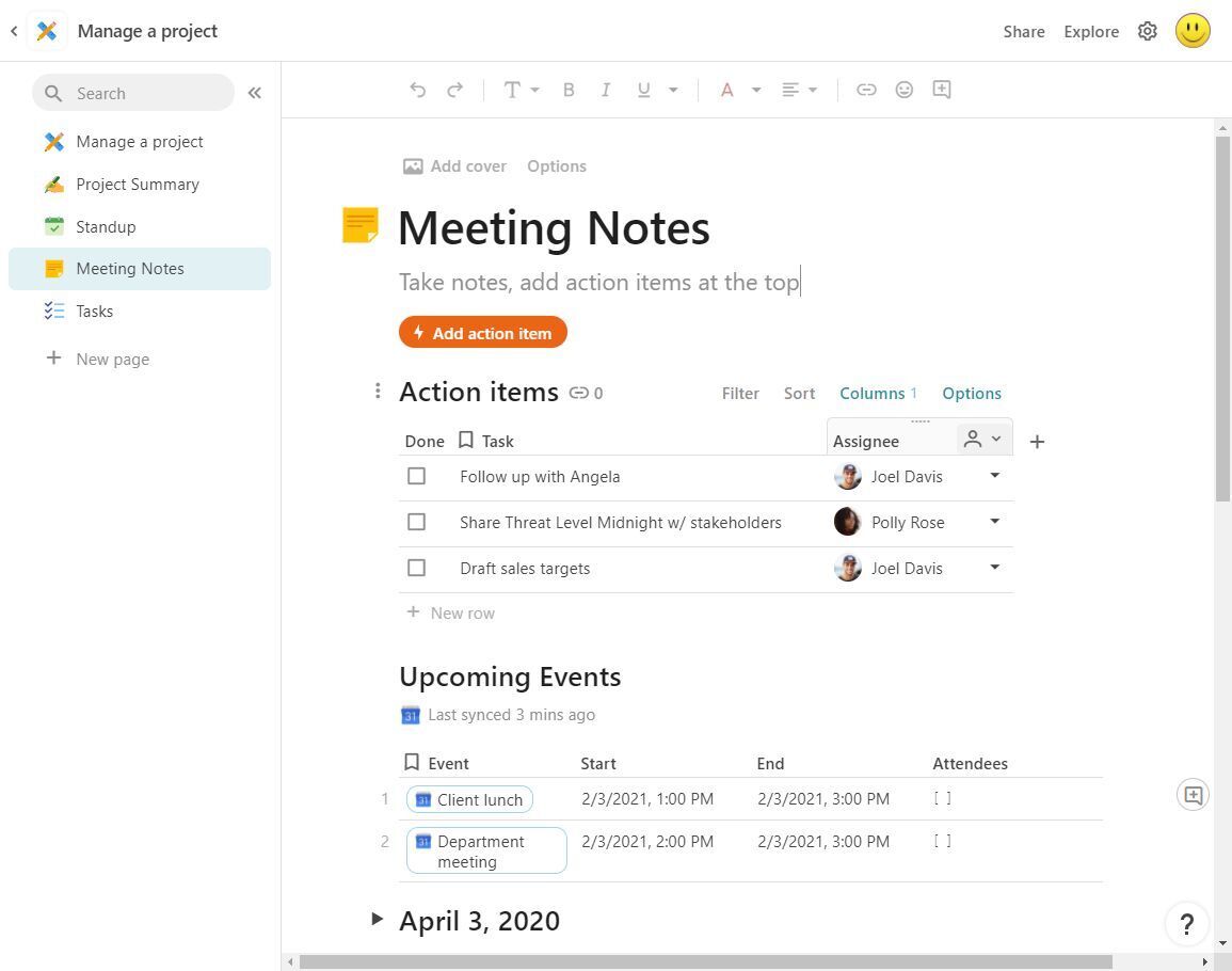
Here, for instance, you see an interactive table with tasks followed by a live Google Calendar module and, beginning below that, a series of expandable bullet lists (similar to the Workflowy style):
 JR Raphael/IDG
Coda can supercharge your notes with pages, lists, buttons, and even embedded Google Calendar views. (Click image to enlarge it.)
And nothing in Coda is static. You can hover over that "Action items" table to find commands for hiding columns, filtering and sorting the table's contents, and changing all sorts of variables about its display.
Where Coda really stands out, though, is on the mobile front, where the service seamlessly transforms all of your creations into app-like interfaces — with pages automatically turned into bottom-bar-tab sections and the entire document taking on a native mobile feel.
 JR Raphael/IDG
Coda makes any document look and work like an app on your phone, without any extra effort required.
Coda isn't quite as granular as Workflowy in its collaboration capabilities, but it does allow you to share entire documents with colleagues, clients, or anyone else in your orbit — either directly or via a private web link — and to choose whether those people can view, view and comment, or edit the information.
Coda is available on the web as well as on Android and iOS. The service is free with a variety of limitations — up to 50 objects and 1,000 rows per document, among other things — or $120 per year for a less restricted Pro plan. In team scenarios, the service costs $30 per "doc maker" (meaning the person who actually creates new documents) per month and is free for any employees who only view or edit existing documents.
Much like the service itself, the pricing of Coda is a little complicated and something that takes a while to wrap your head around. But also much like the service, it's carefully thought out and packed with potential. The only real question is if it makes sense for you.
3. Notion: The all-purpose knowledge machine
Ideal for: Visual note organization with a mix of documents and boards
If Coda is kind of like having a taste of Workflowy within a broader document form, Notion is almost like a Bizzaro World version of Coda with less external data-source support but more focus on Trello-style board-based organization.
Just like Coda, Notion revolves around the, erm, notion of rich content blocks within documents. So you could create a document with a mix of text elements, interactive lists, and even separated subpages:
 JR Raphael/IDG
Notion's documents let you mix all sorts of different elements and kinds of content together in a single place. (Click image to enlarge it.)
Or you could follow the lead of the service's "Roadmap" template and go with a card-driven board view to keep your notes, tasks, and ideas organized into categories or even levels of completion.
 JR Raphael/IDG
Notion combines document views and board views to give you loads of flexibility with how you view and manage information. (Click image to enlarge it.)
While Coda has its own set of powerful though complicated board view options, Notion goes a step further with a polished, readily accessible, and easy to use Trello-reminiscent system of interacting with info in that card-based environment. Clicking on any card within a Notion board opens up a form-like view where you can see and edit all sorts of detailed information based on your own custom choice of fields and parameters. You can drag and drop cards between columns and work with them entirely within that arrangement right out of the box — either on your own or with invited collaborators.
Notion does allow you to embed certain types of external content, too — including functional Google Maps, scrolling web pages, and playable videos — but the list of possibilities and the interactivity of those elements is notably less substantial than what Coda provides. And while the service can take some time to fully understand and master, it comes with a massive array of templates that makes it easy to get started — everything from the product roadmaps we just went over to simple structures for single-page notepads, hubs for multi-paged note collections, and spreadsheet-organized systems for things like team directories and research databases.
 JR Raphael/IDG
Notion makes it easy to organize info into interactive spreadsheets for some seriously advanced information management. (Click image to enlarge it.)
Notion is available on the web as well as in native apps for Windows and Mac, Android, and iOS. It also has a special web clipper extension for Chrome or Firefox that makes it possible to save any page into the service with a single click from your desktop browser — and even add notes, tag team members, or create tasks around the page right there.
Notion is free for individual, personal use, with the only real limits being a maximum of 5MB per uploaded file and a maximum of five "guests" for sharing and collaboration. A $48 per year Pro plan removes those restrictions, while team plans offer the same setup along with a company workspace and administrative tools for $8 per user per month.
And with that, the power is officially in your hands. Figure out which of these services best suits your information-juggling needs — and get ready to take on note-taking like never before.


