


It’s one thing to see a blur of numbers on reports generated by analytics platforms. It’s another thing entirely to view detailed and colorful graphics — also generated by analytics software — that instantly illustrate trends that can be easily grasped by even the most non-technical users.
Data visualization tools are what make the latter possible. They place data into a visual context, creating graphs, charts, maps, and other elements that can make the analytics much more meaningful for business users.
With data visualization, business analysts can more easily detect market trends, patterns, and outliers within a given data set. Given the way the human brain processes information, experts say, using graphical elements such as charts to visualize complex data is much easier than trying to decipher trends using spreadsheets or other numbers-based reports.
As with any other technology tools, there are best practices for getting the most value out of data visualization. Here are some tips from experts.
Keep things simple, especially for high-level users
Even though the analytics process behind data visualization can be highly complex, the visualization itself does not need to be.
“Err on the side of simplicity and elegance when building data visualizations,” advises Daren Brabham, senior director analyst at research firm Gartner. “There are limitations regarding what the human brain can process efficiently when it comes to visual information, so keep visuals clean and easy to digest quickly.”
This is particularly important when building dashboards and reports that are intended for executive audiences, Brabham says.
“Many of our clients are refining dashboards for executives and managers by exploring interactive elements, [building] multiple complex measures into easily digestible indexes and summary scores, and looking to red-yellow-green-type meters to more quickly communicate lots of data in simpler ways,” Brabham says.
At healthcare provider University of California San Diego Health, simplicity is a goal with visualization. “Sometimes we try to create one-size-fits-all visualizations that are extremely complicated to use, especially for a user who is not technically savvy,” says Josh Glandorf, senior director of information services.
“Keep them simple with limited graphs, KPIs [key performance indicators] clearly positioned, and provide the necessary supportive instructional information so users can understand the construct of the data visual, associated nuances, etc.,” Glandorf says. “We have found if visualizations are too complex to navigate, users become overwhelmed and adoption suffers.”
The healthcare organization, which uses a visualization tool from Tableau as part of its business intelligence platform, recently developed a set of standard design templates to facilitate a common look and feel to all of its dashboards. “This will ensure that regardless of the subject matter, the dashboard structure will be standardized to an extent, promoting consistent navigation.”
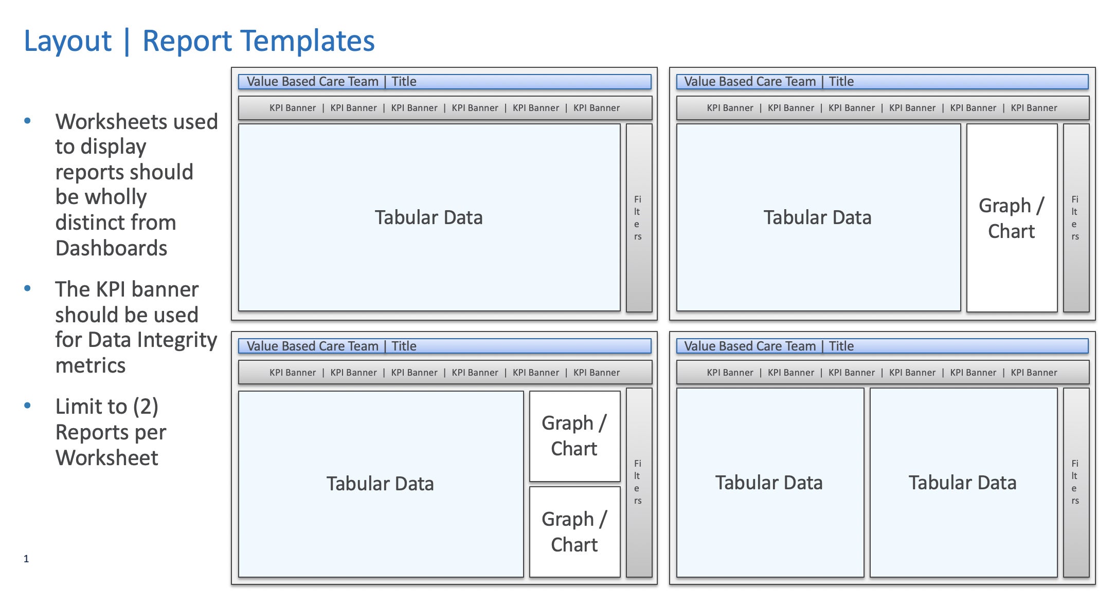 University of California San Diego Health
UCSD Health uses a set of standard design templates for its data visualizations. (Click image to enlarge it.)
Consider the audience
Along the same lines, managers need to understand who will be using the visualizations and design dashboards to meet their needs.
H. & J. Brüggen, a manufacturer of private-label food products for retailers and supermarkets, began using a visualization tool from Qlik in 2016 to gain greater transparency into its supply chain. The Lübeck, Germany-based firm uses the visualizations to support processes such as forecasting for demand planning and supplier logistics.
“When we think about analytics best practices, we apply what we call the DAR-method — Dashboard, Analysis, Reporting — working in Qlik to deliver value across all three aspects,” says Martin Gries, director of supply chain management. “Beyond choosing what data will go into the dashboard, you have to keep in mind the audience and how the visualizations will get that data across quickly and usefully.”
It all starts with dashboard design, Gries says, which should enable easy and helpful analysis for users. “If we execute the design well, that leads to strong analysis,” he says. “Reports are easier to create and can deliver either a bird’s-eye perspective or drill into specific details as needed, depending on the user.”
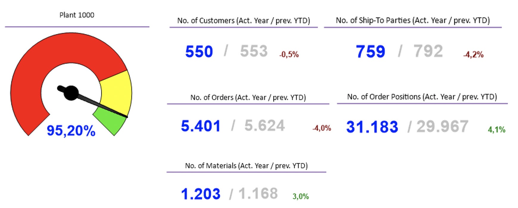 H. & J. Brüggen
H. & J. Brüggen uses easy-to-parse design elements like gauges on its dashboards. (Click image to enlarge it.)
When the company designs visualizations for management, “we leverage elements like gauges, or single measurement KPIs on a common dashboard to help them quickly answer the question of whether we’re on target or not,” Gries says. “These can be used to compare performance over time and can be readily shared with decision makers across the business.”
IT also keeps in mind that many users have limited data literacy knowledge. “For this reason we wouldn’t use Boxplot charts, for example, because they are too complex and not everybody will understand the information,” Gries says.
However, H. & J. Brüggen does apply visualizations such as treemaps to show elements such as service levels and order value for its product groups. That makes it much easier for users to understand things such as high order values to customers.
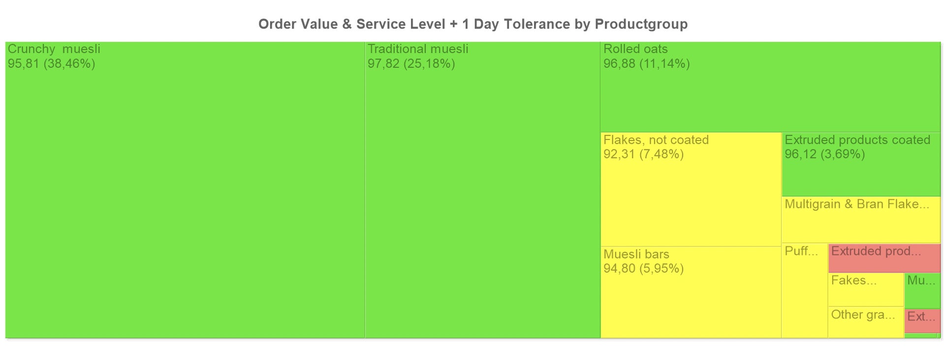 H. & J. Brüggen
H. & J. Brüggen uses treemaps to show order values and service levels for its product groups. (Click image to enlarge it.)
Provide training for the proper use of analytics tools
Many of the major analytics and business intelligence (A&BI) platforms today have sophisticated augmented analytics capabilities, Brabham says. This means users don’t need to be particularly data- or technology-savvy to get visualizations from A&BI platforms.
“This effectively democratizes access to good visualizations, but it also underscores the importance of data quality and data literacy in your organization,” Brabham says. “You have to feed these sophisticated augmented analytics tools good-quality data, and you have to make sure your business users know enough about the data to be able to critically consume what the A&BI tools generate.”
Gartner has a number of clients that are conducting data literacy training and design thinking workshops alongside basic A&BI tool-focused training.
“This ensures users not only know how to navigate through their A&BI tools, but also to think more creatively and critically about the data going into and coming out of these analyses,” Brabham says. “It’s ultimately about impact and business relevance with data visualizations, no matter how user-friendly the A&BI tools become.”
Make sure the right tools are being used
There might be a temptation to deploy all kinds of data visualization technologies. But companies need to consider what data visualization is needed for and select accordingly.
“It’s easy to get lost in the shiny new features and functionality that are being offered by the leading data analytics, business intelligence, and data visualization providers,” says Mike Leone, senior analyst at research firm ESG. “But the top technology used to visualize data today is still Microsoft Excel.”
If the extent of what a company needs is to complete basic visualization tasks on a few, smaller data sets, Excel is more often than not good enough, Leone says. “It’s easy to use, accessible, and familiar to many.”
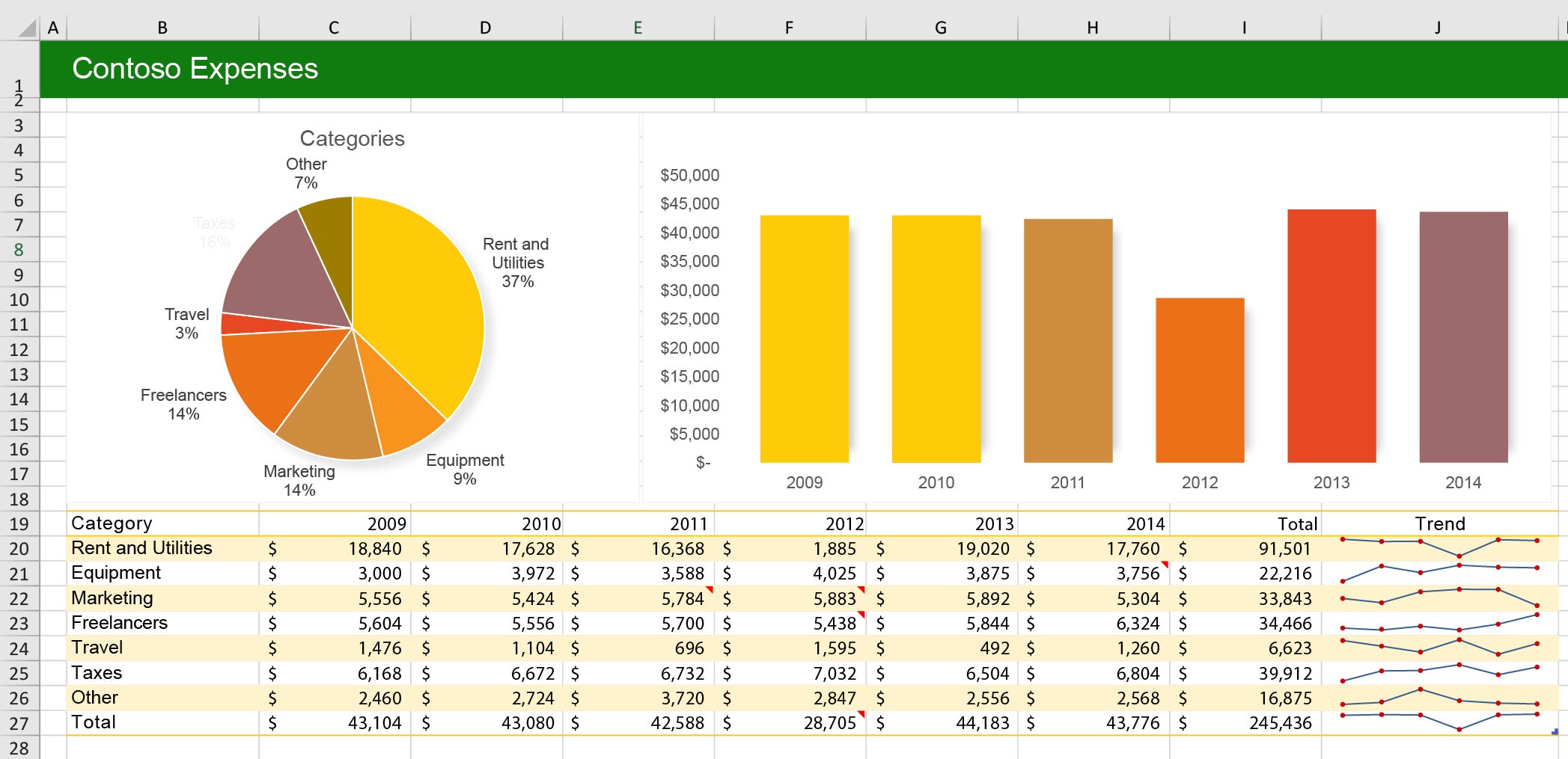 Microsoft
Excel is a good-enough data-visualization tool for many businesses. (Click image to enlarge it.)
For those organizations looking for a more powerful tool to integrate across larger teams or lines of business, connect multiple data sets of different size and structure, enable users to explore and experiment with different data visualizations, and leverage capabilities such as machine learning, then Excel is not the answer, Leone says.
“Finding a one-size-fits-all visualization platform that will meet everyone’s requirements and cater to everyone’s level of expertise is an impossible task,” Leone says. When looking at visualization tools, organizations need to consider the requirements and skill levels of various user groups within the enterprise.
Leverage visualizations to tell stories
As a company’s data visualization skills increase, it should strive to weave together visualizations into a coherent data storytelling pursuit, Brabham says.
“This can mean developing single complex, interactive visualizations that allow for drill-downs and exploration to tell a coherent story about a certain topic,” Brabham says. “Or it can mean building a dashboard or a series of visualizations in a report that, together and in order, tell a coherent story about how and why things are happening in the business.”
The most advanced users of A&BI tools have learned to craft cause-and-effect strings of visualizations that explain why, for instance, sales are down in a certain region and where opportunity may lie for rebounding, Brabham says. Let data tell a story of how your company can meet its key performance indicators, he says.
Make collaboration a priority
Collaboration among stakeholders is pivotal for success with data visualization, Leone maintains. “Once you’ve created a complex visualization that enables great insight, you’re not done,” he says. “There are opportunities to build off of that insight and go deeper or wider, but documentation and using the right platform that fosters collaboration is critical.”
If a team has leveraged certain data sets or chosen certain visualizations over others, it needs to document everything and explain it in detail to others, Leone says. “Data analytics and visualization is a team sport,” he adds. “It’s incredibly valuable to enable peers to quickly ramp up their data visualization tasks and potentially pick up where you left off.”
Leone recalls having a conversation with two people who worked for a large insurance provider. Their responsibilities were both centered around analytics, but for different business units.
The first person was discussing the tools and process that she went through to connect multiple data sources, which were then used to gain very detailed insight into a certain demographic, Leone says. The second person sitting next to her said he’d just spent four hours doing the same thing, unaware that his colleague had already done it.
“Organizations are looking to give more people access to more data to explore and visualize,” Leone says. “And collaboration will be critical in ensuring higher levels of productivity” and a timely return on investment.