Android 5.0 deep-dive review: Exploring Lollipop's many layers
A detailed tour of Google's transformative new OS and what it's like to use.


![]() By JR Raphael
By JR Raphael
Contributing Editor, Computerworld |
Android 5.0 Lollipop
- Got Lollipop? 10 cool things to try...
- Android upgrade report card: Grading...
- Broken Lollipop: 5 things that need to...
- A 60-second fix for Lollipop's heads-up...
- Android 5.0 deep-dive review: Exploring...
Its name may be filled with child-like whimsy, but don't be fooled: Google's Android 5.0 Lollipop release is all about the platform's move into maturity.
Android launched in 2008 as a plain but powerful operating system with plenty of promise. Numerous releases since then have built upon that foundation and pushed the OS forward both visually and functionally -- but they've all felt like pieces from a still-incomplete puzzle.
Lollipop is the culmination of those steps -- the polished and cohesive product the past six years of updates have been building up to. It's the most sweeping and dramatic reimagining of Android we've ever seen, and it's about to usher the platform into an exciting new era.
But before I begin this thorough look into the new OS, I want to make clear that this review is looking at Google's actual Android 5.0 software, which appears on Nexus devices, Moto devices and a handful of other products. As a result of the operating system's open nature, manufacturers can modify the software to give it their own custom "skins" and features -- so depending on what type of device you have and which vendor you bought it from, the software you see may differ in some ways from what's described here.
A whole new Android
As I noted in my first impressions of Google's new Nexus 6 phone, Lollipop feels fresh, modern and comfortable -- like a familiar home that's been thoroughly but tastefully renovated.
Much of that is due to the new design motif implemented all throughout the OS. Known as Material Design, the approach revolves around bold and bright colors, large fonts and flat, paper-like graphics. Animations and transitions are also key -- things move in a way that helps to create a sense of continuity as you navigate the system.
The new app drawer is a perfect example. When you touch the icon to view all of your apps, its white color appears to splash up on the screen and form a square that holds the grid of items. If you then tap the Home button, an animation shrinks the box back down into the small circular icon from which it sprang.

The animation from the Lollipop app drawer.
Other touches are subtler. When you tap an item within Lollipop's system settings, for instance, the entire row turns dark -- starting on the exact spot where you pressed your finger and spreading out horizontally in either direction. It usually happens quickly, but if you touch and hold your finger without immediately lifting, you can see it play out in detail.
A subtle touch from Lollipop's system settings.
These sorts of elements may seem insignificant by themselves, but they add up to form a meaningful layer of polish that makes a big difference in what the software's like to use. And unlike past visual makeovers with Android, Lollipop's changes are sweeping and complete; it's the first update that really feels like a whole new OS.
Everything has been recreated to match the Lollipop look, right down to the Contacts (formerly known as "People") and Downloads apps -- although curiously, in the case of the latter, I'm seeing a version of the app on my Nexus 6 review unit that doesn't quite match the one on my Nexus 9. Given that the Nexus 9 received a software update prior to its consumer launch, I'm guessing that the Nexus 6 will soon be brought up to parity.
The visual overhaul isn't just within Android itself, either; it's across Google as a whole. Though the desktop evolution is still underway, Material Design has slowly but surely been creeping into Google's various apps and services for a while. The same style from Lollipop can already be seen in places like the Web-based apps for Google Docs and Sheets. Standalone Android apps like Gmail are being updated bit by bit to reflect the new vibe as well.
The first taste of Lollipop
From the get-go, Lollipop feels warm and inviting. The software's new setup procedure makes the typically tedious process of moving into a new device delightfully simple. Signing into a Google account with two-factor authentication is finally integrated directly into the OS, as are the introduction and opt-in to Google Now -- which makes both features feel like parts of the operating system instead of tacked-on additions, as they did in the past.
And while Android has always given you the option to restore your apps and basic system settings, Lollipop gives you more control over the process and makes it easier to understand. When you start up a new Lollipop device, the system shows you a list of other Android devices that you've recently used. You can select any one of those devices and choose from which you want to pull apps and settings -- and you can then select either to restore all apps that were installed on that device or to cherry-pick only certain titles.

Lollipop's new system restore process makes it easy to move into a new device.
If you want, you can also opt to physically tap another NFC-enabled Android device against the new one and have all the accounts, apps and app data from it copied over that way. It's not entirely clear how useful the "app data" element of that will be in practice -- when I tested it, I still had to sign into each individual app and none of my in-app preferences seemed to carry over -- but it's apparently something that requires developer-enabled support to function, so perhaps it'll become more relevant over time.
The Lollipop lock screen
Android's lock screen serves as your gate into your phone or tablet -- and with Lollipop, it gains a whole new level of power.
When you turn your device on, Lollipop shows you the current time and date in the center of the screen. Basic enough, right? What's different, though, is that you'll also see any pending notifications immediately below that -- in rectangular cards, just like they'd appear in the Android notification panel (more on that in a moment).
This means you can view things like new emails and text messages right then and there -- and you can interact with them, too: Just tap twice on any card to jump directly into its corresponding app or swipe horizontally on it to dismiss it from view. (If you're worried about privacy, there's a setting that lets you hide "sensitive" info -- in other words, the actual contents of messages, reminders and so forth -- or lets you disable lock-screen notifications altogether anytime the device is locked.)

You can view things like new text messages and emails right on the lock screen.
Suffice it to say, having immediate and interactive access to that type of info is quite handy -- and it makes an awful lot of sense. It does, however, come at a cost: First, the customizable lock screen widgets introduced with Android 4.2 are now gone -- though I suspect only a small subset of users actually understood and used those. The notifications seem like a more broadly beneficial use of the space.
Second, and potentially more significant, if you use a security pattern, password or PIN on your device, you now have to swipe away the initial lock screen before inputting your code. It's an unavoidable extra step -- present even if you disable lock screen notifications -- and it's bound to annoy some users.
There are also a few areas where the Lollipop lock screen is just a teensy bit confusing. One is the way the system behaves based on what direction you swipe: If you swipe upward on the lock screen, all of the content is pushed off the top edge of the display and the device unlocks. That seems sensible.
If you swipe downward on the screen, though, you're taken to a full-screen view of all your pending notifications -- essentially the same thing you were already looking at, only without the clock. That strikes me as an unexpected and somewhat odd behavior; there are no visual cues indicating that'll happen, and it took me a few minutes of trial and error to figure it out. (My initial assumption was that a swipe in any direction would simply unlock the device.)

If you swipe downward on the screen, you're taken to a full-screen view of all your pending notifications.
The Lollipop lock screen also has a camera icon in its lower-right corner and -- provided you're using a phone -- a phone icon in its lower left. Based on that visual, my instinct was to try to swipe upwards diagonally from those icons to open their respective apps, but doing so just unlocks the device normally. It turns out you have to swipe horizontally to activate the shortcuts -- something that again took experimentation to understand and wasn't immediately clear.
Last but not least, the Lollipop lock screen shows full-screen still images from multimedia content being played from the device -- so you might see a graphic from a TV show or cover art from an album, depending on what you're streaming. In my experience, however, the images don't seem to clear properly when the content is no longer being played. I frequently saw images from a show I had stopped streaming long ago -- both when something different was being streamed and when the streaming app was no longer even active.

On the left, the background art matches what's actually being played. On the right, the background art is from something that had been played previously instead of what's actively being played.
Smart Lock, Ambient Display and other security enhancements
Basics aside, Lollipop introduces some useful new ways to manage and get around the lock screen. Perhaps most notably, the software has a new Smart Lock feature that allows you to set trusted Bluetooth devices for your phone or tablet. The devices then work like magic keys, so to speak: Anytime they're present and paired, you won't have to enter your security pattern or PIN to get into your phone or tablet. If they aren't around, the phone or tablet will automatically lock itself and require a pattern or PIN for access.
You can set a trusted NFC tag as well -- if, say, you want to be able to tap your employee badge or a programmable NFC keychain to the device to unlock it. Smart Lock also incorporates a new version of Android's Face Unlock feature, which works far faster and more reliably than it did in previous OS versions. For the first time, it's actually something you might want to use on a long-term basis.
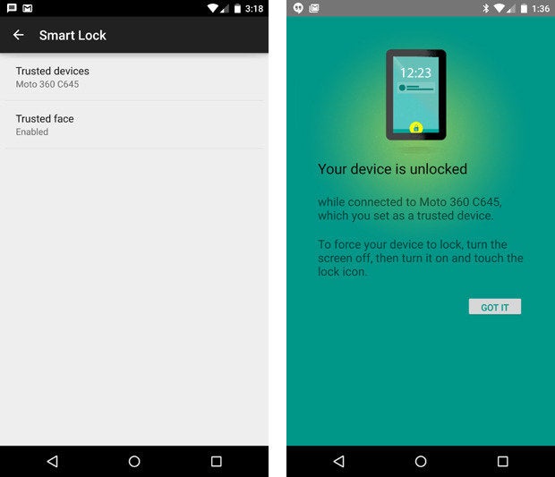
The Smart Lock feature in action.
Beyond that, Lollipop provides a system-level tap-to-wake option, which allows you to double-tap a device's display to activate it without having to press the power button. It's present on the Nexus 9 but not the Nexus 6; it'll be up to each manufacturer to determine if they want to implement it for any given device.
And then there's Lollipop's new Ambient Display feature, which is Google's take on the Moto Display system seen in Motorola's 2014 Moto X. If a manufacturer opts to offer the feature, it'll cause your screen to light up with a black-and-white view of the time and any pending notifications -- in other words, the lock screen -- whenever you pick up the device. If you touch the screen, it then moves into its regular full-color state and you can interact with it normally.
The feature works reasonably well, though it does have its quirks: Unlike Moto Display, the Lollipop version of the system doesn't "pulse" and continue to flash notifications on the screen every few seconds to ensure you'll see them. That makes it harder to know at a glance when something needs your attention, especially if you're using a device that doesn't have an LED notifier (something Ambient Display is intended to replace).
The Moto X's feature employs a variety of sensors to light up anytime you touch the device or even move your hand over its screen; meanwhile, Ambient Display is designed to function with more standard and basic phone hardware. As a result, it's less sensitive and works far less consistently than Motorola's implementation (on the Nexus 6, at least -- where I've been able to test it).
The data shown on Ambient Display is also much more info-dense than what's shown on Moto Display, which has its pros and cons. On the one hand, you see more information at a glance, without having to touch the screen -- but on the other hand, that information is also less easy to digest at a glance.
Lollipop includes several less exciting but equally important improvements to security, which you can read about here.
The new face of notifications
We've talked about notifications as they appear on the lock screen, but Lollipop brings about significant changes to the way notifications work throughout the operating system.
First of all, some notifications now show up in a new "heads-up" format and appear as floating cards at the top of your screen when they arrive. I've seen it happen with calendar events, incoming calls and text messages, but it's possible more apps could tap into the possibility over time. The idea is that you can view a notification quickly without interrupting what you're doing; then you can either tap it to open it, swipe it away to dismiss it or simply ignore it and do nothing at all -- in which case it'll disappear after a few seconds and move into your regular notification panel like any other alert.

Some notifications now show up in a new "heads-up" format.
Android 5.0 Lollipop


