Every time a new Android version arrives, a new game begins: Which of the lovingly described fresh platform features will fail to live up to its hype and then end up fading out of the foreground — either to be phased out completely or just brushed aside and consigned to oblivion?
It seems like a funny thing to say, but when you look back at Android's history, you realize how many once-transformative-sounding features ended up fizzling and being forgotten soon after their grand debuts. Some remain buried in the software while others quietly vanished after a period of inertia, but they all share the fact that they're nowhere near the center-stage-worthy elements they once appeared to be.
(I've been worried for a while that Android widgets might end up on this list, incidentally, but Apple's high-profile adoption of the concept this year makes me hopeful that Google might start caring about it again for the first time since roughly 2011. Funny how that can happen, isn't it?!)
So grab some popcorn and get ready for a nostalgia-filled journey — one bound to be peppered with more than a few "Oh, right, what ever happened to that?!" reactions.
1. Slices
Our first faded Android feature found its way into our lives — in theory, at least — back with 2018's Android 9.0 Pie release. It was called, rather fittingly, Slices, and it sounded downright delicious at the time.
Slices "could eventually reshape the way we find information and actions within apps," as one extraordinarily handsome and exceptionally modest writer put it. In short, the system was supposed to integrate pieces of apps directly into Android's search interface — so you could search for something like "Lyft" in your home screen search box or via the Google Assistant and see the current wait time for a ride, along with icons to actually order a ride, right then and there. Or you could search for a video on YouTube or another streaming service and then play it right in the results, without ever leaving that screen.
Instead of opening individual apps and then digging around to find info and perform actions, in other words, you'd just use one simple, consistent system interface to do it all. It was a whole new model of interaction, with endless possibilities and enormous implications. And the underlying Slices system would "iterate quickly," Google promised, with that initial framework serving only as a starting point for what was to come.
Now, let me ask you this: When was the last time you saw anything resembling Slices in action on your phone? The answer, I'm assuming, is somewhere between "Uh, what exactly is it, again?" and "Wait, does this guy actually expect me to respond out loud?" (Either response is perfectly acceptable.)
The issue with Slices, it seems, is that the system never quite progressed from its early seed-of-an-idea state. It technically still exists, but according to an interview published with two Android executives earlier this year, Google hasn't "found the fit for it just yet":
We don't think we['ve] found the right balance between effort for the developer and user features to make it make sense yet. It's something we're still really interested in. ... I think it's just the details of how to apply it and use cases are not quite there yet.
So maybe one day, Slices will makes its way off this list and into our virtual hearts. For now, though, it's tough to come up with a more appropriately dusty concept to kick off this collection.
2. Miracast
Mira-huh? Its name may be a distant memory for most of us nowadays, but a marquee feature of Google's 2012 Android 4.2 Jelly Bean release was support for a then-new wireless streaming protocol called Miracast. Heck, it was even described in some places as being the main "highlight" of that year's software.
Suffice it to say, Miracast never quite caught on as a standard, and Google eventually pivoted to its own proprietary Cast system as Android's streaming setup of choice. With 2015's Android 6.0 Marshmallow release, Miracast officially disappeared from the software entirely, to the immense disappointment of approximately seven people.
3. Lock screen widgets
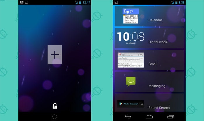
Being able to put widgets on your lock screen was a "killer feature" of 2012's Android 4.2.
 JR
JRTwo years later, the capability itself was killed.
4. The tablet-specific user interface
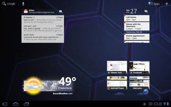
Way back in 2011, Google made a big show of its new take on the tablet interface with the Android 3.0 Honeycomb release. Core system functions like the navigation buttons, notifications, and app drawer all existed in corners of the screen to make two-handed access easier than ever. It was a whole new world for large-screen ergonomics!
 JR
JRWell, for about a year, anyway: In 2012, Android 4.2 brought the more traditional phone-like UI back to tablets. These days, the once-touted tablet-specific UI lives on only in a handful of long-abandoned relics such as the Motorola Xoom (pour one out...) and other old Android devices.
5. Live Folders
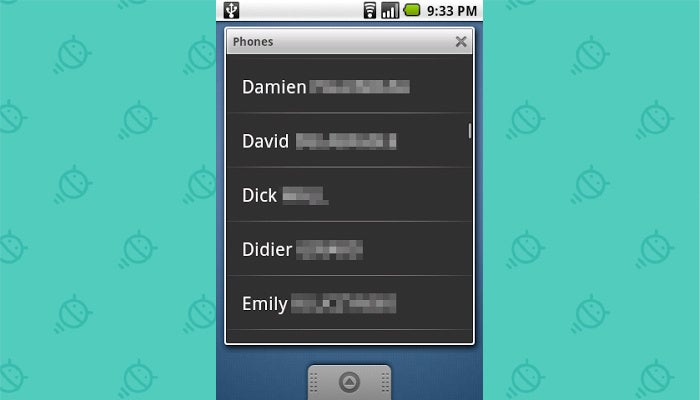
Here's one for the true Android veterans among us: In the ancient era of 2009, Google's Android 1.5 Cupcake release brought an amazing-seeming feature into the equation — a spiffy little somethin' called Live Folders.
As Google explained it in its Android Developers Blog, Live Folders "let [apps] display any source of data on the home screen without forcing the user to launch an application." That meant you could have a folder with a dynamic view of contacts, bookmarks, playlists, email, news stories, and so on — and any changes to the related data would appear in the folder in real-time. (Y'know, as if it were "live." Get it?)
 Google
 If this concept sounds an awful lot like a widget, that's because it is. Support for third-party widgets was also added in Cupcake, and that setup clearly ended up being the more versatile and popular choice. Live Folders died with nary a peep alongside the arrival of 2011's Honeycomb release.
6. A built-in People hub
Google tooted its horn loudly about the relaunch and rebranding of Android's Contacts app with 2011's Android 4.0 Ice Cream Sandwich release. Our phones were about so much more than contacts, the thinking went, and so it made more sense to call the app People — and to have it act as a hub for all of our social communications.
The People app aimed to bring all of your contacts' social networking connections into single, centralized profiles. You could see a person's tweets or, yes, even Google+ postings right then and there — a "live window into your social world," as Google put it at the time.
Unfortunately, renaming Contacts to People mostly seemed to confuse people who couldn't figure out where their contacts had gone. By Lollipop, the app unceremoniously went back to its original name, and it didn't take long for the whole "single hub" thing to fade away, too — even if, here in 2020, such a notion seems more relevant and desperately needed than ever.
7. A native video-editing system
Video editing has never exactly been one of Android's greatest strengths, so the advent of a native system app for movie manipulation was a huge selling point for Honeycomb in 2011.
But oddly, Google seemed to give up on its aptly named Movie Studio app pretty much immediately after its birth. The app never got much in the way of updates or improvements, and after shipping sporadically with Android devices through 2012's Nexus 4, it just kinda silently evaporated — never to be replaced or so much as discussed again.
8. IR blaster support
'Twas a time when being able to use your phone as a remote was a serious selling point and point of differentiation for some Android device-makers. The feature was prominent enough that Google added official support for it in the platform with 2013's Android 4.4 KitKat release.
You can still find some phones that offer the ability to blast IR-style today, but it's an increasingly niche-style option and a far cry from the mainstream, box-worthy bulletpoint it once was.
9. Android Beam
Back at its 2011 debut, Google's Android Beam system was a genuine source of excitement — a "futuristic twist" that used the then-crazy-seeming new Near Field Communication technology to let you tap two phones together and transmit info between 'em like a wizard.
Let's all say it together: Whoaaaaaaa...
And, pardon my Keanu, but whoaaaaaaa again:
The problem: Despite the admirable marketing effort, Beam never quite worked particularly well, and numerous other systems for sharing proved to be simpler and more reliable. Beam officially got the boot with the arrival of Android 10 in 2019, and I'm pretty sure next to no one even noticed.
10. Daydream screensavers
Another Android 4.2 creation, Daydream introduced the ability to set a custom screensaver that'd show up whenever your phone was docked or charging. Boy, oh boy, was it the business when it first arrived!
Then, like the other features on this list, the spotlight went away — and Daydream got buried and forgotten. So much, in fact, that when Google announced Daydream as the name of its (now dead and gone) VR platform in 2016, hardly anyone seemed to make the connection.
Following the overlapping launch of that other Daydream, the original Daydream was quietly debranded and renamed simply to "Screen saver." It still exists beneath a few layers in the Android system settings, where tens of people find it and put it to good use every year.
11. Google Now/Now On Tap
Some things come and go for good reason — or at least with relatively minimal impact. But Google Now? Google Now was something special. It was something unique. It was something that brought Google's unique knowledge about our lives and our world together in a fantastically useful way. And Google Now On Tap had the potential to take its power even further and change the way we interacted with Android.
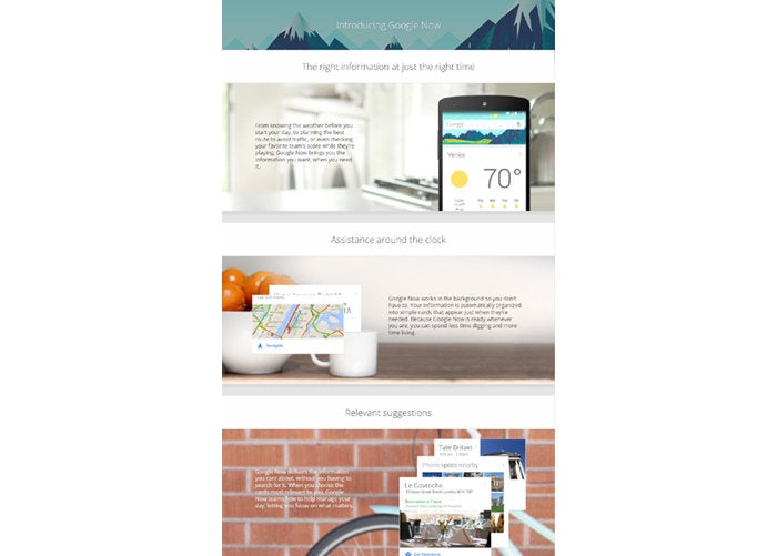 Google/Archive.org
(Click image to enlarge)
But right when the Now services were on the brink of becoming invaluable, Google gave up on the concepts — without any real fanfare or as much as an announcement. The Google Now feed eventually morphed into a glorified news stream and lost its soul and sense of purpose. According to a 2015 report by the website Recode, most of the original Now team left Google over frustration "that the product, born within Android, was shuttered into search" — and that, following the decreased role of Google founder and former CEO Larry Page, was no longer being treated as a priority.
And while Google has slowly — veeeeerrry sloooowly — added some Now-reminiscent elements into an out-of-the-way area of the Google app known as Snapshot, it's never managed to reclaim the momentum or the magic of the once-promising but prematurely abandoned original.
The good news is that, well, this is Google we're talking about — so if we wait around long enough, it's entirely possible things will come full circle and at least some of these items will end up falling back into favor again. What can we say? For better and sometimes for worse, flipping and flopping is just part of the Google way.
Sign up for my weekly newsletter to get more practical tips, personal recommendations, and plain-English perspective on the news that matters.

[Android Intelligence videos at Computerworld]


