Six days into its life, we're still trying to figure out what Android Q is all about — what will come to define this latest Android release and end up having the most impact on us, as nose-breathing mammals who rely it on to power our cellular telephony gadgets.
We won't truly know Q's defining features until the software's further along in its development and all of its elements have been revealed, but having used it for several days now, some intriguing areas of progress are coming into focus — areas where Google is clearly working on refining the user experience and, in small but potentially significant measures, turning Android into an even more effective productivity tool.
Aside from the main stuff announced by Google and the critically important under-the-hood changes related to privacy, security, and performance, there are three specific areas I'd keep a close eye on as the Q train inches ever closer to its destination — and they're all areas that play pivotal roles in making our phones more pleasant to use and primed for efficiency.
1. Notifications
Up first: The way a smartphone handles notifications is more important now than ever, given how aware we're all becoming of the problematic nature of unnecessary distractions. Android's notifications have always been a strength of the platform, and with Q, Google's making some interesting moves to refine them further and make them easier to manage.
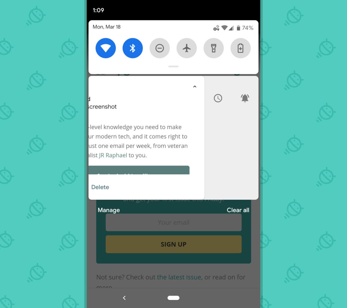
The first and most obvious change — one you may have heard about by now — is how notifications work within Q in terms of on-the-spot actions and commands. Just in case you've been resting under a rock and/or large pachyderm these past several days, swiping a notification to the right in any way in Android Q dismisses it, while swiping a notification to the left brings up the options for snoozing the alert to a later time or adjusting how and when that specific type of notification is able to interrupt you.
The placement of snoozing is a welcome change, if you ask me; previous versions of Android required you to do this awkward partial-swipe just the right amount (to either side) to find that option, and it was about as unnatural and unintuitive as — well, opting to spend your leisure time under a large elephant. This still isn't the massive expansion of Android's snoozing function I've been hoping to see, but hey — baby steps, right? It's certainly a toe in the right direction.
 JR
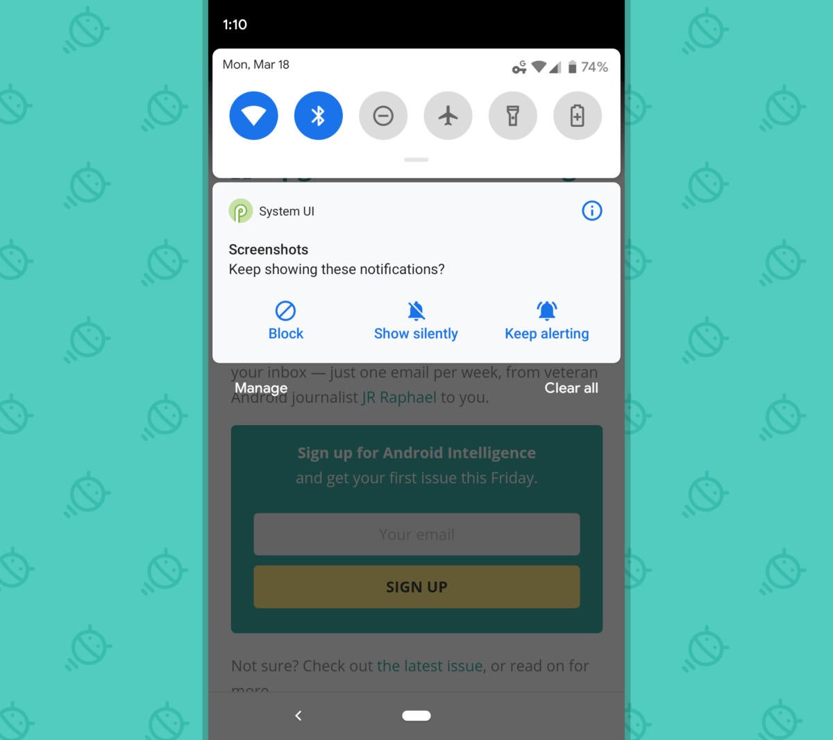
JR The notification control, meanwhile, is a nice little expansion from what was possible before (and you can still get to it by long-pressing a notification, too, by the way). Instead of simply being able to opt in or out of a notification entirely upon viewing it, like in previous versions of Android, Q allows you to choose from a series of slightly more nuanced options right then and there: blocking such notifications altogether, continuing to receive them normally, or continuing to receive them silently — with a visible alert but no accompanying sound or vibration.
 JR
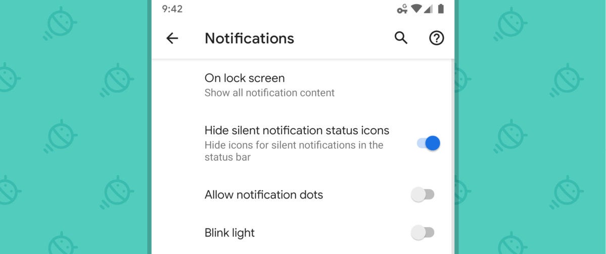
JR You can even go a step further and tell Android to avoid putting an icon for any silenced notifications in your status bar — so the information will be there when you look for it but won't create any sort of visual distraction that demands your attention or takes your focus away from more important matters.
 JR
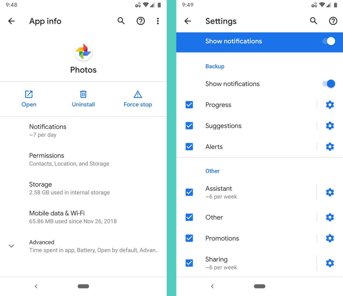
JR But wait! There's more: In addition to those surface-level changes, Android Q makes it possible to find and manage any notification types you've silenced — in case you ever tell a certain alert to go away and then later change your mind. Plus, every app's info page within the system settings now tells you how many alerts the app sends you on average each day, which can be a helpful way to assess your interruptions and figure out what types of alerts might be worth scaling back.
You can even break things down further by looking at the app's individual notification categories — the channels, in other words — and seeing how often each type of notification within an app interrupts you in an average day.
 JR
JR Other intriguing notification-related improvements in the works with Q include a customizable "time to read" setting, which lets you extend the length of time certain notification types remain on your screen, and an expanded Smart Reply system that could allow for suggested replies and contextual actions on any notification — regardless of whether the app explicitly supports the feature or not. A similar system debuted with Android Pie last year but required developers to support it in order for it to work, so it's still fairly limited in practical effect. (See the "Auto-replies" section on this page for some examples of what the updated system might be able to do.)
Last but not least, in a slightly strange twist, Google is apparently experimenting with an option to make all notifications appear as floating bubbles on your screen. This feels like a bit of a throwback to an interface trend from some years back (paging Link Bubble...), so it's a little confusing to see it being toyed around with now — but who knows? Maybe there'll be something worthwhile to it, provided it makes its way into the final Q release.
2. System navigation
The most transformative change from last year's Pie released was without a doubt its new gesture navigation system — something that dramatically affects the look and feel of Android and the very way you get around your phone.
Well, Qbert, it appears Google is at least considering some tweaks to that system for Q that could make it a bit more sensible and maybe even easier to use.
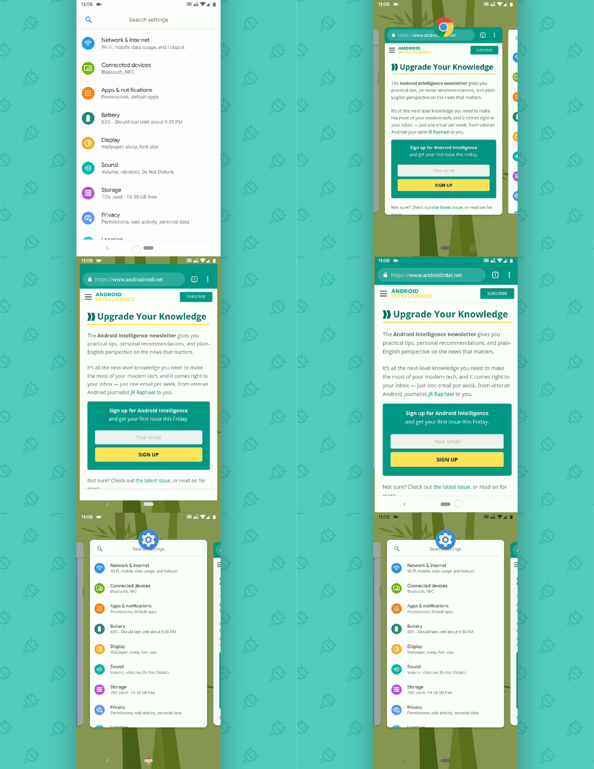
First, in this current beta, a new gesture gives you a faster and smoother way to snap between your two most recently used apps. In Pie, if you weren't aware, you can swipe to the right on the gesture nav bar to go back and forth between your current app and the one you had open previously. That gesture still works in Q — but you can also now do the same thing with a slight arc to avoid the zooming-out effect present in the traditional transition and get more of an instantaneous zap.
It's easiest to explain by illustration. Here's the standard app-snap gesture, as introduced in Pie (and be sure to watch toward the bottom of the screen to see how my finger is moving):
 JR
JR And here's the new arc-oriented alternative, present in this first Q beta:
 JR
JR As you can see, it's still a bit rough around the edges — especially with what's going on toward the bottom of the screen and in the top corners — but it certainly seems like a noteworthy potential new possibility for the shortcut-adoring efficiency-seekers among us.
More broadly yet, it looks like Google is at least experimenting with the idea of revamping Android's gesture system even further — possibly ditching the Back button entirely and replacing it with a left-swiping gesture or maybe going with a more revamped (and somewhat iPhone-reminiscent) setup.
Only time will tell what ends up making the cut — but, yeah: Suffice it to say, this is definitely an area to watch.
3. Power management
Last but not least is perhaps one of the least sexy but most important parts of the smartphone user experience: stamina. After all, if there's one area everyone complains about, it's a phone losing its staying power prematurately. (Hey, it happens to lots of phones. Don't feel bad.)
On the operating system level, Google's made some pretty significant progress with battery life in recent years — and with Q, a couple new touches suggest the effort isn't over yet. First, in terms of keeping tabs on your device's power and knowing when there's a cause for concern, Q introduces a new option to show the estimated time remaining on your current charge (based on typical usage patterns) right in the Quick Settings area. That one-swipe-away placement makes it much more useful than the current system of having to dig into the Battery section of your system settings to find that same info.
 JR
JR As of this first beta, the specific time estimate shows up only when you have the option to display your battery percentage in the status bar activated — and, from what I can tell, also only when you're using the default system launcher.
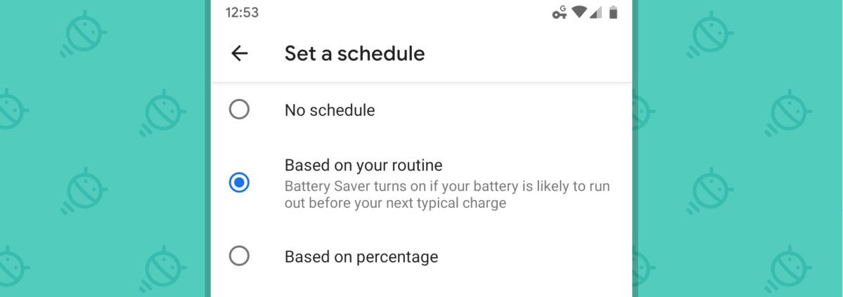
More useful yet, Android Q has a way to make the system's Battery Saver mode activate based on your own personal routine — the way you use your phone — so that it kicks in anytime the system detects that your device is likely to run out of juice before your next typical charge (based on your usage patterns over time). That's a much more advanced way for things to work than the pre-Q setup, which is able to fire Battery Saver up based only on a specific, static percentage of power remaining.
 JR
JR Considering how much of a difference Battery Saver can make in extending your phone's life during desperate moments, having it work in a more intelligent manner could be a pretty big practical upgrade that'd be valuable for practically all of us.
Just like the foundational improvements we talked about last week, none of this stuff is exactly headline-making in the way a more marquee feature tends to be, but all of it has the potential to make a noticeable difference in our day-to-day lives. And at the end of the day, that's the type of improvement that has the most meaningful and lasting impact.
The question now is how all of this will evolve and come together between now and the final Q release — and that, my nose-breathing friend, is a question only time can answer.
Sign up for my weekly newsletter to get more practical tips, personal recommendations, and plain-English perspective on the news that matters.

[Android Intelligence videos at Computerworld]


