Multitasking sure has come a long way since we first laid our paws on Google's Android software.
I mean, think about it: Back in the early days of Android, multitasking basically just meant being able to switch quickly between apps, using the Overview (then known as Recent Apps) button that was built into the operating system. It seems almost silly now to think of that as a feature, given how commonplace and basic of a concept it is in 2019, but put yourself back in your brightly colored 2009-era shoes — when smartphone operating systems were simple and the iPhone's option-free interface was the de facto standard — and it's easy to remember how powerful and transformative such a possibility was at the time.
Then came the era of split screen — something first introduced by Samsung and other Android device-makers and eventually adopted by Google as part of Android itself. The idea behind split screen (or multi-window, as it's often called) is certainly sound: You've got a phone with plenty of screen space. Why not be able to split that sucker in half and see two different apps at the same time? Sensible as it seems, though, split screen on a smartphone just isn't something most folks tend to use terribly often (a notion supported by the fact that Google de-emphasized Android's split-screen command with last year's Android Pie release and made it decidedly out of the way to access).
Companies like LG have tried other weird twists on mobile multitasking, like allowing floating apps — apps that exist in small, moveable windows that float on top of other stuff on your screen — but since such concepts are limited to just a single manufacturer and not part of Android itself, they tend to be pretty limited in adoption and available only with a small number of inconsequential apps. Even Android's own native picture-in-picture mode, introduced with 2017's Oreo release, is fairly small-scale in relevancy and reach (despite its genuinely useful nature).
Well, my dears, 2019 appears to be the year where we'll see the next big trend in mobile multitasking. And the craziest part is that it's something we've actually known about for ages.
Hop into the nearest metaphorical bath, get some good suds going, and let's talk about Android's newest multitasking standard.
Android Q Bubbles: A familiar-feeling revolution
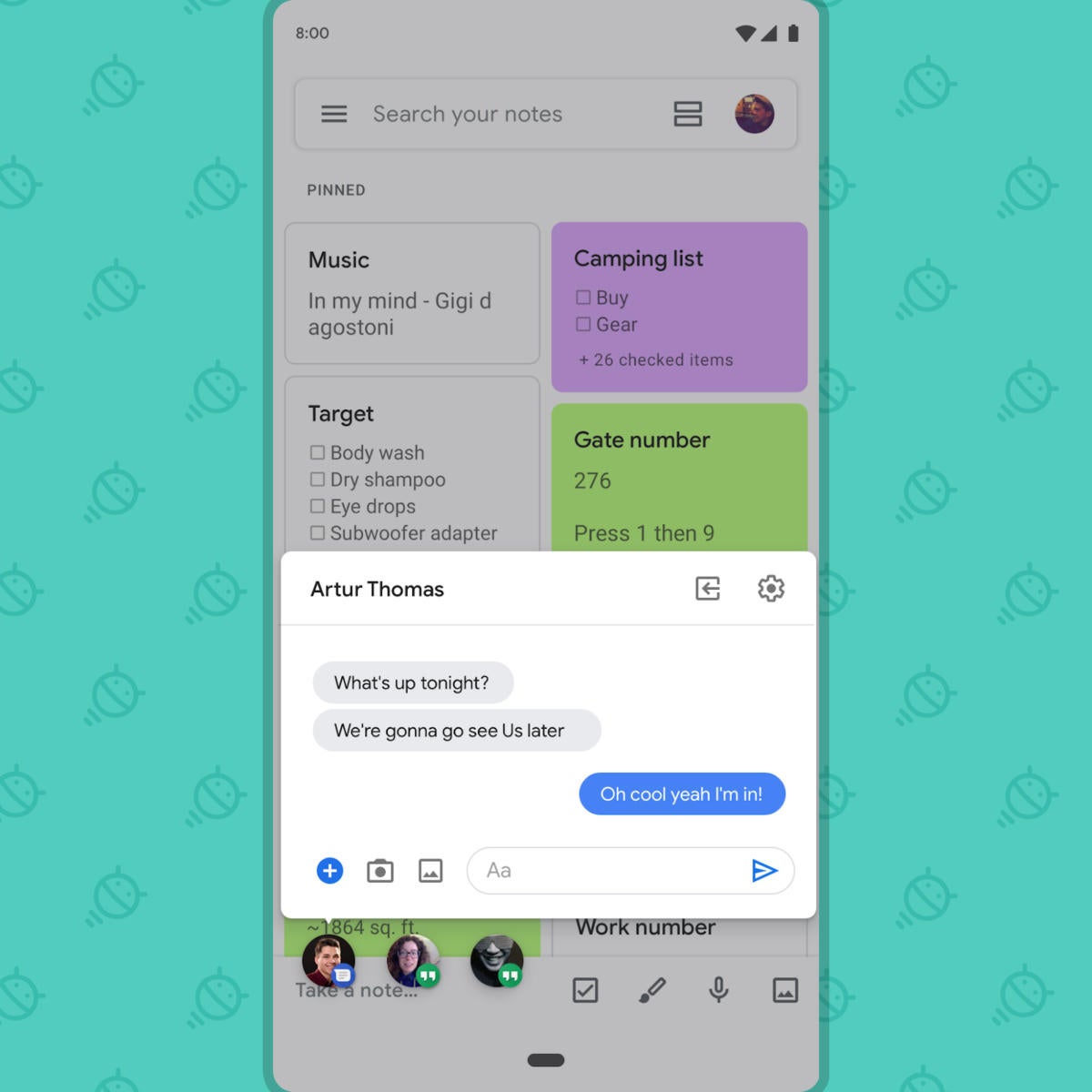
As part of its second Android Q beta release, which landed last week, Google revealed a fresh Q feature called Bubbles — "a new way for users to multitask and re-engage" with apps, as the company puts it. It's called Bubbles because, well, it brings what look and act like a bunch of floating bubbles to your screen. They aren't just pretty decorations for your inner Ernie, either; you can tap on them to view and interact with different kinds of content, all while keeping whatever primary app or activity you're viewing present and visible:
 Google
 Feeling that rush of déjà vu yet? Bubbles, in case you're relatively new to these parts (and/or have been zoned out whilst bathing yourself for much of the past six years), first came along to Android way back in the prehistoric era of 2013 — when Facebook, of all places, came up with the idea to display incoming messages in floating bubbles it called Chat Heads.
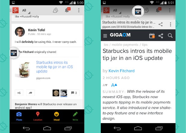
Other apps soon latched onto the concept, including a program that was near and dear to my heart for many moons: Link Bubble, the Android web browser that put every tab you opened from inside another app into a floating bubble so that you could view it or hang onto it for later — all without ever having to switch processes.
Here's a delightfully dated screenshot showing the thing in action in 2014 (and let me just say, I can't even begin to tell you how much I love everything about this image):
 JR
JR And here, meanwhile, is a video from Link Bubble's developer showing the app in action — a walkthrough that now seems almost prophetic with its philosophies:
Link Bubble was eventually sold to the folks who formed Brave Browser, which used the bubble interface as part of its initial release (though the bubbles were eventually dropped from the software altogether). The interface idea hung around as a bit of a trend for a while, with apps ranging from unapologetic Link Bubble browser ripoffs to entirely bubble-based Twitter clients popping up across the platform — and then the obsession just kinda quietly faded and stopped being an area of focus.
So, yeah: When I first saw signs that Google was toying with a bubble-like concept for Android Q, I was confused. A bubble-based interface in Android — now? Why? While the timing and the sudden renewed interest in the notion still perplex me somewhat, though, I've gotta say: Having now studied Google's plan for Bubbles in Android Q and beyond, I'm genuinely excited about the idea and what it could mean for us finger-using land-creatures who carry Android products.
Bubbles, take 2: The native Android chapter
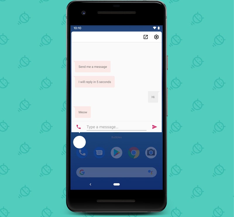
The basic point of Bubbles in Android Q isn't so different from the bubble implementations we saw in apps some years back — a similarity Google itself recognizes and openly admits, in fact. By bringing the feature into Android as a native system-level tool, Google's goal is to make it something that even more apps can utilize easily, without having to come up with their own code, and to create a consistent, privacy-conscious standard for the interface as part of that.
So why should we care? Well, take a second to think about the sorts of time-saving, experience-enhancing possibilities having Bubbles in Android could create. Your favorite messaging apps — whether we're talking texting apps or Slack-like collaboration tools — could give you the option to receive certain incoming messages as bubbles so they're easy to interact with in full app-like interfaces without having to switch to the actual app and stop whatever else you're doing. They might even give you the ability to manually pop certain conversations out into bubbles on demand, too, so you could then place the bubbles anywhere you want on your screen and maintain a fast, easy, and ergonomically optimal way to open 'em up and interact with 'em whenever you need to — then collapse 'em down and get 'em out of your way (but keep them readily available) whenever you aren't actively using them.
 Google
 Beyond that, the Bubbles system could be used to provide quick access to things like notes — say, a Google Keep note in which you're jotting down occasional thoughts while also doing other things on your phone or maybe a shopping list you want to glance at and update occasionally without having to keep it open in full all the time. It could be used in similar manners for translation tools, task lists, recipes, directions, or almost anything else imaginable. Heck, you might one day be able to tap a special command to compose a new email in a bubble-based window so that you could come and go from it as needed while simultaneously opening other apps and looking at other info.
Of course, the bubble interface won't be right for everything — and the idea here is absolutely not to have it serve as a standard setup for every sort of notification or action on your phone. Google notes that bubbles should be used only for things that are important enough to require ongoing access or that a user explicitly requests to open in that environment. Android will also provide a way for us to opt out of using bubbles for any given area, so you'll never be forced to accept any type of info in that format (even if the developer enables it by default).
But in the right sort of scenario, Android Q's Bubbles system could lay the groundwork for a form of multitasking that actually makes sense from a smartphone perspective — a way to interact with multiple apps simultaneously without having to commit to the desktop-like (and often awkward-on-mobile) idea of splitting your screen in half in order to focus on multiple things.
Of course, there's the usual asterisk that applies to any new app-oriented Android system: How useful and successful Bubbles ends up being lies entirely in the hands of developers — both the independent creators and the big-company departments responsible for creating and maintaining all of the non-Google software we use on our devices. Android has a bit of a history of introducing promising-seeming concepts that fail to catch on because developers don't bother embracing them — so intriguing as Bubbles may sound, only time will tell if and how it comes to life.
For now, there's at least reason to be cautiously optimistic about the productivity-boosting possibilities this feature could provide. New system-level tools are among the most important and impactful parts of Android upgrades, and this is a perfect example of how a simple software update could empower our apps to change the way we use our devices and turn them into more efficient tools for our day-to-day tasks.
Not bad for an idea from six years ago, right?
Sign up for my weekly newsletter to get more practical tips, personal recommendations, and plain-English perspective on the news that matters.

[Android Intelligence videos at Computerworld]


