Every time we think we know all there is to know about Android Q, something new comes along and shakes up our understanding of Google's latest Android version.
The first Android Q beta brought us relatively subtle changes to areas like notifications, navigation, and power management — along with quietly important improvements to less visible areas like privacy, security, and performance. Then the second Q beta introduced Bubbles, a whole new approach to mobile multitasking that makes its debut with this release.
Now, with the latest Q beta, introduced at Google's I/O developers' conference this week, we're seeing a whole other side of the software — and with it, a massive interface advancement that represents one of the most transformative shifts Android's seen to date. Make no mistake about it: This will completely change the way you use your phone.
I'm talking about Android Q's new gesture navigation system, and boy howdy, is it a big ol' matzo ball to wrap your noggin around. I've been using the latest Android Q beta for a couple of days now. Allow me to walk you through what's changing and what this totally reimagined system is actually like to use.
Android gestures, take two
First of all, feeling a sense of déjà vu? You should: Google just revamped the way we get around Android and gave us our first taste of gesture navigation with the Android Pie release last year. But, yes: The company's gone back to the drawing board and come up with another new navigation model in Android Q, and it's completely different from what we had before.
The simplest way to explain it is that Android's new gestures are basically like Apple's. And you know what? Despite the indignance some folks might feel over the blatant iOS borrowing, that might actually be a very good thing.
Here's how it works (and this isn't enabled by default as of now, by the way; you have to go into the system settings and manually change a gesture control setting in order to experience it): In place of the previous pill-like Home button is a much thinner line, which lives within a much smaller bar at the bottom of the screen. In an incredibly strange-feeling twist as a long-time Android user, you can't tap the bar to go back to your home screen; instead, you swipe upward on it to return to the home screen from anywhere in the operating system.
 JR
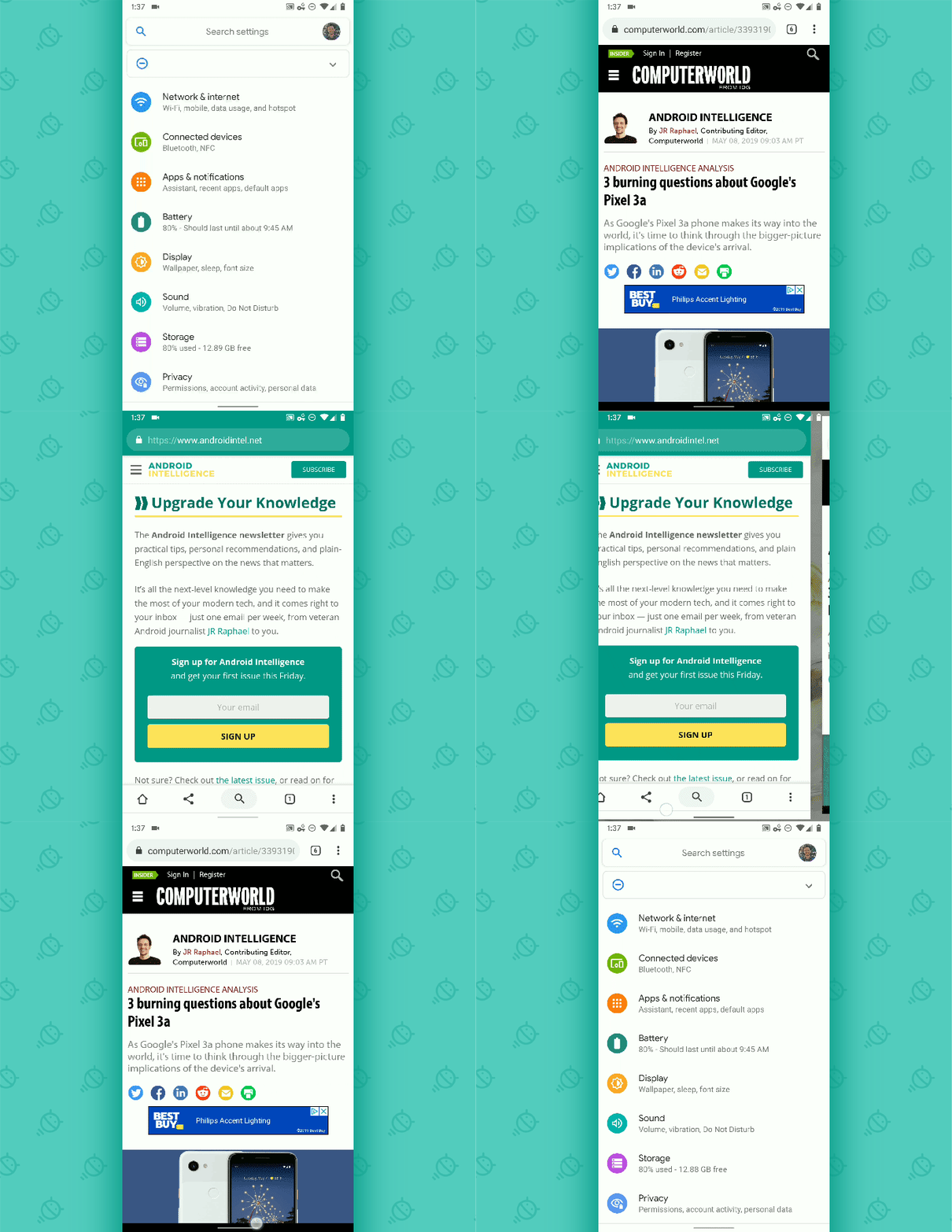
JR You can swipe upward and then hold your finger down, meanwhile, to get to the Overview screen and move among your recently used apps. If you let your finger go after a moment, you'll see the full Overview interface appear — with app suggestions and a search bar at the bottom — or if you immediately start swiping to the left, you'll be able to scroll through other apps and jump directly to any of them.
 JR
JR You can also swipe toward the right on the bar to jump immediately to your most recently used app — and once you've done that, you can swipe to the left on the bar to return to the app you just came from. Essentially, all of your apps exist in a timeline, and you swipe either way on the bar at any point to move forward or backward in the list.
 JR
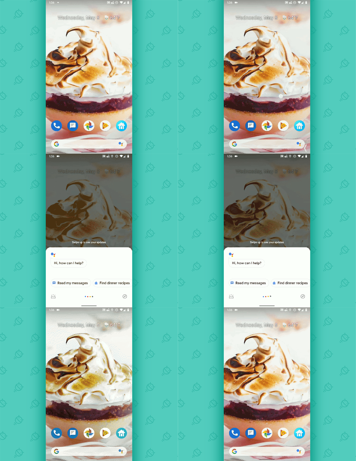
JR What about Assistant? As of now — and from the sounds of it, this could still change between now and the final Q release — you swipe inward diagonally from either lower corner and then hold your finger down for a second to pull it up.
 JR
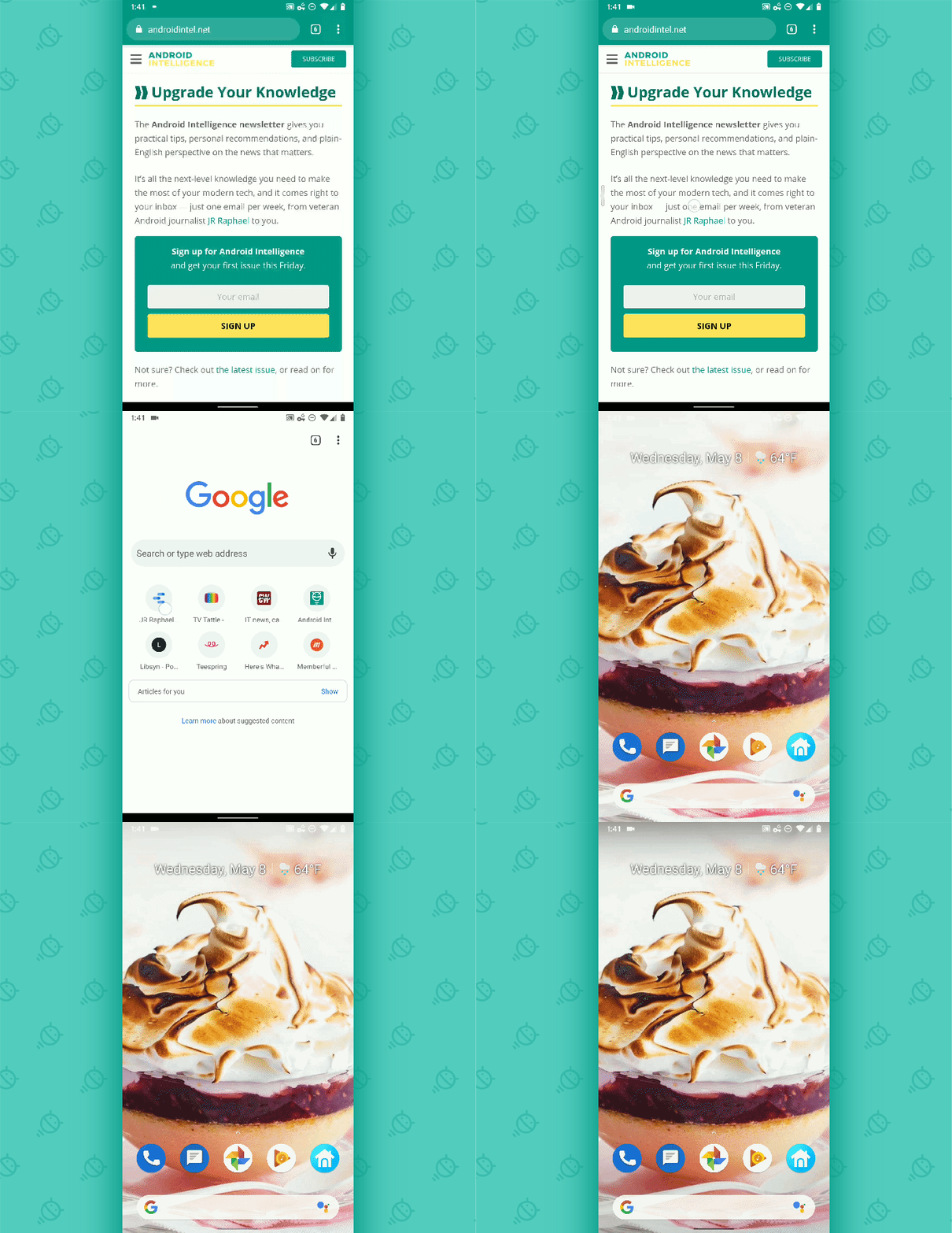
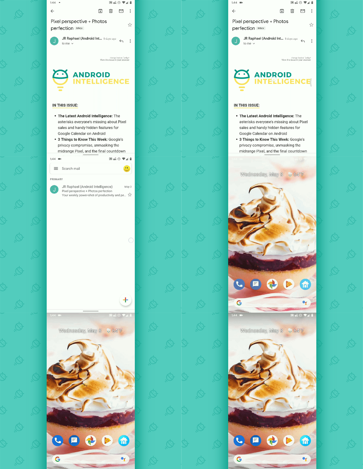
JR Did you notice what's missing from this picture? Yup — the Back button. Google's gotten rid of it in this arrangement and instead implemented a gesture that allows you to swipe inward from either side of the screen — not in the navigation bar area, mind you, but within the main large area of the display — to move back one step. It works just like Android's traditional Back button within apps, taking you back a step in whatever you were doing, and it brings you back to your home screen when there's no remaining step to take.
 JR
JR The Back gesture works the same whether you swipe in from the left or the right side of the screen, too:
 JR
JR It's a whole new world — and it's pretty darn interesting to use.
Thoughts and impressions
So what to make of Android's coming gesture revamp? After a couple days of living with the new system in this latest Q beta, I'd say this: It is a pretty shocking change at first, and the immediate reaction I suspect most of us will have is one of annoyance. Plain and simple, it messes with your muscle memory — the long-reinforced habit of reaching toward the bottom-left corner of your screen to find the Back button or tapping the bottom-center area of your screen to go back to your home screen. This revamped setup is gonna take an awful lot of getting used to, and while I already feel more comfortable with it now than I did in my first few hours, I still find myself trying to tap the Home button area and place my finger where the Back button used to be.
With that being said, though, I genuinely think this is a tremendous improvement over the gesture navigation system introduced in Pie. That system, as we discussed in detail around the time of its debut, never quite came together in a totally sensible or intuitive-seeming way. The occasional presence of the Back button always felt awkward and out of place in that gesture-driven arrangement, the lack of saved screen space created by the setup always seemed counterintuitive, and the lopsided nature of the nav bar always looked rather odd.
This revamped interface addresses all of those issues, at least on some level. And once you get past the initial shock and start to adjust to it, it's actually quite pleasant to use. My one big lingering concern is the way the new Back gesture — swiping inward from the side of the screen — interferes with the very common Android design pattern of swiping inward from that same area to open an app's menu. Right now, you end up with an incredibly awkward overlap between those two areas (in most of Google's own apps, even), and the Android team doesn't seem to have a great solution for that yet. The Back gesture similarly interferes with existing gestures to swipe between tabs in Chrome, swipe between emails in Gmail, and other basic things.
But this is still an early beta, and we have to be forgiving of some unaddressed quirks at this point in the process. For now, I've seen enough positives to feel comfortable saying that Android Q's new gesture system is a serious step forward from Google previous gesture attempt in Pie. It's unfortunate that it'll require yet another adjustment right after we just went through an adjustment with Android's first gesture nav interface — and that'll undoubtedly be a serious challenge for casual users and the IT folk who support 'em — but with any luck, in time, the end result will outweigh the clunky path that brought us to it.
Based on my early experiences with Google's progress, it sure seems like a strong possibility.
Sign up for my weekly newsletter to get more practical tips, personal recommendations, and plain-English perspective on the news that matters.

[Android Intelligence videos at Computerworld]


