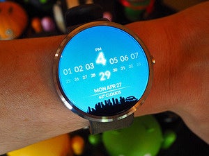
Moto 360 and Android Wear revisited: 3 months with Google on my wrist
Spending three months with a smartwatch gives you some important perspective.
Android Wear
- Huawei Watch vs. the new Moto 360: A...
- Living with the LG Watch Urbane:...
- LG Watch Urbane, take 2: Why I'm...
- 9 exceptional Android Wear watch faces
- 5 animated Android Wear watch faces...
Having Google on your wrist really is an interesting thing.
Sure, we all have on-demand access to information in our pockets nowadays, but you'd be surprised: Making the move from pocket to forearm makes a huge difference in how you interact with that info -- and what type of experience you have.
I've been living with Android Wear and the Moto 360 in my day-to-day life for nearly three months now. (I've actually been using Wear on and off since the launch of the Samsung Gear Live and LG G Watch in June, but it didn't become a regular part of my personal life until the 360's arrival.) Both the platform itself and the 360's performance have evolved quite a bit over that time, so I thought it'd be worth revisiting the subject with some updated thoughts.
Ready? Let's get into it:
The Moto 360's hardware and design
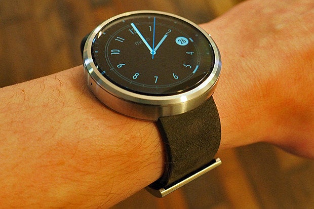
The 360 seems every bit as beautiful and elegant today as it did when I first got my hands on it. It looks like a classy high-end watch -- not a cheap gadget or a dorky wrist computer. There's a place for all sorts of styles in the smartwatch realm, and the 360 fills the "sleek and modern dress watch" role with admirable grace.
The lack of any real bezel on the display is something I continue to notice when I compare the 360 to other Android Wear watches (and I'll have more to say on those other devices soon). The watch gives you pure surface area on its face, which creates an infinity-pool-like visual and adds to its minimalist vibe.
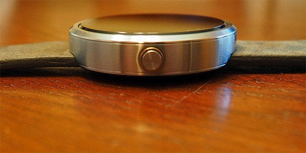
There is, of course, a tradeoff to the lack of bezels (is there ever anything in technology that doesn't require some sort of tradeoff?). Actually, in this case, there are two: First, the 360 has that infamous "flat tire" effect in which a small bar at the bottom of its screen is blacked out; since there's no real open space anywhere on the device, that's where Motorola stashed the circuitry to make the screen work. The watch would look better without it, no doubt, but I use a face configuration that's designed with that element in mind, so I honestly don't even think about it or notice it at this point.
The other thing is a weird light-refracting effect that's visible along the display's beveled edges whenever there's a light-colored background on the screen. It's also not anything I tend to notice or focus on much in regular use, but it's certainly there if I look for it.
A night-and-day difference in performance and stamina
The 360's performance and stamina were weak points when I first reviewed the device in September. A software update sent out over the air that same month, however, went a long way in improving those areas: The jerkiness and slight lag that were present at launch are pretty much gone now, and the watch is generally smooth and on par with other Wear devices in terms of responsiveness.
As for stamina, it's almost hard to believe the 360 is even the same product I tested this summer. I now have no trouble consistently making it from morning to night without even coming close to running out of juice. On days where I have lighter active use, I often go to bed with well over two-thirds of the charge still remaining.
Pretty much all Android Wear watches will get you a full day's use -- maybe two days if you use them sparingly. For whatever reason, the Moto 360 was barely making that metric at its start, but it's right up there with the rest of 'em now. I drop it on a charger when I go to bed every night and never give it another ounce of thought.
Speaking of power, the fact that the 360 uses standard Qi wireless charging is probably my favorite feature of the device (and thus far, the 360 is the only Wear device to have it). The official charging cradle is hassle-free as can be: You just set the watch on it and move on with your life. No annoying wires to connect, no pins to match up, no clicking anything into place or fussing of any sort. Charging the watch puts the display into a dock-like clock mode, too, which is a nice touch when you keep the cradle on your nightstand.
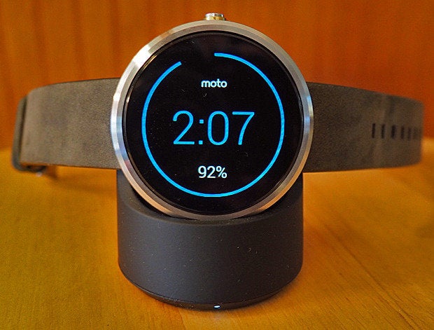
The best part, though, is the fact that you don't have to use that cradle; you can just as easily set the watch on any ol' Qi-compatible pad you have around. Whether I'm at my desk or on the road -- where the official charger usually isn't handy but a Qi battery pack is almost always nearby -- that's an incredibly useful option to have, and one I sorely miss when I spend time with other Wear devices.
A couple of 360-specific quirks
Most Android Wear watches have an "always on" mode, where the screen remains in a dimmed and scaled-down state most of the time and then lights up all the way when you raise your wrist or touch the display. On the Moto 360, it's called "ambient screen" instead -- and the way it works is still a little strange to me.
"Ambient screen" does offer a dimmed and scaled-down version of the display, but instead of remaining on all the time, it turns off anytime your arm is in a more vertical orientation and also anytime you've gone a few minutes without touching the watch. It then turns back on when you move your arm even slightly.
In theory, that allows you to see the time at a glance without having to fully activate the display, just like the more typical "always on" mode would -- but in reality, it can sometimes be a little finicky and erratic. If you're sitting still, for instance, you can't just casually look down to see the time; you have to move your arm a bit first to get the dimmed display to turn back on. That can be mildly annoying.
And between the dimmed mode turning off and on and the fully illuminated mode coming off and on, you end up with a screen that sometimes seems to be in a perpetual state of change -- frequently lighting up and then darkening in one way or another even when you aren't intentionally interacting with it. That can be somewhat distracting at times.
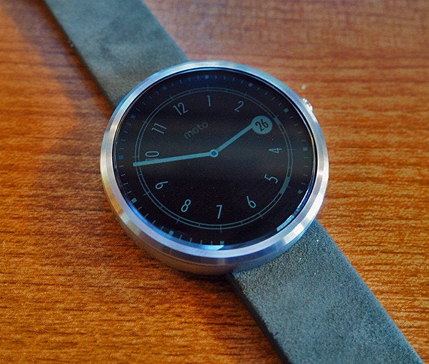
The Moto 360 in its dimmed "ambient screen" mode -- if only it'd stay on all the time...
On a related note, if you opt to turn the 360's "ambient screen" setting off -- and thus have the watch remain completely blank by default, activating only into its fully illuminated state when you touch it or raise your arm -- you run into another irksome quirk: Even when you mute the watch, its screen will continue to illuminate anytime it detects motion.
To clarify: On most Wear watches, the display won't illuminate automatically based on movement when the device has been muted. That way, if you're in a movie and don't want your wrist to light up every time you shift positions, you can just mute the thing and have it remain dark until you're done.
For some reason, Motorola has modified this behavior on the 360 -- so when the "ambient screen" setting is off, the watch continues to illuminate with movement even when the device is muted. I learned this the hard way when I was in a theater and couldn't get the damn thing to stop lighting up every time I shifted. I can't for the life of me figure out why Motorola changed the software to work like that, but man, I wish there were an option to disable it and go back to the normal Wear behavior.
A couple of 360-specific strengths
Speaking of dark environments, one area where the 360 really shines (so to speak) is in the realm of display brightness: The watch has a built-in light sensor and adjusts its brightness automatically based on your conditions. Sounds like an obvious feature, I realize, but the 360 is one of only two Wear watches to have it so far -- and when you use other watches that lack it, you realize how big of a difference it makes.
The 360 gets bright when you're outside and dim when you're in the dark. It's so basic and sensible that it's almost shocking all smartwatches don't do it.
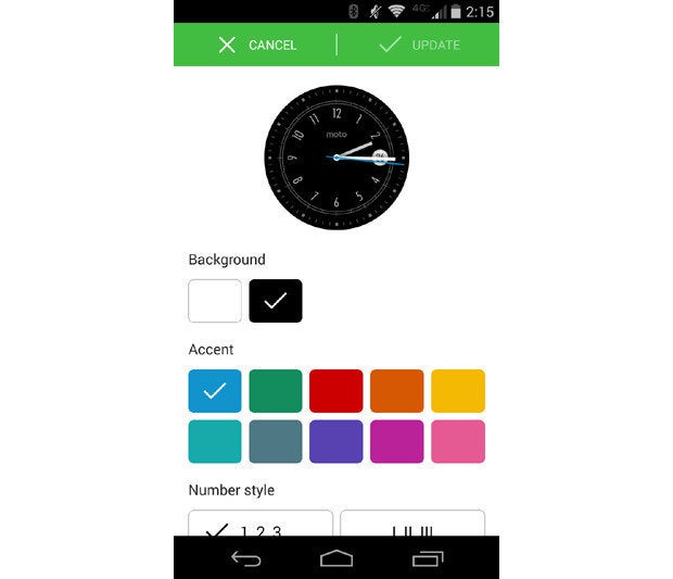
The Moto 360 also continues to stand out for its customization potential: If you install Motorola's companion Moto Connect app, you can tweak the various watch face designs to make them look the way you like -- changing background and accent colors, selecting number styles, and adding or removing the date. There's even a relatively new design (added via a recent Moto software update) on which you can set any of your own photos to be the watch's background. It's a really cool touch that goes a long way in making the watch feel like your own.
The Android Wear experience in everyday life
As for Android Wear itself, it's expanded a bit since I first reviewed it -- you can now store a small amount of music on watches themselves, for instance, in case you want to listen to tunes when your phone isn't around -- but its primary purpose remains the same: to supplement your phone in ways that make your life easier in small but meaningful measures.
For me, it accomplishes that -- mainly by allowing me to get pertinent info I need without having to constantly pull out my phone and stare at it. It may sound trivial, but getting a text message on your wrist truly is a different experience than getting it on your phone. You feel a gentle buzz on your arm and then glance down quickly. If it's nothing important, you swipe it away and are done. If it warrants a response, you swipe, tap, and say a few words into your arm without interrupting what you're doing.
Receiving and dealing with notifications -- be they texts, emails, or calendar reminders -- is hands-down the way I use Wear the most in my day-to-day life. I also regularly take advantage of the platform's reminder feature: If I'm walking or driving somewhere and think of something I need to do later, I'll raise my wrist and say: "Okay, Google, remind me to defrost the chicken when I get home," or "Okay, Google, remind me to call Jim back in an hour." I never have to futz with my phone or stop what I'm doing, and when I reach the time or place I specified, my wrist buzzes and delivers my reminder.
Wear has also been invaluable to me while traveling, as it buzzes my wrist with info about flight changes and allows me to keep up with those details -- and quickly fire off texts to loved ones to let them know what's going on -- even while I'm speed-walking through a terminal and loaded down with luggage.
The software can perform more advanced tasks, too: The number of worthwhile third-party apps for the platform grows every week, and some of them are pretty darn clever. Whether it's fitness tracking, step-by-step recipe guidance, or remote gadget control, there's no shortage of interesting possibilities for feature expansion. (Personally, I've found I'm using third-party apps less frequently these days -- I seem to get the most value out of Wear's basic system-level functionality -- but everyone's different in that regard.)
Things aren't perfect, of course, and the OS still has room for improvement. For instance, it's pretty surprising that this far into Wear's existence, Google has yet to roll out official support for downloadable third-party face designs. The company says that'll happen before the end of the year, but five months from the platform's launch is already pushing it for something that seems like it should have been present since day 1. (Some developers have come up with a roundabout way to offer downloadable faces in the meantime, but the workaround isn't ideal and tends to take too high of a toll on battery life.)
On a broader and more philosophical level, there are times when I feel like Android Wear makes me more connected than I want to be. Sometimes, I like to be in the moment and not feel tethered to my electronic devices -- and having a screen right on my wrist kind of runs counter to that goal. Those are the days when I leave the 360 at home and strap on an old-fashioned analog watch or no watch at all, and I must admit that it's kind of refreshing to have my limbs free of flashing distractions for a change. For me, at least, the heightened connectivity and constant awareness Wear provides isn't necessarily something I want all the time.
On days that I do want to be connected, though, I find the software serves its purpose and does so in a way that makes sense for the smartwatch form. You don't want to be tapping lots of tiny buttons and performing grand tasks on a small wrist-based screen; you want to be getting info you need and sending short messages quickly, without any fuss. And that's exactly what Wear accomplishes.
As I observed before, Android Wear isn't about complex commands or cramming every feature imaginable into your wrist; it's about giving you a more convenient way to handle the functions you already have -- about creating a new type of interaction that's more than the sum of its parts.
After three months of living with Wear, I'd say it by and large succeeds at that deceptively difficult objective. And beyond just the 360, I'm happy to see hardware options for all different tastes and purposes starting to show up. The elegant watch, the casual watch, the sporty watch -- this isn't a one-size-fits-all domain, and the Wear ecosystem is slowly but surely starting to reflect the inherent diversity of personal style.
What we're seeing now is still only the start, but it's a promising one. And as the software continues to mature and the hardware moves into its second generation, things are only going to get better.
As for whether the platform will ever progress from "neat tech toy" to "mainstream must-have," only time will tell. For now, the Android Wear smartwatch remains more of a luxury accessory than any sort of must-have gadget -- but for those who want to be hyper-connected and have the cash to spend, it's an increasingly compelling way to bring a world of information one step closer to your brain.

Copyright © 2014 IDG Communications, Inc.
Android Wear
With a little bit of behind-the-scenes customization, you can turn Gmail and Android Wear into an...
So many watches, so little time! We compare four Android Wear watches -- Moto 360, LG G Watch R,...


