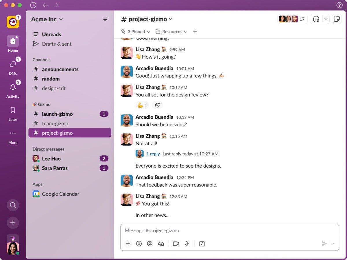
Slack has added a range of new features to its collaboration app since its last redesign three years ago. And while these features — such as Huddles voice and video calls, Canvas documents, and Connect channels — have added functionality for users, the app has become somewhat cluttered, with a growing list of tabs along the left-hand sidebar.
With that complexity in mind, Slack has again revamped its software to simplify the user experience across the desktop, mobile and web versions. The changes will begin rolling out to users today.
“We made a lot of these updates rooted in what we've been hearing from users, whether it's Enterprise Grid customers wanting a single unified view into all of their workspaces and channels, or users wanting the ability to focus more,” said Brad Monroe, product management director at Slack. “And we've made all of these with our core mission in mind: to make people's working lives simpler, more pleasant, and more productive.”
The UX update will help users “focus a bit more on things that actually require their attention, rather than having to hop into an active channel quickly to see if you’re needed or not,” said Will McKeon-White, a Forrester analyst covering unified communications. “Slack’s been adding on features routinely for a few years, without a redesign of the core platform. This most recent update is focused on bringing all of these features into a single place that’s a bit easier for humans to parse.”
 Slack
Slack
Slack is giving its popular collaboration app a new Home screen.
The new Home view provides access to messages and channels; the main change is aimed at customers on Slack’s Enterprise Grid, who can view all of their messages from one place without having to jump between workspaces. To help avoid message overload, Enterprise Grid users can filter which messages are available to them.
Slack has also reorganized existing tabs into what it calls “dedicated views.” For most users this means three icons on the sidebar. The DM view, as expected, hosts a user’s direct messages. Activity provides an overview of notifications such as @mentions, thread replies, reactions, and more. And the Later view contains messages and action items that users want to deal with at another time.
Customers paying for Slack’s Sales Elevate software, announced last week, can access sales information in another “dedicated view” tab placed underneath Later. Other tabs, such as Canvases and Files, will be kept in the More tab.
Although it’s not currently possible to customize the dedicated view sidebar, that’s likely to change in upcomingupdates. “A lot of this [redesign] is planting the seed for future customization,” said Monroe. This could mean that regular Canvas users will be able to place a tab shortcut on the sidebar for quick access, for instance. “You can see how we're laying a lot of the foundation for that,” he said.
“It’s important generally for vendors to modernize their user experience on a regular basis,” said Mike Gotta, research vice president at Gartner. “It provides a more solid foundation to incrementally add new features in ways that are more blended into the way customers interact with the application.”
He noted that redesign efforts can be subtle ways for vendors to position their applications for “more transformational changes down the road.”
Other UX changes include the addition of a “create” button, accessible at the bottom of the application. This offers another way for users to start a Canvas document, as well as messages, channels and huddle meetings.
The search bar, previously accessible at the top of the app, will have a smaller icon available just above the “create” button. Users will be able to preview a notification by hovering over a tab, meaning they don’t need to click and switch their attention fully to a channel, for example.
And Slack is introducing new “theme” options. “We totally redid theming in this new update to make it really vibrant and cool. We’re adding translucency: the themes can get pretty trippy in a really fun way,” said Monroe.
The themes won’t be available immediately; they’re expected to roll out later this year.
Despite the changes, there are still ways that Slack could improve, said McKeon-White, such as the ability to send messages between Slack and other popular collaboration products.
“The main UX gap for Slack — and really, most of the messaging and UCaaS players today — is lack of native messaging level interoperability,” he said. “This would mean someone on Teams [could] send a message to someone in Slack, and vice versa. There are workarounds (like m.io, RocketChat, Element, and more) but very few that can just easily plug into another messaging solution.”
Usability has long been one of Slack’s strong points, said McKeon-White. This has typically been seen as an advantage over Microsoft’s rival Teams platform, which is in turn considered to have a broader set of capabilities. While some users have a strong preference for one or the other, to the average observer they’re mostly the same: team-based persistent chat apps with audio and video calling features built in.
“Where both Slack and Teams are going to be competing is in ‘intelligence’ enhancements,’” said McKeon-White. “This was in part what this update was about for Slack — providing a more intelligent way to draw users attention to what is most required of them. Teams will likely have similar capabilities coming in the future.”


