Email is a complicated beast. There are so many layers to mull over when it comes to making an inbox manageable, from the surface-level organizational factors (hello, labels!) to the more advanced under-the-hood features (filters, anyone?).
But beyond all of that, even, is the issue of your actual inbox interface. It may seem trivial, but having an interface that emphasizes the functions you use most while minimizing unnecessary clutter can go a long way in making email easier to manage — both in terms of efficiency and for the simple matter of sanity. (I know I feel far less mentally stable after I've been staring at an awful interface for an hour!)
Well, good news, my fellow Google-app dwellers: Gmail has one of the most customizable inbox interfaces around, and there's plenty you can do to make it both visually appealing and primed for productivity. By default, though, the Gmail website is kind of a cluttered mess — and it's up to you to fine-tune it.
So let's do a little tuning, shall we? Here are eight smart steps you can take to optimize your Gmail inbox interface and turn it into a more effective home for all of your email-oriented needs.
1. Cut out clutter
First up is that virtual clutter we were just discussing — and goodness gracious, does Gmail have heaps of it.
Take, for instance, the service's importance markers. Those are the flag-shaped icons to the left of every email in your inbox, sandwiched between the star and the sender's name. On some emails, they appear as hollow outlines, while on others, they're filled in with a golden-yellow hue.
 JR Raphael/IDG
The Gmail importance marker unfilled, on the top email, and filled in, on the lower message. (Click image to enlarge it.)
Officially, those markers are meant to indicate whether messages are likely to be important to you, based on a variety of signals such as which emails you open and reply to. To me, though, they're just visual noise that in no way affects how I handle messages. They're also redundant with the sorting performed by the Primary tab in my Gmail inbox, which already serves to separate out important messages from inconsequential junk. So the only thing those indicators really accomplish is making my inbox more overwhelming and less easy to process.
If you find them equally useless, send 'em a-packin' by clicking the gear icon in Gmail's upper-right corner, selecting "Settings," and then selecting the "Inbox" tab at the top of the screen. See the section labeled "Importance markers"? Change its setting from "Show markers" to "No markers," then click the Save Changes button at the bottom of the screen.
Next, do you actually use Google's online messaging service — whichever messaging service you happen to have present alongside your Gmail inbox? (It's complicated.)
Long story short, G Suite users now see the Slack-like Google Chat service (known as Hangouts Chat up until very recently) in the left-hand sidebar of the Gmail desktop interface, while non-G-Suite Gmail users see the original, consumer-focused Hangouts service (which has been in the process of being killed for what feels like an eternity now) in that same spot.
And unless you're regularly using whichever service shows up in that area for you, its presence is likely providing little more than a disposable distraction. So zap it away and celebrate more clutter cleared: Just head back into Gmail's settings, select the "Chat" tab at the top, turn the toggle to "Chat off," and then click the Save Changes button.
Now, ask yourself this: Do you like the way Gmail shows email attachments as their own lines within your inbox, beneath the main content of their associated message? If you don't find that to be a beneficial addition, you can turn those tiles off, save space, and give your inbox a more uniform appearance by clicking the gear-shaped icon in Gmail's upper-right corner, selecting "Display density," and changing the setting from "Default" to "Comfortable" (a nice middle-of-the-road option) or "Compact" (a super-condensed, almost claustrophobic vibe that I wouldn't recommend for most people).
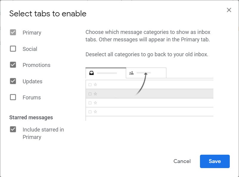
Last but not least for this first step, let's talk about tabs. Assuming you're using Gmail's default tabbed inbox setup, think carefully about the five tabs at the top of your inbox and how much you rely on them. Are there any tabs that are of little to no meaningful value to you? Personally, for instance, I don't get many emails (that I care about) from social networks. So I've turned off the Social tab, which gives me one less place to feel obligated to check and makes my inbox even more minimal.
If you have any tabs you don't rely on regularly, click that gear-shaped icon once more — and this time, select "Configure inbox." There, you can uncheck any tabs you no longer want and have them vanish from your inbox entirely. Any messages that would have been filed into those tabs will simply be shifted to the next most appropriate tab that is still present.
 JR Raphael/IDG
Turning off Gmail tabs that you don't need can help make your inbox more manageable.
Speaking of the Gmail inbox style, by the way, don't forget that Gmail actually now offers five distinct inbox arrangements. If the default tabbed setup doesn't seem right to you, consider one of the alternate options — like an inbox arrangement that organizes your incoming messages into a single list, with unread emails first. I've got a separate guide devoted entirely to finding the best inbox setup for your work style, if you want to explore the possibilities in detail. Also don't miss my collection of time-saving Gmail tips for navigating the inbox and managing mail.
2. Close drawers when you aren't using them
My wife has a habit of leaving dresser drawers and cabinet doors open, and lemme tell ya: It drives me absolutely nuts. (Hi, honey!) Having virtual drawers hanging open all over the place creates the same sort of effect, minus the potential for head bonks: It adds clutter into the environment and makes it hard for your eyes to focus on the elements that actually matter.
So take the simplest step possible in improving your Gmail interface and start shutting the damn drawers, would ya? (Sorry. Pent-up frustration from a vaguely related area.) There are two drawers worth closing whenever you aren't using 'em in Gmail:
First is the Google service bar at the right side of the screen — that strip that holds icons for Calendar, Keep, and Tasks. Whenever you aren't using it, click the little right-facing arrow in its bottom corner and collapse it to clear out its clutter and reclaim that space.
And second is the main Gmail menu on the left side of the screen, which can be similarly closed in order to repurpose the same space for your main message area. Click the three-line icon at its top to collapse it, then just hover your mouse over its collapsed form whenever you need the full menu to appear.
3. Optimize your label lists
Gmail's labels are awesome for organization, but sometimes your organizational system itself needs a little optimization. (I can't even begin to tell you how much pleasure that brought me to say.)
After all, it doesn't take much for Gmail's label lists to get unruly. And the more cluttered those lists become, the more difficult it is for you to find the labels you actually need and use often.
Labels show up in two different places in Gmail — in the main menu to the left of your inbox and then also within individual messages, anytime you use the Label command. With very little effort, both of those spots can be cleaned up and condensed from the same streamlined tool.
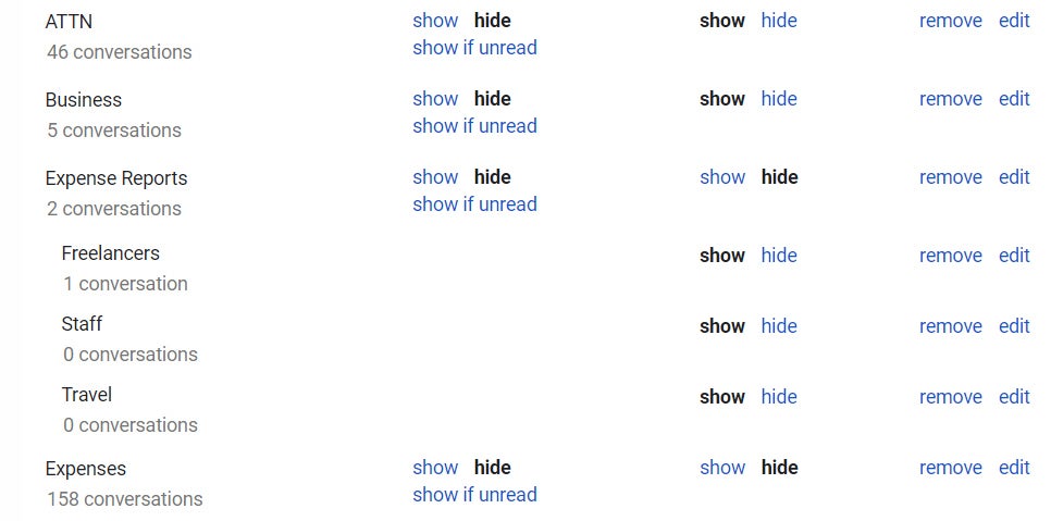
So make your way back into Gmail's settings, and this time click the "Labels" header at the top of the screen. There, you'll see a list of every label you've ever created, along with all the default system labels and categories. Next to each one, you'll see two columns: "Show in label list," which controls whether a label is shown or hidden in the upper part of the main Gmail menu, and "Show in message list," which controls a label's visibility in the list that pops up when you use that in-message Label command.
 JR Raphael/IDG
You can set any label to be hidden and keep it from taking up space. (Click image to enlarge it.)
Think through each label and category and consider how frequently you access it from either location. If a label isn't something you click on routinely, hide it. You'll still be able to get to it — by clicking the word "More" in the main Gmail menu or by using the search field within the in-message list — but it won't take up space on your screen and push the labels you do use regularly out of sight.
4. Expand your organizational options
If you use Gmail's stars system to mark messages in any way — such as giving extra emphasis to emails that are particularly pressing or those that warrant a reply — listen up: You don't have to stick with just a single star style.
Gmail has the ability to give you multiple star options — different colors and styles — that you can reserve for different purposes. In my inbox, for example, I use one type of star for messages I need to reply to, another style of star for high-priority messages that need to be dealt with that same day, and yet another star style for messages that require some manner of processing (such as adding an event onto my calendar or marking an invoice as paid).
You can add extra stars into your own mix by looking in the "General" tab of Gmail's settings and finding the "Stars" section midway down the page. Drag any designs you want to use from the "Not in use" row up to the "In use" row and then place them in whatever order you want. (Most likely you'll want the ones you use more frequently near the beginning.)
 JR Raphael/IDG
Adding extra stars into your Gmail setup gives you more ways to mark messages. (Click image to enlarge it.)
Be sure to hit the Save Changes button at the bottom of the screen when you're done — and then, anytime you star a message, you can keep clicking the star icon to cycle through all your available choices. They'll appear in the same order you just established in the Gmail settings. (Annoyingly, this feature doesn't carry over to the Gmail mobile apps, but you'll have it on your desktop, at least.)
5. Blast away nudgy annoyances
I don't know about you, but I find Gmail's nudges — the service's habit of bringing messages to the top of the inbox with a distractingly bright reminder whenever the Google genie decides you're overdue to take action — incredibly annoying and also quite counterproductive. I have my own systems for managing email, and Gmail's attempts at trying to figure out what I do and don't need to respond to tend to be more hindrance than help, as they force me to waste time clearing away clutter I've already dealt with once.
Unless you find those nudges to be useful, turn them off by looking in that same "General" tab of Gmail's settings and finding the option for "Nudges." You'll see two different options there to uncheck.
6. Cut down on unnecessary clicks
When you're scrolling through messages in Gmail, the last thing you want to do is keep clicking to continue on to the next page — and yet, by default, Gmail makes you do exactly that after every 50 messages.
You can't break Gmail's pagination habit entirely, but what you can do is double the amount of messages it displays per screen. That way, you'll be able to see a hundred messages on a single page before having to click to load more. Hey, it's progress.
The option you want to adjust is at the top of the "General" tab we were just looking at in Gmail's settings. Click the box next to "Maximum page size" and change it from "50" to "100," then get ready to give your finger a break.
7. Find a theme that works for you
Gmail's default appearance these days is quite white, but you don't have to stick with that mildly blinding motif. Click the gear-shaped icon in the website's upper-right corner and select "Themes," then browse through the available options.
Two simple choices worth considering are "Dark," which effectively puts the entire Gmail website into a native dark mode, and "Soft Gray," which is basically just an enhanced version of the default all-white theme — equally minimal but with more contrast to set the active message area apart from the surrounding menus.
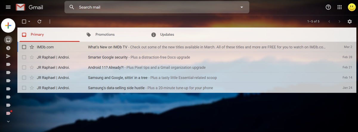
If you decide to go with a more graphical option, meanwhile — whether one of the many available photos and illustrations or your own uploaded image — take note of three subtle options for making the most of your custom color scheme:
- Text Background — the icon with an "A" in a box at the bottom of the theme window. That lets you toggle the actual message area background color between a light and a dark theme.
- Vignette — the icon with an oval in a box. That lets you use a simple slider to make the outer edges of the image darker, thereby creating extra contrast and placing more emphasis on your main message area.
- Blur — the icon with a bunch of little dots in a box. That, as you'd expect, lets you add a level of blur onto your image, making it less attention-grabbing and more of a proper background.
With the combination of those three settings, you can create some appealing visual effects that make your inbox minimally straining on your eyes and maximally pleasant to view.
 JR Raphael/IDG
Google's theme options can turn your inbox into a serene setting for peaceful productivity. (Click image to enlarge it.)
8. Give your inbox a major minimalist makeover
Finally, what might be the most impactful change you'll make to your Gmail inbox — the crowning touch upon this interface improving process: Try out an extension called Simplify Gmail. It's available for both Chrome and Firefox. And it is, without exaggeration, the best part of my email experience.
Simplify Gmail is the creation of a former Googler who served as Gmail's longtime design lead and was the co-creator of the company's short-lived Inbox experiment. It picks up where Inbox left off and rearranges the core Gmail interface to give it a cleaner, simpler, more minimal appearance that makes it infinitely easier to use.
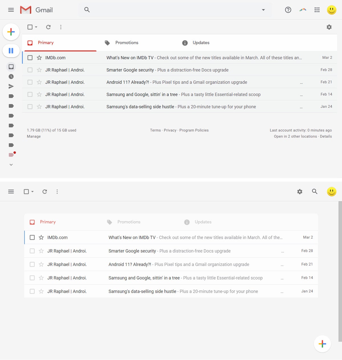 JR Raphael/IDG
Gmail in its native form, at top, and with Simplify Gmail's automatic enhancements applied, at bottom. (Click image to enlarge it.)
The extension doesn't involve any trackers, ads, or cookies, nor does it collect or use any manner of personal data. It's even open source, if you want to look at the code to confirm that for yourself.
With it and the other interface optimizations we just finished going over, your Gmail inbox will be a whole new beast — one that'll let you be more focused and consequently more productive than ever. And guess what? The more productive you are with email, the less time you'll have to spend staring at your inbox.
And if there's one surefire way to make email more enjoyable, it's to spend less time doing it.


