An inbox is an inbox — right?
You'd certainly think so. After all, how many ways could there possibly be to view email?
The answer, as it turns out, is quite a few — especially when it comes to Gmail. It's easy to overlook or forget, but Google's email service now offers the choice of five distinct inbox arrangements. And within each of those setups lie even more options for fine-tuning and customizing how your email reaches you.
We're talking about more than just basic themes here, too: These are completely different ways to experience email, each with its own unique set of characteristics and advantages. And finding the right arrangement for your own personal style of working can make a world of difference in your ability to manage email efficiently — and keep your brain from suffering an inbox-induced meltdown.
Join me for a tour of the possibilities, and get ready to reinvent your inbox to match the way you prefer to work.
(These Gmail tips are focused on the Gmail website interface, by the way — what you see when using the service on a desktop computer — but the same basic concepts of each inbox arrangement apply to Gmail's mobile apps as well. The main difference is simply that in that environment, tabs or sections are accessible via a menu icon within the app instead of being permanently present as part of the main inbox screen.)
Gmail inbox #1: Default — a.k.a. the tabbed inbox
- In five words: Email sorted and organized, automatically
- Activate it by: Hovering your mouse over "Inbox" in Gmail's left-of-screen menu, clicking the downward-facing arrow at the right of that line, and selecting "Default" from the list that appears
- Use it if: You want your incoming messages to be separated into purposeful category-driven sections
- Avoid it if: You prefer to see all of your incoming mail in a single list — or you don't trust Google's algorithms to sort your messages properly
What Gmail's Default inbox is all about
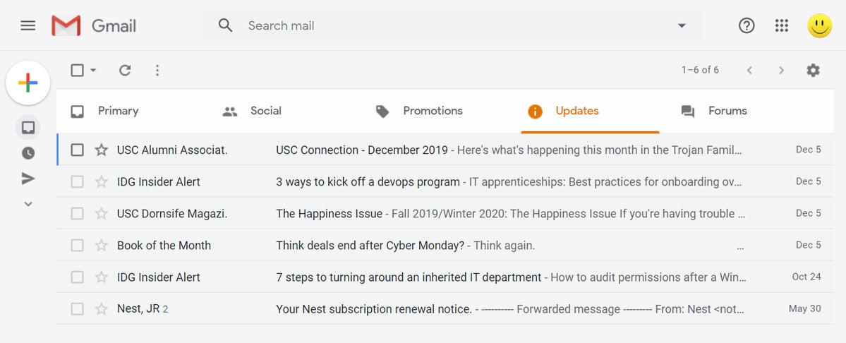
The standard Gmail inbox arrangement — and the one you're probably already using — is the thrillingly named Default setup. It's better described as a tabbed inbox, though, because it's designed to separate your inbox into as many as five categories that exist in a series of tabs across the top of your screen.
 JR Raphael/IDG
Gmail's Default inbox automatically sorts your mail into tab-based categories. (Click any image in this story to enlarge it.)
By default, Gmail's Default arrangement gives you five tabs:
- Primary, which is meant to house important emails and those that are personally addressed to you
- Social, which is intended for automated messages sent from social media websites
- Promotions, where all sorts of marketing emails are collected
- Updates, which tends to include everything from bills and statements to confirmations and notices
- Forums, where messages from mailing lists and other online groups are placed
Google's virtual genies analyze all incoming messages and automatically attempt to place them into the appropriate tab, but the real value of the tabbed setup comes when you start to customize it and claim control.
How to make the Default inbox work for you
First, think about which tabs you really want. I, for example, don't get a lot of social-media-related emails — certainly none I care to see. So I disabled the Social tab entirely, which causes my inbox to be tidier and any emails that would've landed in the Social tab to be rerouted to the next most appropriate place.
To disable any tab with the Gmail Default setup, click the gear icon in the upper-right corner of the screen, select "Configure inbox," and then uncheck the box next to the tab you don't want.
Next, think about how you could make the tabs you are using work better for you. Maybe you want to have all of the newsletters you've subscribed to show up in your Primary tab, where you're likely to see 'em, instead of getting routed into the Forums tab, where they might not catch your eye. Or maybe you don't really use the Forums tab for anything special and want to repurpose it as a place for customer feedback sent through a form on your website — or for articles you save into your inbox for later reading.
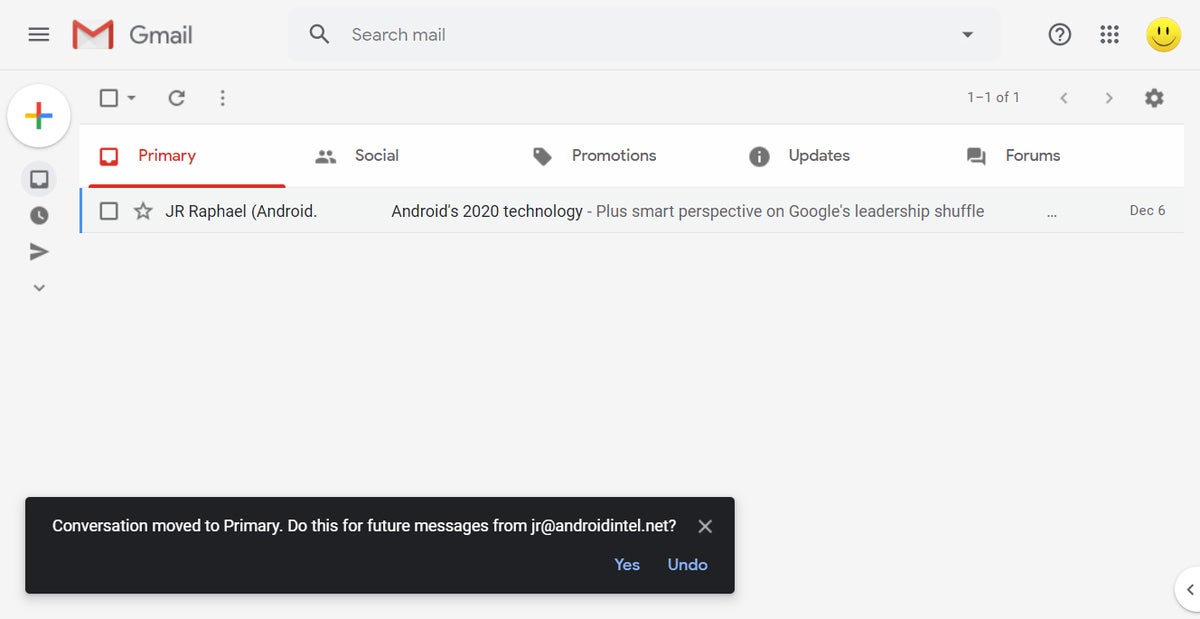
No matter the specifics, all you've gotta do is teach Google to do your bidding. The simplest way is to recategorize a representative email by dragging and dropping it into another tab on the Gmail website. When you do that, you'll see a box pop up in the lower-left corner of the screen prompting you to categorize all future emails from that sender in the same way.
 JR Raphael/IDG
When you drag a message from one tab to another, Gmail will prompt you to treat that as a permanent rule.
Click "Yes," and there ya have it: Those messages will always land where you want 'em from now on.
If you need to get more advanced and direct emails into a certain tab based on a factor other than their sender — be it a word or phrase in their subject line, the presence of certain text in their body, or even the email address to which they were sent — just create a Gmail filter to handle it. It's easier than you'd think and doesn't take long at all to accomplish; you can find step-by-step instructions in my separate Gmail filters guide.
Gmail inbox #2: Priority Inbox
- In five words: Sorted email with custom parameters
- Activate it by: Hovering your mouse over "Inbox" in Gmail's left-of-screen menu, clicking the downward-facing arrow at the right of that line, and selecting "Priority Inbox" from the list that appears
- Use it if: You like the idea of separating your mail out into different sections but want more control over how it's done — and want all the sections to appear within a single untabbed screen
- Avoid it if: You prefer to see all of your incoming mail in a single list — or you want the more advanced and granular style of sorting provided by the Default inbox arrangement
What Gmail's Priority Inbox is all about
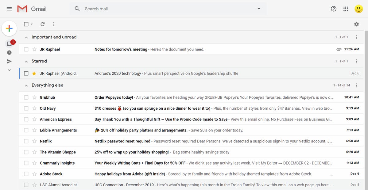
Priority Inbox is Google's precursor to the tabbed inbox interface and something plenty of email aficionados still swear by. Like the tabbed interface, Priority Inbox sorts your email into multiple sections — but instead of the sections existing as tabs, they take up the full width of your screen and are stacked on top of each other. And instead of the sections representing specific categories of messages, they're a mix of broad importance designations and divisions driven by your own message-marking actions.
 JR Raphael/IDG
Priority Inbox sorts messages into full-width, horizontally stacked sections.
Specifically, Priority Inbox gives you up to four configurable sections — any combination of:
- Important emails, as determined by Google's message-analyzing algorithms
- Unread emails, meaning those you have yet to open
- Starred emails, either by your own manual clicking of the star icon or by a filter you create to add a star based on a message's qualities
- Labels — any label you've created that you want displayed as part of your inbox
- Everything else, in which all emails within your inbox that don't fit into any other section are displayed
By default, Priority Inbox puts emails that are both important and unread into its first section, emails that are starred into its second section, and everything else into its third section — but the real beauty of this arrangement is just how much you can bend it and customize it to your will.
How to make Priority Inbox work for you
The key to making Priority Inbox effective is figuring out which sections make the most sense for your personal organization style. Maybe you don't find Gmail's marking of which emails are or aren't important to be particularly useful, for instance, and you'd rather have your first section be devoted only to unread messages, regardless of their importance status.
Maybe you filter work-related emails into a special "Work" label and want to have that appear first and foremost in your inbox, above everything else. Or maybe you have a "VIP Client" label that you want to include somewhere in the mix so that messages with that designation stand out and grab your attention.
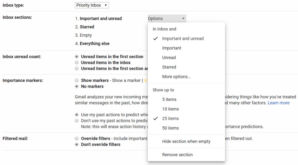
To experiment with different configurations, click the gear icon in Gmail's upper-right corner, select "Settings," and then click the "Inbox" tab at the top of the screen. From there, click the "Options" box next to any inbox section to specify what you want that section to be.
Experimenting with different Priority Inbox configurations requires you to go a little deeper into Gmail’s settings than tweaking the Default inbox configuration does. Click the gear icon in Gmail's upper-right corner, select "Settings," and then click the "Inbox" tab at the top of the screen. From there, click the "Options" box next to any inbox section to specify what you want that section to be. Click "More options" to access your own custom labels as well as Gmail's default ones.
 JR Raphael/IDG
You can fully customize each Priority Inbox section.
Gmail inbox #3: Important First
- In five words: Two sections — important, everything else
- Activate it by: Hovering your mouse over "Inbox" in Gmail's left-of-screen menu, clicking the downward-facing arrow at the right of that line, and selecting "Important First" from the list that appears
- Use it if: You really like Gmail's importance markers and want to rely on them and them alone to separate your mail into sections
- Avoid it if: You aren't entirely confident in Gmail's ability to interpret importance or you want your inbox organized by anything other than that one factor
What Gmail's Important First is all about
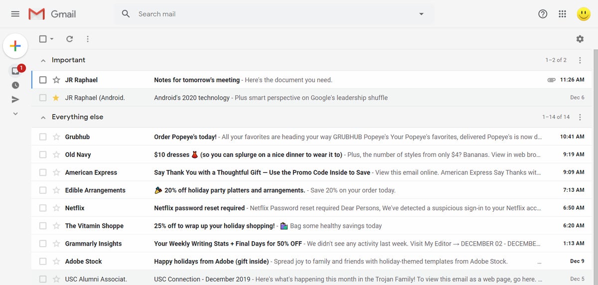
The aptly named Important First style is really quite simple, as all it does it separate your incoming messages into two horizontally stacked groups: those that Gmail and its all-knowing algorithms determine to be important and those that they don't.
The messages that are deemed important exist in one section at the top of the screen, while those that aren't reside in a separate section beneath it.
 JR Raphael/IDG
The Important First inbox style shows two simple sections: messages Gmail has deemed to be important and those it has not.
So what makes a message "important," you might wonder? Good question, gumshoe. According to Google, Gmail uses a variety of signals to interpret importance, including:
- Whom you email and how often you email them
- Which emails you open and reply to
- What keywords are present in emails that you actually read
- Which emails you tend to star, archive, or delete
There's really not much more to it than that.
Gmail inbox #4: Unread First
- In five words: Unread messages separated at top
- Activate it by: Hovering your mouse over "Inbox" in Gmail's left-of-screen menu, clicking the downward-facing arrow at the right of that line, and selecting "Unread First" from the list that appears
- Use it if: You want a super-simple inbox that emphasizes unread mail and doesn't do any sorting or separating beyond that
- Avoid it if: You want any other more advanced form of inbox sorting and organization
What Gmail's Unread First is all about
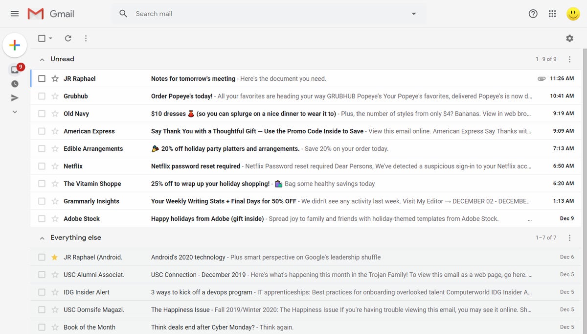
Similar to Important First, Unread First splits your inbox into two horizontal sections — but here, instead of using Gmail's assessment of a message's importance to determine its placement, the system shows any messages you haven't yet opened in the first section and any messages you have opened (but haven't archived) in the second.
 JR Raphael/IDG
With Unread First, any emails you haven't opened are shown most prominently.
And that's about it.
Gmail inbox #5: Starred First
- In five words: Starred messages get shown first
- Activate it by: Hovering your mouse over "Inbox" in Gmail's left-of-screen menu, clicking the downward-facing arrow at the right of that line, and selecting "Starred First" from the list that appears
- Use it if: You rely heavily on Gmail's starring system for organization and want that to be the sole factor that organizes your inbox
- Avoid it if: You want any other more advanced form of inbox sorting and organization
What Gmail's Starred First is all about
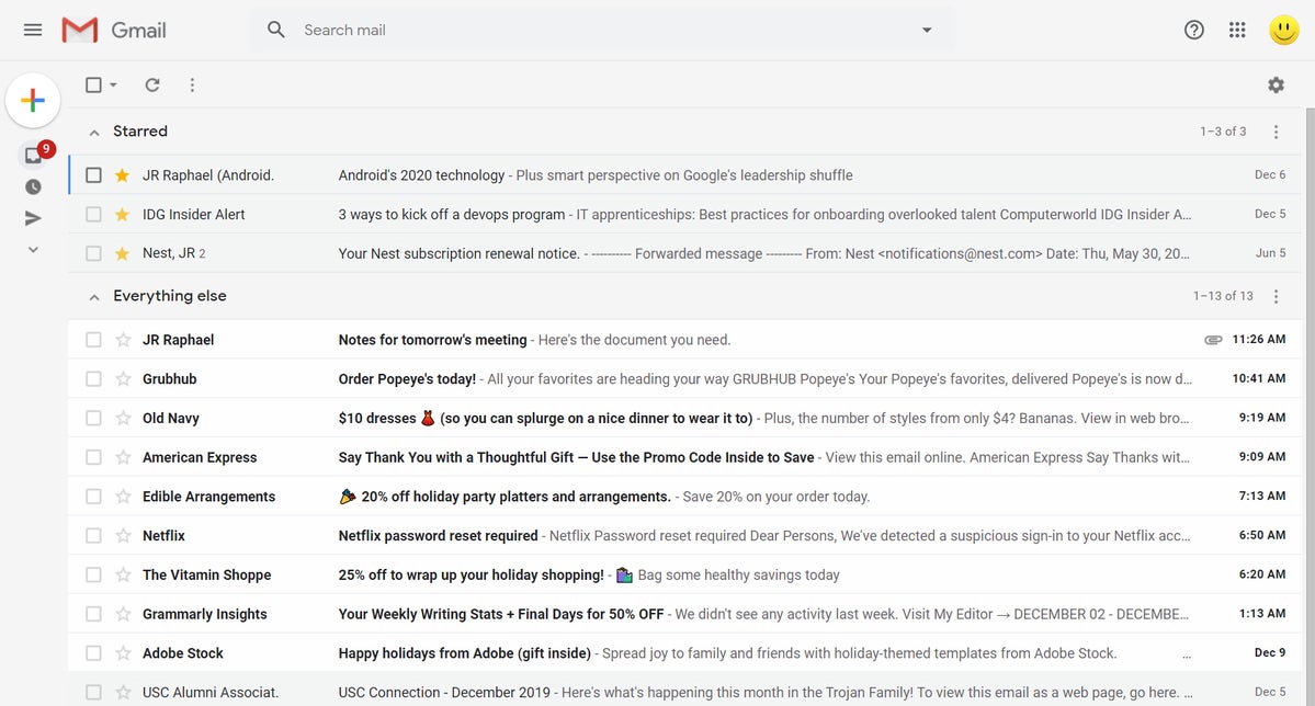
Any guesses where this is going? Yup, you got it: Following the same trend as the last two Gmail inbox options, Starred First splits your inbox into two horizontal sections — in this case, showing any messages you've starred first and then any messages you haven't starred beneath that.
 JR Raphael/IDG
The Starred First inbox style relies on your own marking of messages for emphasis.
If simplicity is your goal and you rely on starring to mark particularly pressing missives, this no-frills setup could be just the thing for you.
Got all that? Good. Now decide which approach is worthy of your adoption, then learn how to use Gmail labels to tame your inbox even further — or, if you're feeling especially ambitious, explore a next-level batch-delivery option that could seriously step up your email efficiency.


