In light of Inbox's untimely demise, we've been talking a lot about ways to make Gmail a less cluttered and more pleasant home for email productivity. Earlier this week, we even looked at a way to bring the actual Inbox interface into Gmail — but you know what? Clinging onto the past isn't the answer for everyone.
What if instead there were a way to embrace Gmail for what it is — to keep its own distinctive interface but to apply some Inbox-like minimalist principles, tweaks that make it less of a visual mess and more of a focus-friendly environment for getting stuff done?
Well, one of Gmail's longtime design leads and the co-creator and original design lead of Inbox itself has taken on the task. His name is Michael Leggett, and while he no longer works at Google, he decided someone had to give Gmail a minimalist makeover — and who better to manipulate the site than someone who helped design many of its and Inbox's most compelling elements?
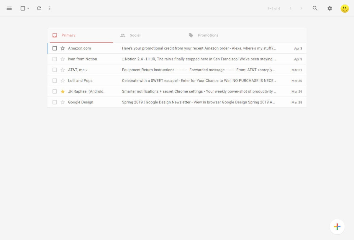
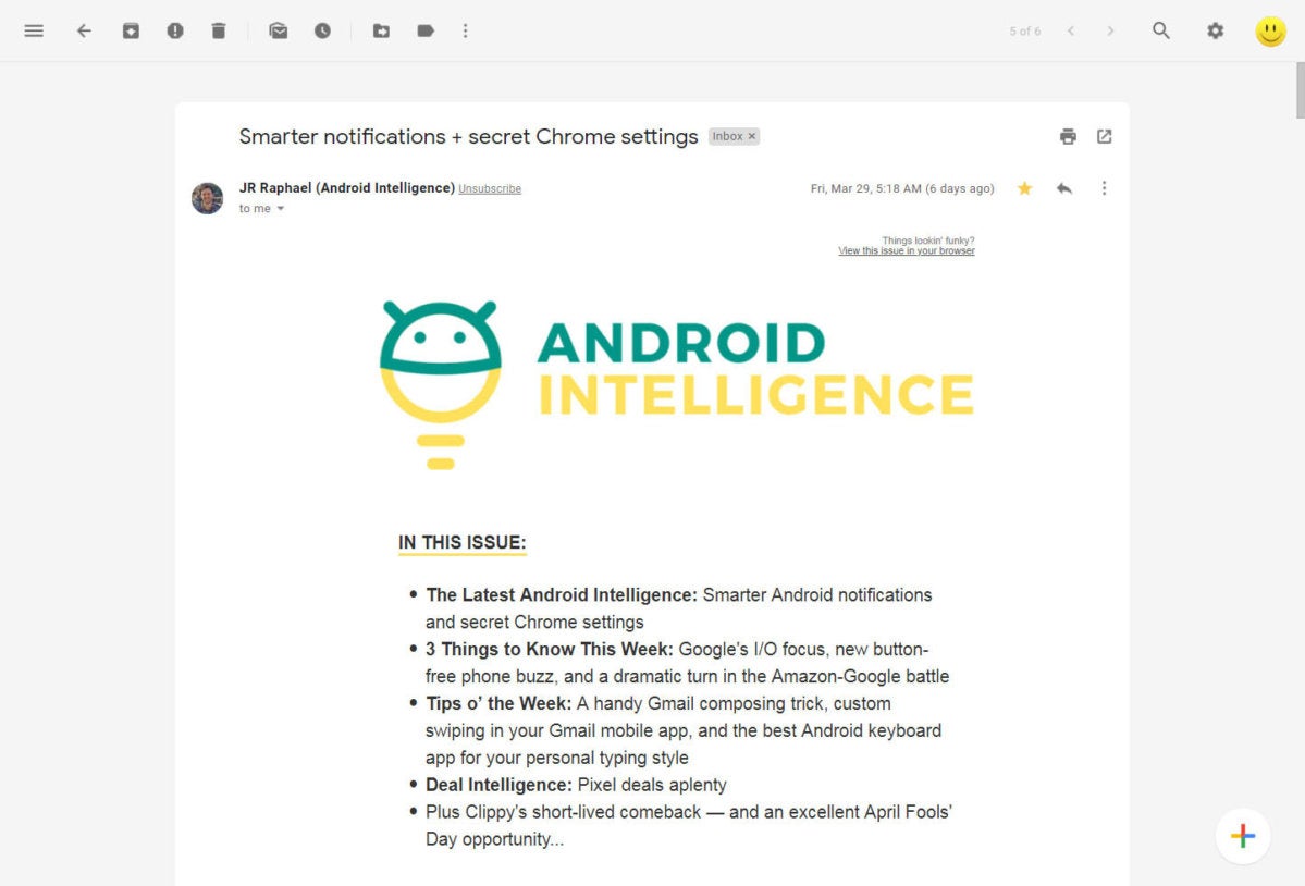
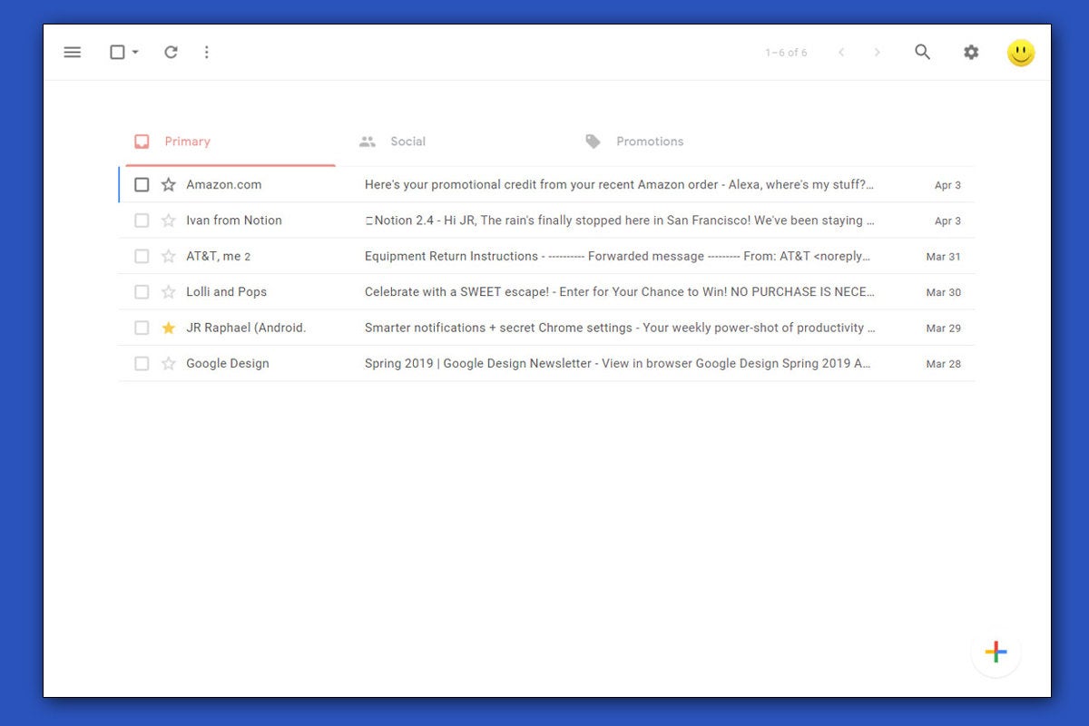
Leggett came up with a simple Chrome extension called Simplify Gmail that works some magnificent magic on the Gmail site. It makes it feel as if, well, the designers of Inbox came in and rethought how Gmail should look, too. All you do is install the thing in Chrome on your desktop, refresh the Gmail page, and presto change-o — look at what you've got:
 JR
JR This, my friends, is a Gmail desktop interface that's actually a joy to use and consequently much more conducive to efficient email-oriented work. It doesn't look overtly like Inbox, in the way our earlier fix did — so if that specific vibe is what you're after, the other setup is the one for you — but it does apply the same basic principles that made Inbox such a pleasure, and it does so in a thoughtful and thorough way that Leggett says he'll maintain and make sure remains current over time.
 JR
JR Now, there are a few minor tweaks I'd suggest making to finish out the transformation. First of all, if you want the background of your inbox — the open space surrounding the active-content area — to be a darker gray hue in order to be offset from the main focal area, as you see in the screenshots above, you'll need to change your Gmail theme. Click the gear-shaped settings icon in the site's upper-right corner, select "Themes," then scroll down until you find the "Soft Gray" option. Select it and click the blue "Save" button at the bottom of that window. (You could also select any other color or image, of course, to achieve whatever appearance you like.)
Second, set up a couple of Inbox-inspired shortcuts to make it easier to get around. The two I rely on heavily, as I've mentioned before, are being able to hit "i" from anywhere in the site to go back to the main inbox view and being able to hit the Esc key to back out of a message and return to your previous screen. I put step-by-step instructions on how to bring both into Gmail here.
And third, if you want to implement Inbox-like systems for keeping reminders in your inbox and/or saving articles into your inbox — two features I've added to my own Gmail setup and use religiously, almost every day — look at this guide I put together to recreating Inbox features inside of Gmail. Those specific elements are "Part I" and "Part II" on the page, respectively, and some other interesting possibilities follow them — all of which fit in seamlessly with this scaled-back design.
As for our fantastic new interface fix, Leggett — its creator and the former Gmail and Inbox design guru — says he's actually been writing extensions like this for all sorts of apps for years now but has never shared them publicly until this point. His personal collection includes similar sets of design adjustments for tools like Docs, Trello, and even Amazon. He hopes to little by little bring more of that work into public view via this Simplify project, which may remain free or may eventually include a subscription element of some sort as it grows.
But, notably, Leggett promises his extensions will never use any sort of ads, trackers, or other data-collecting mechanisms. He's even posted the entire code for this inaugural effort to Github, if you want to check it out for yourself.
I don't know about you, but I can't wait to see what he offers up next.
Sign up for my weekly newsletter to get more practical tips, personal recommendations, and plain-English perspective on the news that matters.

[Android Intelligence videos at Computerworld]


