I don't know about you, but I spend a shockingly high amount of my life staring at the Google Docs interface.
Docs is where I write all of my columns and articles along with other assorted musings. And by and large, it's an ideal environment for me to transfer thoughts from my noggin onto the screen: It's fully featured enough to do everything I want and yet simple enough to be easy to use. And, of course, all of my work is constantly saved, instantly available on my phone (or any other device I happen to be using), and automatically connected to the rest of the Google ecosystem in some pretty helpful ways.
Still, I can't help but feel the occasional tinge of envy when I see people talking about their super-minimalist, distraction-free writing apps — those canvas-like surfaces for scribbling words in a serene setting, with an eye-pleasing color scheme and no on-screen commands to steal away focus. Whenever I see one of those interfaces and then go back to Docs, I'm suddenly all too aware of the fact that I'm working in an overly sterile word processor instead of the spa-like oasis of a writing app.
Well, it turns out you don't have to choose between those two extremes. You can have all the functionality and native Google-syncing power of Docs while also enjoying an appealingly minimalist, distraction-free environment for your writing adventures. And all it takes is a few quick clicks to get there.
Fair warning, though: Once you experience Docs in this newly enhanced arrangement, you'll never be able look at its default interface the same way again.
The secret to Docs' minimalist makeover is a Chrome extension called, rather fittingly, Distraction Free Mode. (It's also available for Firefox, if that's your jam.) All you've gotta do is add it into your desktop browser, and the next time you open anything in Docs, you'll see a new outlined-square icon in the upper-left area of the screen.
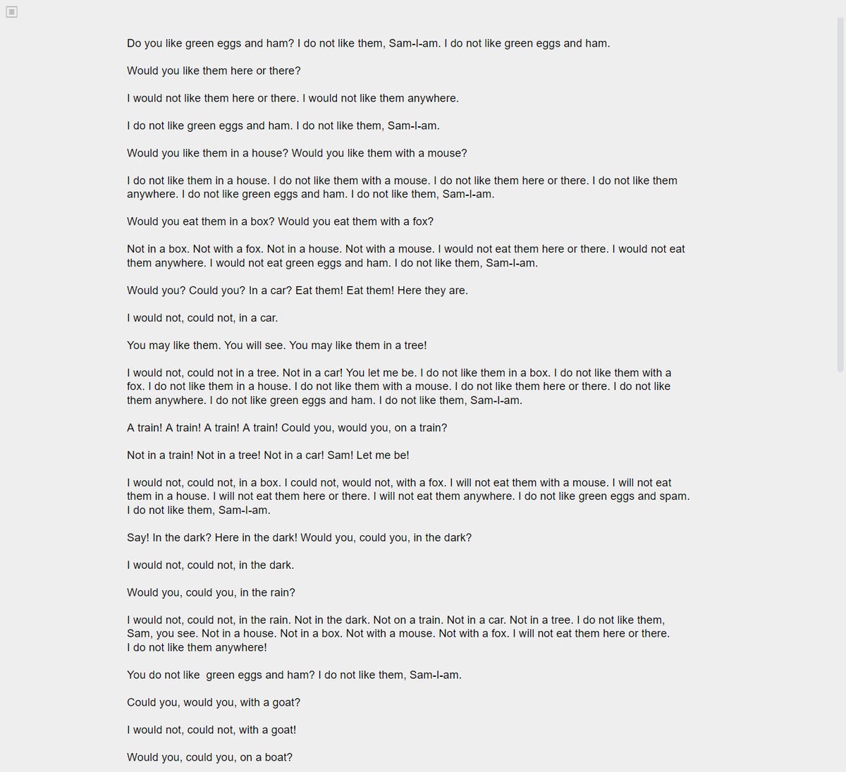
Click that icon, and bam: Just like that, your document will be transformed to show only your active text editing area, with a softer hue for its background and none of Docs' standard on-screen elements.
 JR
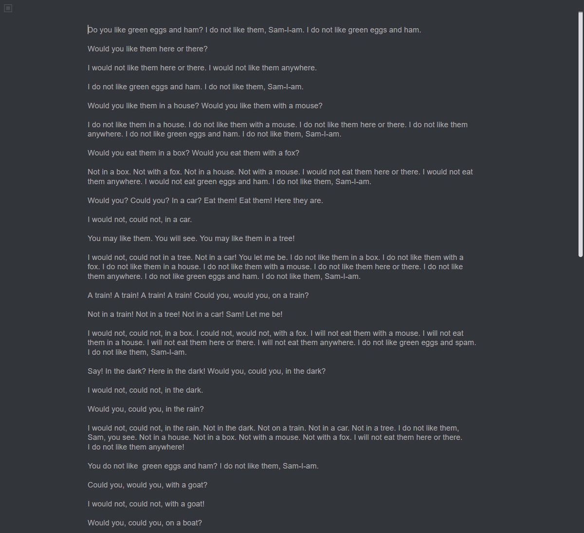
JR The only thing left beyond your words is that outlined-square icon in the screen's upper-left corner. Click it, and you'll be able to change from the default color scheme to a handful of other themes — including a gentle sepia setup and a couple of dark options.
 JR
JR The key to making the most of this minimalist interface is to rely on Google Docs' keyboard shortcuts for common commands. You can pull up a list of available shortcuts anytime by pressing Ctrl and the forward-slash key (/) on Windows or Chrome OS or Cmd and forward-slash on a Mac, even while Distraction Free Mode is activated. You may also want to zoom into the page to make the words larger (Ctrl and + in Chrome) and set the tab to take up your entire screen in order to eliminate other desktop distractions (F11 in Chrome).
As for the ever-important question of privacy, the Distraction Free Mode extension does get granted access to "read and change" data on the Google Docs website (and only on that website), but that's the only way it'd be able to make adjustments to the Docs interface. The software's privacy policy is as unambiguous as can be about its behavior: "We do not collect any of your data." (That's actually the entire privacy policy, which is kind of awesome.) The extension is open source, too, and its code is posted on GitHub for anyone to look through and assess.
All in all, there's plenty of upside and no real downside to this simple Google Docs upgrade. Give it a go and see how the minimalist environment suits you. Hey, you never know: It might end up being just what the doc(tor) ordered.
Sign up for my weekly newsletter to get more practical tips, personal recommendations, and plain-English perspective on the news that matters.

[Android Intelligence videos at Computerworld]


