The saga of Google's Chrome OS platform has seen plenty of dramatic twists — but from the get-go, most tech-observers have been too busy scoffing at the software to notice the rich narrative unfolding around it.
Bring up Chrome OS with most pundits — be they professionals or the social-media-dwelling variety — and you tend to hear the same sorts of reactions:
- It's just a browser. You could open up Chrome on your Windows or Mac machine and have the same thing.
- It's fine if you don't need to do anything real on your computer.
- Why hasn't Google gotten rid of it or combined it with Android already?
Each one of those reactions is equally misguided, as those of us who have actually spent a meaningful amount of time living with Chrome OS know. Chromebooks offer a level of simplicity and security not present with traditional operating systems; they're capable of handling the full range of tasks the majority of people perform on computers nowadays; and all the "Android-Chrome OS merger" speculation has been off-target from the start.
Crazy as the notion may seem on the surface, Chrome OS and the devices it powers have a real place in the mobile productivity world — and that place is only expected to keep growing, with the enterprise taking on an increasingly prominent role in the months ahead.
A small and scrappy platform with modest initial market share, oft-overlooked potential and impressive year-to-year growth — all driven by an open-source model that allows any manufacturer to dip its toes into the ecosystem? Huh. You know, that sounds an awful lot like another once-easily-dismissed platform I also recall covering in its early days.
Perhaps it's no surprise, all considered, that the popular public opinion always seems to be that Google should or would somehow "merge" Chrome OS into Android. We've been hearing predictions of such a combination for years now, but what those of us who look closely at the platforms have actually seen all along are far more nuanced signs of alignment — a gradual adjustment that allows both platforms to remain intact while overlapping and working together in mutually beneficial ways.
And now, that effort is being cranked into overdrive. As has typically been the case throughout this progression, each individual piece of the puzzle may not look like anything monumental in and of itself — but add 'em all up together, and you start to see the forest for the trees.
And boy, do we have quite the woodland sprouting up around us this summer. Consider these recent steps in Google's Android-Chrome OS alignment effort:
1. A new touch-friendly Chrome OS launcher
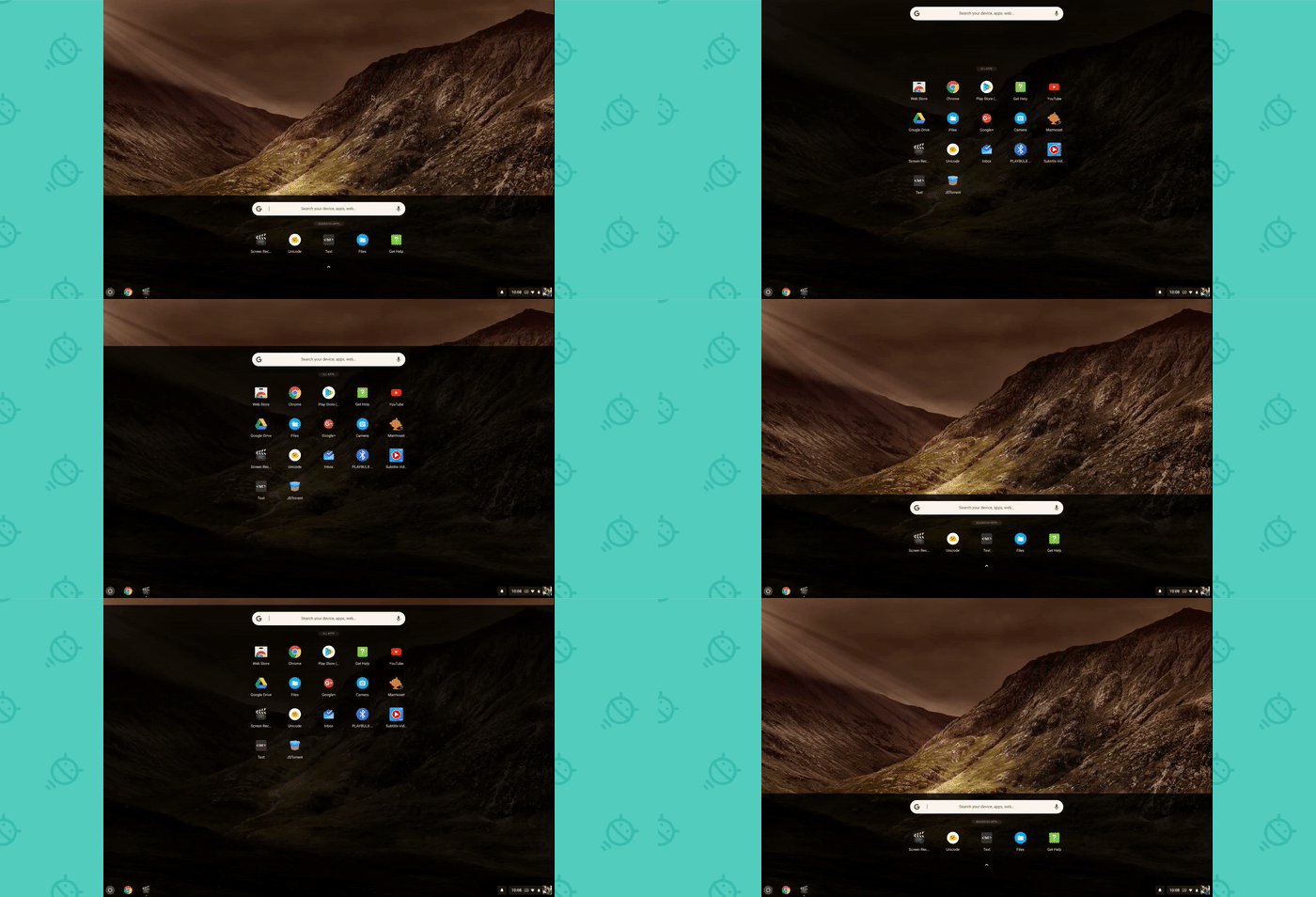
It's described as "experimental" for now and is available only in Chrome OS's cutting-edge Canary channel — but take a careful look at this reimagined Chromebook "home screen" environment, and you're bound to notice something:
 JR
JRSeem familiar? It should — especially if you know Google's current Android-focused launcher, the Pixel Launcher:
 JR
JRNeed I say more?
2. An early effort to make the Play Store the default app storefront for Chromebooks
Android apps being available on Chrome OS is a key part of the platforms' convergence — but powerful as that move may be in theory, it's proven to be a bit awkward in practice.
A large part of that is due to the confusing nature of the implementation. On supported Chromebooks, you can now install Android apps by going to the Play Store and searching — or you can install Chrome apps by going to the Chrome Web Store and searching there.
That's all well and good for tech-minded folks who understand such distinctions, but let's be realistic: Most normal people just think "I want to use Word" or "I need Skype." They don't consider what flavor of app might address their needs or which storefront they should search to find it. Having Android apps available fills a meaningful void in a Chromebook's capabilities, but it also creates a fair amount of confusion.
Google appears to be ready to address that via a new tweak to the aforementioned experimental Chrome OS launcher. It changes the way search operates on the system level so that when you search for an app in the launcher, you see results from the Play Store by default (provided your device is among those with Android app support).
The Chrome Web Store, in other words, is being pushed out of focus and into the background. "Android apps" (and yes, I'm placing that term in quotes very intentionally now) are becoming the main supplement to the regular ol' web-based tools at Chrome OS's core. And that, suffice it to say, is an enormously significant step.
It's not an entirely surprising one, either: Back in August of last year, Google announced its plan for beginning "the evolution away from the Chrome apps platform."
A mere 1% of users across traditional platforms actively use Chrome's packaged apps, the company pointed out, and the regular ol' web has progressed to the point where most of those apps' advanced functions — being able to work offline, send notifications and connect with hardware — can be accomplished natively within the browser, without the need for anything extra to be installed.
The announcement didn't spell out the end of Chrome apps for Chrome OS, specifically, but it pretty clearly laid out Google's long-term plan for phasing out the Chrome app as a point of emphasis and making sure its functionality wouldn't be missed.
It's hard not to draw a connection between that and the inching forward of the Play Store as the primary Chrome OS app storefront — a shift that could bring some much-needed clarity to the Chromebook app environment and could also go a long way in creating an app store like no other.
(And don't forget, too, that Android O introduces some noteworthy improvements that'll help make "Android apps" feel even more native in the Chrome OS environment. Coincidence?)
3. A more Android-like way to get around Chrome OS
When you think about getting around Android, you probably think about one of the platform's most distinctive visual elements: the set of three navigation keys that's almost always present at the bottom of a device's screen.
Well, guess what appeared in a recent Canary build of Chrome OS? Look closely:
 William Greene/Google+
 See that in the bottom-left corner? Oh, yes: It's an Android-esque Back button, right next to the already-Android-style Home button (which takes you to the Chrome OS launcher). That setup, as first noted by an eagle-eyed Google+ user and subsequently reported by the website Chrome Story, appears whenever you're using a convertible Chromebook in its tablet mode (with the physical keyboard flipped around the back).
But wait! There's more: Look in the lower-right corner of the screen. That little button — one that's been present in the Chrome OS tablet-mode interface for some time now — opens up a multitasking tool that lets you view all of your open apps and tabs together and quickly jump between them. And guess what? That tool just happens to sport an interface that's incredibly similar to the Overview UI introduced for Android tablets running the Pixel Launcher earlier this year.
Swap out the Chrome OS multitasking icon for the Android Overview icon — a minor tweak that doesn't seem far-fetched to imagine happening in the foreseeable future — and, well, see where this is going?
4. Google Assistant on Chromebooks
We just talked about this last bit a month ago, but to refresh your memory: Signs suggest Google's getting ready to bring its Google Assistant A.I. tool into the realm of Chrome OS. Before long, you'll likely be able to press a dedicated button or speak a hotword on a Chromebook to pull up and interact with the same system present on Android devices (as well as on Google Home, which itself is on the brink of getting a major productivity upgrade).
Put all this stuff together — and consider it within the context of the increasingly common laptop-to-tablet convertible Chromebook form — and what do you have? You have practically all the pieces for the Chromebook to become a new kind of platform-defying, all-purpose productivity machine.
Sure, it's not actually running Android — but isn't that almost a technicality at this point? It revolves around the Play Store and provides native-like access to Android apps. Its touch interface is increasingly Android-reminiscent. It'll likely soon have the same method of navigation and even the same virtual assistant as most Android devices.
What sets it apart from a traditional Android tablet is the fact that it gives you all of that within the fast-booting, auto-updating and virus-worry-free environment of Chrome OS. And it gives you all of that alongside the desktop-caliber browser experience that's a foundational part of the Chromebook experience — not to mention the laptop-level keyboard and capable trackpad that come with a Chromebook device. You get the best of both worlds, in other words, all smooshed together into a single seamlessly-blended superplatform.
Three years ago, when we were just starting to see the first seeds of this effort taking shape, I posed what at the time came across as a wild thought:
If all Android apps can eventually run on Chrome OS — and if Chrome OS evolves to look more like Android while web apps and Android apps grow increasingly similar in design — would you notice the difference between a phone running Android and a phone running Chrome?
Turns out I was thinking about the wrong form factor, but substitute "tablet" for "phone" — and, well, here we are.
It's been a long time coming, dear readers, but things are about to get real.


