Android may be Google's highest profile platform, but Chrome OS is arguably the place where the fastest and most exciting progress tends to go down these days.
Every year as of late, we see leaps and bounds being made in how Chromebooks work and what they're capable of doing — the types of programs they're able to run, the kinds of advantages they're able to offer, and the interesting ways they're able to interact with Android to create a more connected and cohesive-feeling Google ecosystem experience.
And while lots o' folks are fast to write Chrome OS off as an irrelevant experiment, let me remind you: Those sentiments are based mostly on outdated myths from the platform's earliest days. Chrome OS is nearly a decade old now, and Chromebooks today are surprisingly capable — almost ironically so, given the product's original limited purpose. What's more, they're actually incredible common, with an ever-expanding presence not only in the education domain but also in the enterprise and regular ol' consumer realms. Heck, they even outsold Macs in some recent quarters. (How 'bout them apples?!)
So, yeah: When someone scoffs at the very idea of Chrome OS, their comment is usually less about the platform's relevance and more about their own ignorance. Chromebooks are increasingly sophisticated and valuable productivity tools — and from the looks of it, their growth and development won't be slowing down anytime soon.
Here are five interesting elements Google's got cookin' with Chrome OS right now — including one that's already broadly rolled out and four that are under development but readily available, if you know how to find 'em.
[Get more Googley knowledge in your inbox every Friday by signing up for my Android Intelligence newsletter. All sorts of tasty treats await!]
(Note that most of these new features revolve around the current Chrome OS 97 release, which is in the midst of rolling out to Chromebooks wide and far as we speak. You can confirm that it's on your Chromebook by clicking the clock in the lower-right corner of the screen and then clicking the gear-shaped settings icon and selecting "About Chrome OS" in the main system settings menu. If you don't see Chrome OS 97 listed at the top of the screen, try clicking the Check for Updates button — and if nothing shows up as being available, give it a day or two and check back again!)
Chrome OS feature No. 1: A new calendar view
For all of its progress, one thing Chrome OS has curiously always lacked is the simple integration of a calendar into its main desktop interface. Especially when you consider the fact that Google is the company responsible for the calendar app so many of us rely on — y'know, that little ol' thing called Google Calendar — it's vexing to have a built-in calendar function M.I.A. on the platform all this time.
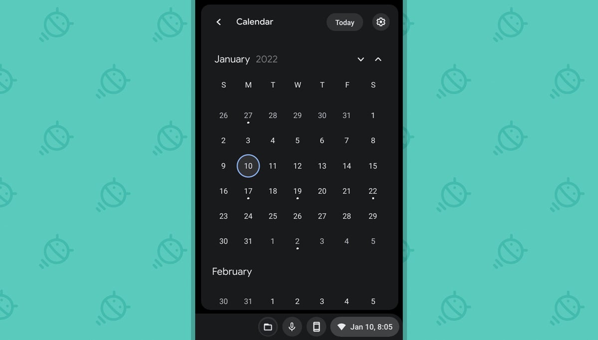
Well, as of this latest Chrome OS version, color yourself befuddled no more: With a single six-second adjustment, you can (a) add the date right into your Chromebook's shelf, a.k.a. the taskbar area — and (b) have a full month overview just two more clicks away whenever you need it.
See?
 JR
JR Tada! Here's how to make it happen on your own device:
- Type chrome:flags into the browser's address bar.
- Type calendar into the search box at the top of the screen that comes up.
- See the line labeled "Productivity experiment: Monthly Calendar View"? Click the box next to it and change its status from "Default" to "Enabled."
- Eat a hoagie, if hungry. (Not directly relevant but advisable nevertheless.)
- Click the blue Restart button at the bottom of the screen.
And that's it: When your system comes back up, you oughta see the date in the lower-right corner of the screen. Click it, then click the date on the Quick Settings panel that pops up, and your long-awaited monthly view will be right in front of your suspiciously sticky face.
Chrome OS feature No. 2: A smarter web-wide search system
Ever find yourself searching for something, then clicking on a result in Google — and seconds later, realizing you need to look further down the search results list?
This next new Chrome OS feature is designed to address that very situation, and once you have it enabled, you may never want to go back.
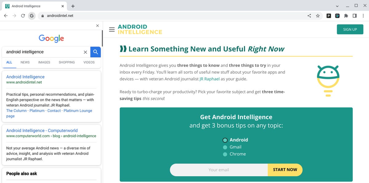
It's called Side Search, and it creates a new icon in your browser's address bar that appears anytime you've performed a search in Google and then clicked through to a result.
Click that icon — a small Google-themed "G" in the upper-left corner, alongside the commands for moving back, moving forward, and refreshing — and sweet sassy molassy, wouldya look at what happens?
 JR
JR There, right alongside the page you're viewing, appears a sized-down view of the same search results you were gazing uponst a mere moment earlier. And you can continue clicking through 'em as much as your strangely sticky heart desires — with each page opening up inside the same panel-adjacent frame by default (though you could also opt to open it in a separate new tab if you want, of course).
To get this beaut of an option to appear:
- Once again, type chrome:flags into your browser's address bar.
- Now type side search into the box at the top of the screen that comes up.
- Find the line labeled "Side Search" and change its setting from "Default" to "Enabled."
- Click that blue Restart button to make the changes apply.
Just be sure to perform a regular Google search once your Chromebook comes back online, then look for the "G" icon in the upper-left corner of the browser to find and activate your fancy new panel after you've clicked on something from the results.
Chrome OS feature No. 3: More gooder grammars
No matter how cunning of a linguist you may be, even the brightest bulbs among us are guilty of making the occasional grammatical goof. (Yes, even I are guilty.) And while Google-scented services such as Gmail and Docs offer their own on-demand grammar checking systems, your on you're own when yo'u're entering text into any other field on the world wide interwhoomps. (I'm pretty sure I got all of that right, yes?)
Well, fear no more, 'cause Chrome OS is here to help. The latest Chromebook software has a spiffy new system for checking your grammar anywhere on the web — be it in your company's content management service or even just a regular ol' form on a random website — and then alerting you to any linguistic concerns before it's too late.
When your virtual editor buddy detects something amiss, it'll place a dotted blue line beneath it — like this:
 JR
JR And clicking that text will pull up a suggestion for fixing up your words and saving yourself some face.
 JR
JR Best of all? The system works both online and offline, so you can rest easy knowing your most mortifying mistakes will always get caught — even when your Wi-Fi is letting you down.
Chrome OS feature No. 4: A lighter look
This next new Chrome OS feature is purely superficial, but hey: Sometimes, a freshened-up look can make a surprisingly large difference in your demeanor and your ability to focus.
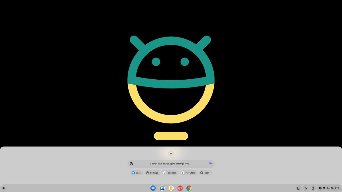
One quick flip of a switch in your Chromebook's engine room, and bam! Check it out — a new light theme of your entire system interface:
 JR
JR Kinda purty, wouldn't ya say?
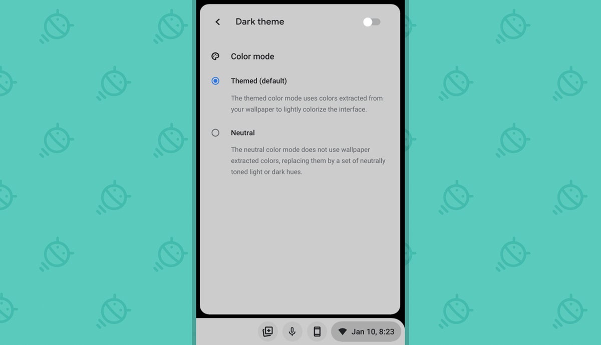
What's especially interesting about this under-wraps option is that once it's activated, you can toggle the lighter look on or off via the "Dark Mode" setting in your Chromebook's Quick Settings area — and there, you'll notice an incredibly intriguing extra addition:
 JR
JR Yep — looks like Google's cookin' up an Android-12-inspired Material-You-like system for automatically theming the entire Chrome OS interface to match your current wallpaper at any given moment. It doesn't seem to be doing much for me at the moment (remember, this is technically an under-development feature we're exploring here), but it's certainly something to keep an eye on as the weeks go by.
For now, to give yourself the lighter interface look:
- Type chrome:flags into your browser's address bar.
- Type light mode into the search box on the screen that comes up.
- Click the box next to "Dark/light mode of system UI" and change it from "Default" to "Enabled."
- Click the blue Relaunch button at the bottom of the screen.
My, you're suddenly looking rather dapper.
Chrome OS feature No. 5: A new and improved app launcher
We're nearing the end of this lively, lovely list, but don't fret your biscuits too much — 'cause we've definitely saved the best for last.
This final tucked-away Chrome OS treat is actually one that's been quietly available in the software for a little while now. In fact, we talked about it late last year, as you've been able to dig up and enable a version of it since all the way back in the Chrome OS 94 era (ah, simpler times).
But it's come a long way since then — and whether you checked it out in the past or are scratching your flaky noggin in confusion and wishing I'd just explain what I'm talking about already, it's well worth giving a look now.
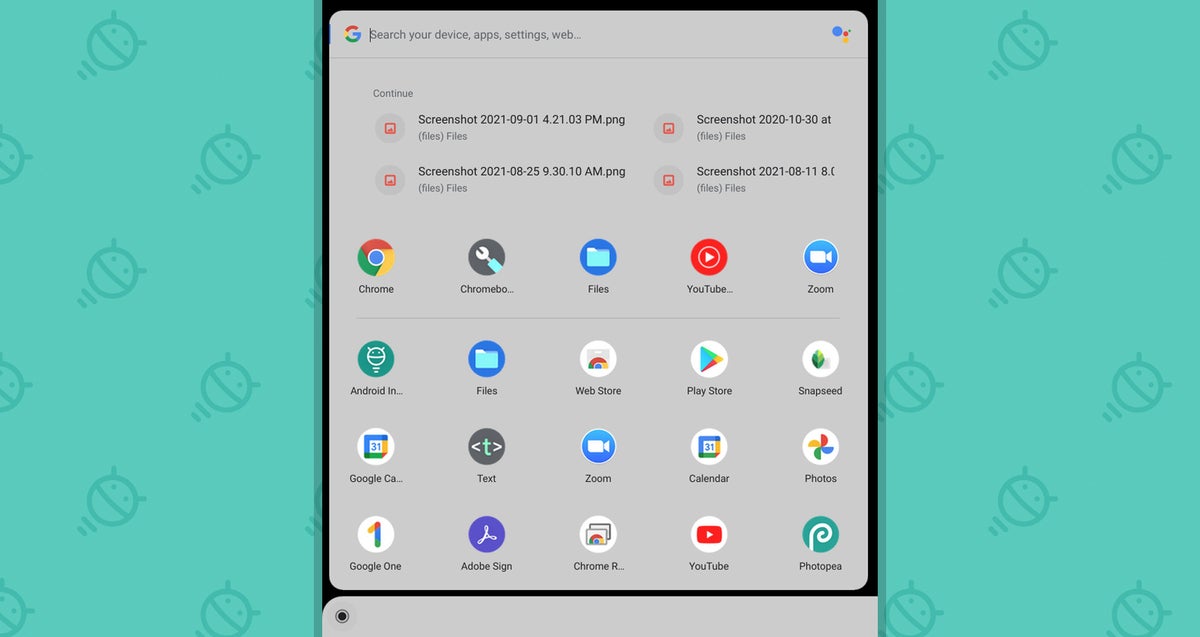
The feature of which I speak is a totally reimagined version of the Chrome OS app launcher — the panel that pops up when you click the circle-shaped icon in the lower-left corner of the screen or press the Everything button (also known as the Launcher key, the Search key, and "that one button where Caps Lock usually goes") on your Chromebook's keyboard.
Instead of being the usual full-screen, Android-app-drawer-like setup, the new and improved launcher is a more Windows-10-reminiscent left-of-screen window that holds shortcuts to all your installed apps along with a universal device/apps/settings/web and Google-Assistant-summoning search box.
And my goodness, is it ever a sight to see:
 JR
JR This latest version of the Chrome OS launcher fixes some flaws in the earlier incarnation (including the vexing broken folder bug in the Chrome OS 94 setup), and it introduces a new element that automatically shows your most recently used files at the top of the panel for easy access to those when you need it, too.
Oh, and it looks positively dashing with the light mode we just finished talking about, as you can see in the screenshot above.
To try it out for yourself:
- One last time, type chrome:flags into your browser's address bar.
- Type productivity launcher into the search box on the screen that comes up.
- Click the box next to "Productivity experiment: App Launcher" and change its setting from "Default" to "Enabled."
- And just for giggles, do the same thing with the line labeled "App Launcher: Animation," too.
- Click the blue Relaunch button at the bottom of the screen and sing a jaunty tune for good measure (and also to make yourself look like a fool to anyone around you — always a nice bonus).
Now you can find what you need in style and know you're a step ahead of the game — not a bad way to start the new year, if you ask me.
Get even more useful Googley knowledge by checking out my free weekly newsletter. You'll get three exclusive new time-saving tips within seconds of signing up!


