Some weeks, Chrome OS gets so many new features, it feels like we're practically drowning in possibilities. And man alive, is that ever a delightful sensation (even with the metaphorical lack of oxygen).
One part of the Chrome OS experience that hasn't changed much in recent years, though, is the desktop environment — y'know, the Chromebook's exceptionally humble home screen. Sure, the taskbar area (a.k.a. the Chrome OS shelf) has learned a few new tricks over time, but the desktop itself has remained vexingly blank and free from advanced functions ever since its inception.
That's a stark contrast to Android, where the home screen is an all-purpose panel for both app shortcuts and interactive widgets. Widgets in particular have the potential to make so much important info readily available, and they'd be every bit as helpful in the even more productivity-oriented Chrome OS setup.
But despite all my wishing and summoning of magic virtual-genie spirits, Google has yet to grant us the ability to place widgets on a Chromebook's desktop. (It's astonishing, I know. I'm starting to wonder if my sorcery powers aren't as potent as I've been led to believe.) You can install Android apps on a Chromebook, of course, but widgets? Nope. Fuhgeddaboutit. Not gonna happen, Horatio.
Or so you would think. Google may not officially support Android widgets on Chrome OS as of now, but with a little creative tinkering, you can build yourself a custom panel filled with any widgets you want and then make 'em all available from anywhere on your Chromebook system. It's a custom Chrome OS productivity dashboard, essentially, and it'll take you all of four minutes to set up.
Here, look — here's a Chrome OS widget panel I plopped together in a matter of moments just now, with widgets showing my Gmail inbox, a Google Calendar monthly view, a Todoist task list, and a Google Keep notes collection:
 JR
JR Once you get this thing goin', my goodness, you're gonna be zippin' around and takin' care of business like, well, nobody's business. So crack those phalanges, grab yourself a fistful of crackers, and get ready: It's time to treat yourself to one heck of a Chromebook upgrade.
The Chrome OS widget secret
First things first, to pull this feat off, you'll need to snag the secret ingredient in our zesty and suspiciously greasy geek-stew recipe. It's an appetizing app called Taskbar, and while it's primarily designed for Android, it works deliciously well on the Chromebook side of things. So go get it — either via the dedicated Play Store app on your Chromebook or from the Play Store in your browser — and get it loaded up onto that stunning little system of yours.
(Taskbar is free, by the way, and it doesn't require any eyebrow-raising permissions in order to operate. So charge forward, my fellow brave explorer — charge forward with gusto.)
Once Taskbar's in place on your Chromebook, open the app up, and you'll find yourself staring at its configuration screen. There are a few adjustments we need to make in order to have things running the way they should, so stick with me and stay patient; I promise we'll get to the good part soon.
Okay — start by clicking or tapping the "General settings" section, and on the menu that comes up:
- Select "Position on screen" and change it to "Bottom left (vertical)."
- Check the box next to "Alternative position for collapse button."
Now, click or tap the arrow in the upper-left corner of the screen to get back to the main settings area. Select "Advanced features," and then:
- Check the box next to "Replace home screen" and follow the steps to grant the app permission to display over other apps. Taskbar needs that permission in order to place itself on your Chromebook's desktop and show up on top of other apps you're using. There's no real risk involved.
- Once you've granted the permission, make your way back to the "Advanced features" menu. You'll probably have to check the box next to "Replace home screen" one more time now to get it to take.
- Next, check the box next to "Enable widget support."
- Last but not least, select "Widget dashboard grid size" and change it to 2x2. (You can go back and play with this later, if you want, but this setting seems the most suitable to the Chrome OS environment to me. It divides your widget-panel screen into quarters and gives you space for four different widgets with plenty of room for 'em to spread out and breathe.)
Now, take a deep breath yourself — we're almost done! Click or tap the arrow in the upper-left corner of the screen to get back to the main Taskbar settings area again. There's just one thing left to do for this initial foundational part of our setup, and it's an important one: Click or tap the toggle in the upper-right corner of that settings screen and flip it into the on position. That's what'll actually activate the application. (I told you it was important!) You'll probably see a prompt asking if you want to grant a certain permission in order to include recent apps in the tool; I'd suggest clicking "Cancel" and ignoring that for now, as it's really not needed, and it'll just add extra clutter into the interface for our current purposes.
And that, my efficiency-adoring amigo, is it. You should now see the Taskbar interface right above the circular launcher icon in the lower-left corner of your screen — and you're ready to get your custom Chrome OS widget panel set up with all the wuvely widgets you want. (And to be clear, by the way, "wuvely" isn't a typo. It's the word "lovely," as said with an Elmer Fudd accent.)
Customizing your Chromebook widget panel
Hey, you made it! This is the fun part! Pat yourself on the back, then stop screwing around and let's get this thing done already.
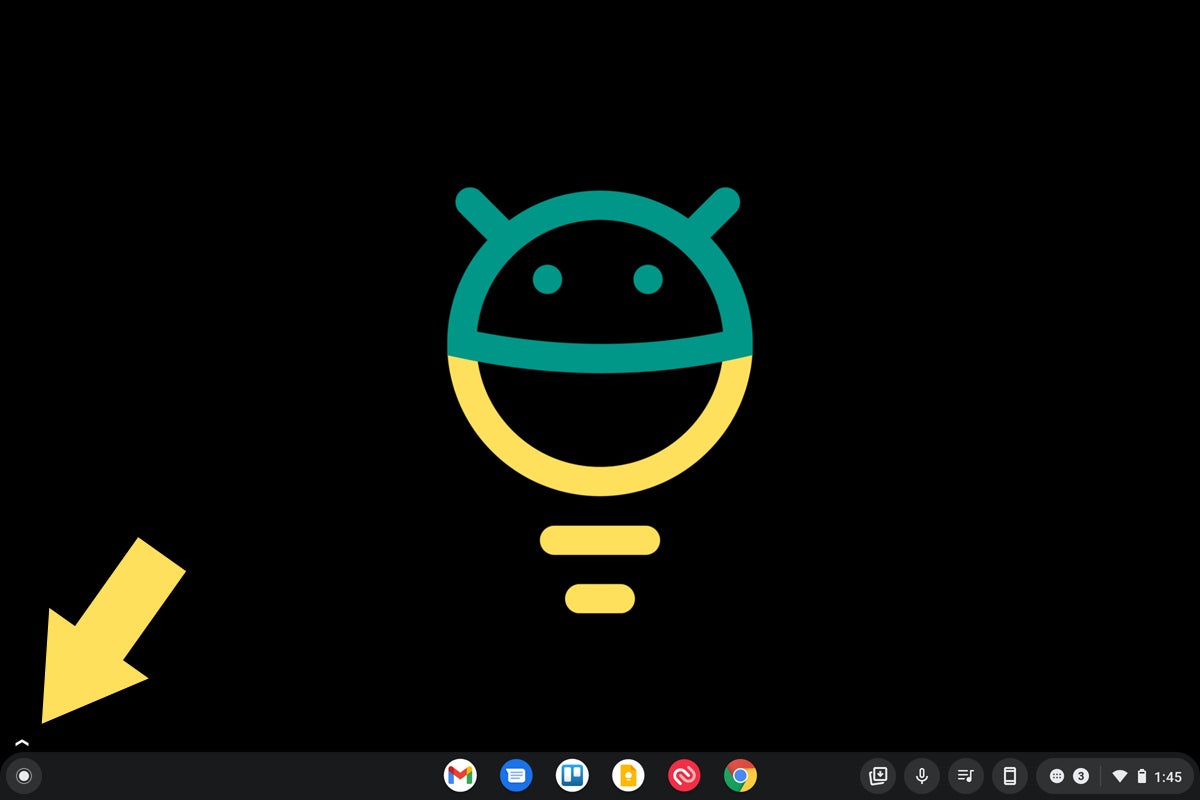
First, to open up your productivity dashboard, click or tap on the arrow above that launcher icon — the same one we were just looking at a second ago.
 JR
JR Yup — that's the one, you smart and capable sea creature. Once you click that bad boy, you should see an expanded bar with a square-shaped icon showing six small rectangles inside it. See?
 JR
JR Click that, and bam: There's your dashboard. It'll pop up atop anything else you've got open, whether it's your function-free Chrome OS desktop, a browser window, or any variety of Chromebook-compatible apps. Of course, it's blank right now, which isn't especially useful. So let's fix that, shall we?
Hover your mouse over any of the four quadrants of your screen — or tap your finger onto any of 'em once, if you're using a Chromebook without a keyboard handy — and you should see the words "Click to add widget" appear. Can you guess what we're gonna do next?
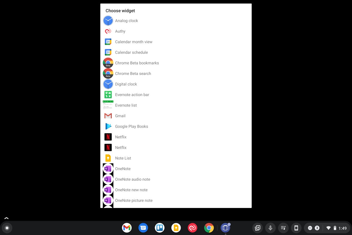
Yes, oh yes: Click or tap onto that very area, and holy jumpin' jackalopes: Just like that, you'll see a simple widget selection interface appear right in front of your overly wet eyeballs.
 JR
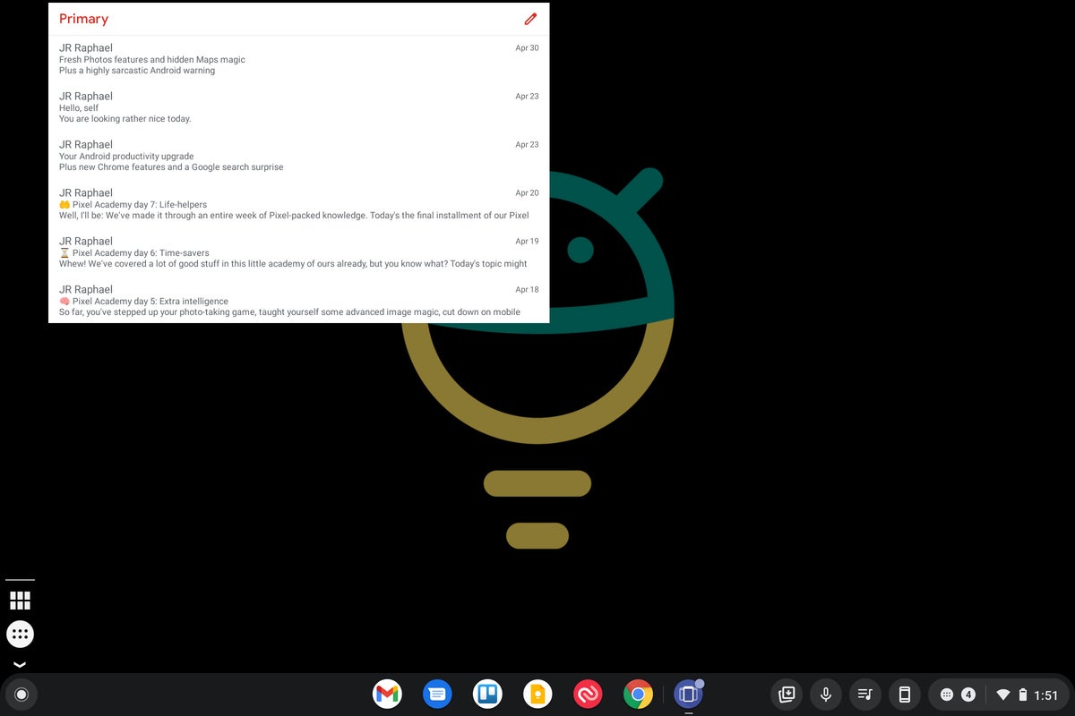
JR Pick out any widget you want, follow the steps to configure it as needed, and before you know it, you'll be staring at a fancy interactive widget — right on your crusty ol' Chromebook.
 JR
JR And remember: Just like with a widget on Android, you can scroll up or down in it, as supported, and tap any active area of it to jump directly to the related element. You can fill up all four spots and have a variety of widgets on demand and available — including any of my top Android widget recommendations, if you're looking for inspiration — or you can keep things simple and just add one or two items into the mix. Remember, too, that you can always go back and adjust that "Widget dashboard grid size" setting from a minute ago to play around with how many spots are available (and thus also how much space each one of 'em is able to take up).
A handful of other things worth noting before we call it a day:
- Anytime you want to access your widgets, just follow the same steps from above and click or tap that small arrow to reveal the full Taskbar bar, if needed, then click or tap the square-grid icon to make the widgets show up.
- Clicking or tapping that square-grid icon a second time will make the panel go away; clicking or tapping the arrow icon again will make the bar collapse.
- When the bar is expanded, you can also click or tap the circular icon in that area to see and quickly access any Android apps that are installed on your Chromebook. It's not the most significant benefit of this setup, if you ask me, but it's an interesting extra touch that's there and worth keeping in mind.
- If you ever want to remove a widget from your panel, double-click it — or long-press it with your finger (provided you have a Chromebook with a touch-screen, that is; otherwise, you won't accomplish anything more than smudging up your display and making yourself feel silly).
- You'll have to manually open the Taskbar app once every time you restart your Chromebook in order to get it up and running. The app does have an option in its settings to start itself automatically upon booting, but it doesn't seem to work in the Chrome OS environment. It's a minor extra step but a pretty painless one to contend with. You could even pin the app to your taskbar area to help yourself remember and keep it a single click or tap away.
And that, my dear, is all there is to this. All that's left is to widget away — widget away with abandon, damn it! — and leave everyone else around you wondering how in the world you're making that virtual-genie-level magic happen.
Want even more Googley knowledge? Sign up for my weekly newsletter to get next-level tips and insight delivered directly to your inbox.


