In the world of technology, some changes seem to happen with the snap of a finger. A new operating system update hits your phone, and bam! You've got a next-gen gesture navigation system and all sorts of other interface changes. The cause and effect are both immediate and obvious.
Other times, change can happen in a much more subdued and piecemeal manner — an evolution-like progression, with subtle and often insignificant-seeming shifts showing up bit by bit over time. In and of itself, each shift may not look like much. But add them all together, and you realize a massive transformation has been building up in front of your eyes (you know, the whole "seeing the forest for the trees" thing).
That second scenario is precisely what's been happening with Google's Chrome OS platform over the past several years. While most folks were distracted thinking about some grand, only-one-can-survive "merger" of Android and Chrome OS, Google was quietly working on the more practical goal of aligning its two operating systems and bringing them together — in a way that allows each to serve its own unique purpose while benefiting from the other's strengths.
That goal has become increasingly apparent as of late, as the changes start to create a more overt and visible impact — especially on the Chrome OS side of the equation. But everything we've seen up til now is about to look miniscule in comparison to Google's next phase of Chrome OS Androidification.
This phase will bring unmistakably Android-like elements into some of the most prominent and core parts of the Chrome OS interface. As such, it's poised to transform the Chromebook-using experience in some pretty powerful ways.
Let's break it down part by part, shall we?
Part I: The launcher and home screen
Thus far, the Chromebook's launcher and home screen have remained decidedly different from their Android equivalents. Now? Well, things are about to get a lot more similar.
First, take a look first at this new Quick Settings design from Google's latest Chrome OS developer channel release:
 JR
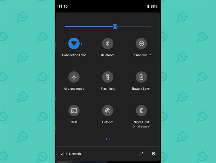
JR Look familiar? It should:
 JR
JR The setup takes some pretty apparent design cues from its Android 9 Pie cousin, shown above — not only in its color scheme but also in its iconography (that's a real word, right?), the rounded nature of its elements, and its overall presentation.
If that isn't enough, Chrome OS's notifications are also about to move into that same area of the screen — a migration from their longtime placement within a separate, neighboring panel and another noticeably Android-like twist:
 JR
JR But all of that is nothing compared to the new home screen setup in the works for the Chromebook's tablet mode. Ahem:
 JR
JR To be clear, the app drawer isn't opened there; that is the home screen. Keep in mind that this is an early, still-under-development incarnation — but, yes, Google appears to be ready to create a more traditionally tablet-like desktop environment for Chromebooks. You can't change much about the presentation as of now, aside from shifting around the placement of individual shortcuts, but it doesn't seem far-fetched to imagine support for widgets and other Android-level forms of customization coming along before long.
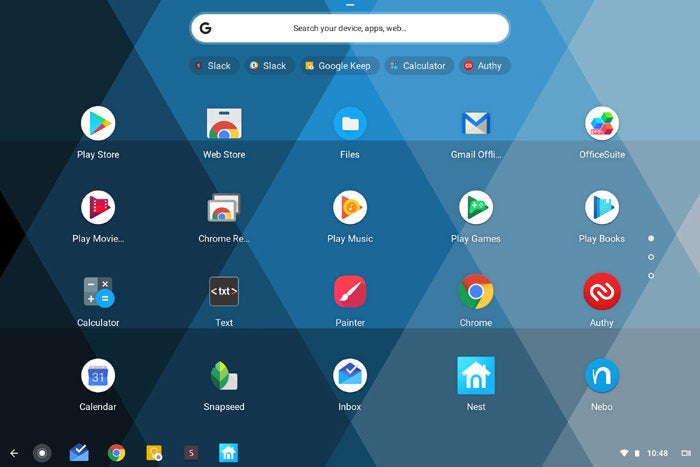
Speaking of which, notice those cards at the top of the app drawer? I'll shift back to the laptop view for emphasis:
 JR
JR You recognize those, right? They're contextual suggestions, just like you see when you open up your app drawer in recent versions of Android. Here, they're all links to full apps — not individual actions within apps, as Android also now offers as of Pie — but bringing this level of predictive technology into the Chromebook front is a pretty big step, regardless.
That partial "peeking" view of the app drawer, incidentally, comes about when you touch or tap the "Home" button in the lower-right corner of the screen or when you touch the matching button on the Chrome OS keyboard. If you want to load the full app drawer immediately, guess what you can do? Yup — swipe upward from the bottom of the Chromebook's display, just like in Google's Android launcher.
On the subject of swiping, this latest Chrome OS work in progress includes a new system for switching between apps and multitasking while in a Chromebook's tablet mode — and the whole thing revolves around (drumroll, please...) gestures. You can simply swipe down from the top of a Chromebook's display to open the Overview interface. From there, you can look through your currently open apps and even start a split-screen mode by dropping your current app into a designated area on either side of the screen.
 JR
JR It's not identical to what you see on Android right now, but it certainly shares some of the same foundational concepts. And as far as the split-screen function, specifically, it actually seems like an improvement over Android's current implementation — which buries the split-screen command in a rather out-of-the-way place. This feels like a more clever use of gestures to make split-screening a natural part of the interface instead of an awkwardly tacked-on addition.
Other Androidification elements worth noting in this area include a new Android-like wallpaper picker and the introduction of both Android's App Shortcuts system and notification badge feature.
And that's all just part one.
Part II: Google Assistant integration
Google Assistant's presence on Chrome OS may still be limited to Google's own top-of-the-line Pixelbook device, but that's almost certainly a short-term limitation. And while the rest of the Chromebook ecosystem waits, Google is taking more steps to make Assistant an integral part of the Chrome OS experience — in some fairly familiar ways.
As it stands at the moment, Assistant is available on the Pixelbook only by pressing a special Assistant key on the device's physical keyboard. In this latest developer-channel version of the software, Assistant gains the Android-like (and tablet-friendly) additional placement in the on-screen Home key, via — oh yes — a long-press gesture.
 JR
JR Beyond that, Google is experimenting with adding an Assistant shortcut into the search box within the Chrome OS launcher — something that's simultaneously being tested on Android.
And last but not least:
Part III: Text input
With Chromebooks now effectively acting as Android tablets, one area has remained oddly unaddressed: text input — specifically, the fact that typing on the screen of a Chrome OS device is nowhere near as pleasant as typing on Android.
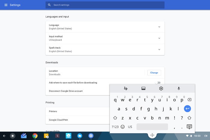
That's because on a Chromebook, you're stuck using the Chrome OS virtual keyboard — which is, well, serviceable but not exceptional. That's about to change, though: Google is working on a vastly improved Chrome OS keyboard that allows you to turn the typically full-screen-width interface into a sized-down, floatable keyboard. That makes it much easier to use and much closer to the tried-and-tested Android standard.
 JR
JR Combine this with signs that Chrome OS will soon support an array of third-party Android keyboard apps, and the gaps between the Chromebook touchscreen experience and the Android touchscreen experience are suddenly looking a whole lot smaller.
One other input-related addition of note: With this same in-progress effort, Chrome OS is gaining a new system-wide dictation feature. Once activated, it allows you to simply tap an icon in the screen's corner to speak and have your words turned instantly into text — anywhere, anytime, without even having the keyboard pulled up.
That's another improvement we can safely file under "Android-plus" — something that takes the Android model and turns it up a notch, this time in a way that makes sense specifically for the convertible device form.
Putting it all together...
With all the additions across these three core Chrome OS areas, the Chromebook is about to become more Android-like than ever. And that's to say nothing of the other changes on the way to the platform — things like support for an Android-esque always-on VPN option, support for Android-reminiscent lock screen notifications, the implementation of the Android-based Camera app, and the adoption of Google's Android-based picture-in-picture system.
Of course, as we said earlier, more significant than any individual piece of this puzzle is the big picture of what it's all creating. The trend we saw starting to take shape so many years ago is finally coming together; all of those little pieces are being joined by big ones to form a clear and cohesive outline of Google's Android-Chrome-OS strategy — a strategy in which selective overlap and thoughtful alignment allow two very different operating systems to co-exist harmoniously and with mutual benefit.
Oh, and by the way: All of these changes? They're under development for Chrome OS version 70, which is slated to roll out as a stable release in mid-October.
Something else is expected to happen around that same time: Google's annual fall hardware event, at which the company is widely expected to debut a new tablet-experience-focused Pixelbook device. Hmm...
Keep your eyes on the forest, gang. You don't want to miss what's about to appear.
Sign up for JR's weekly newsletter to get more practical tips, personal recommendations, and plain-English perspective on the news that matters.

[Android Intelligence videos at Computerworld]


